Friday, February 25, 2011

Swarm

Spread from Winter Lullaby- 10.5" x 21" , acrylic

This week's Illustration Friday topic is "Swarm". I admit, I rarely have time to create something new specifically for Illustration Friday, but I enjoy participating in the forum. If you are not familiar with the site, you should check it out. It's an excuse to be creative and share with other artists and fans. There is a different theme posted every Friday and hundreds of artists contribute to it each week.

Detail from Winter Lullaby

This piece is the second spread from my picture book Winter Lullaby. Written in question and answer form on alternating spreads, the text simply and poetically explains where animals go in the winter. The opener poses the question "When the breeze blows the petals off the flowers, where do the bees go?" Turning the page, this  particular painting illustrates the answer, "inside their hives 'till spring arrives". It's a quiet bedtime story  for young children that happily is still in print. You can find it here.

Thursday, February 24, 2011

Creating Visual Balance

Back cover for Jack Black and the Ship of Thieves- 8" x 8" , acrylic

Finding balance in your composition can be a tricky process. One rule of thumb that is helpful to keep in mind is the fulcrum and lever principle. Once again I pull a page from  Creative Illustration by Andrew Loomis to illustrate the concept. The value of creating appropriate distance between compositional elements is evidenced in his sketches. A basic rule is to have the larger heavier object nearer the center of the composition and the smaller object further away from the "balance point".  If the two objects are of similar size and shape then overlapping the two forms can add interest to the composition.

From Creative Illustration by Andrew Loomis

In the back cover spot illustration at the top, I  used the smaller scale of the plane to balance the larger forms of the ship's smokestacks. I broke the "keep the larger elements toward the center" rule in order to add drama and keep the plane the center of focus. The simplicity of the smoke and sky shapes against the complexity of the plane also provides a nice visual counterpoint. Obviously no rules are set in stone, but if something looks wrong or out of balance to me, I look at changing the scale, spacing or location a bit until things look right.

Tuesday, February 22, 2011

To the Desert Again

West of Cedar Fort - 10" x 8" , Oil 

Yesterday afternoon I took off to paint in the desert again. Richard Hull, David Meikle and I ventured out into the sagebrush west of Cedar Fort, Utah about an hour from my house to paint for a bit. It was a bit frigid at around 33 degrees but stretches of sunshine and breaks from the biting wind made things bearable.

The View west of Cedar Fort, Utah

There is really nothing that can substitute for what you learn painting out of doors. I didn't really understand this until I started doing it, but I think it has to do with being forced to observe from life and then respond to that immediately in paint. You have to make decisions regarding composition and color in the moment. You are compelled to either change a painting based on fleeting shadow patterns or stick with your original impression.

The picture in progress

I changed up the lighting patterns in my picture about halfway through because I liked the simpler shapes on the mountains to the right of my composition when they fell into shadow. This would not have happened if I had simply been working from a photo and I like the painting better as a result. This painting was done in a bit under 2 hours. I'll work on it a little more in studio to finish it up. Can't wait for the next chance I get to go paint outside.

Friday, February 18, 2011

Layer Cake

The "Worst" Cake Ever - digital

This piece is for a magazine story in which the dad teaches the importance of following instructions and how some rules in life (as well as art making) never become obsolete, such as like look both ways before crossing the street. The object lesson was to make a cake without a recipe. Everything went OK until the dad decides to add Worcestershire sauce at the end. I am sure that additional ingredient would add a layer of flavor nobody would enjoy. Of course all ends well when out came the cake that had been previously baked. This lesson reminds me of how important it is to learn and use the basic rules of good picture making as we create our art. Just like a trained chef, if we know the rules, we can mix and match and come up with art making recipes that are new and tasty. This one continues my explorations into Photoshop as a painting medium.

Thursday, February 17, 2011

C.F Payne Visit


Yesterday I had the privilege of watching yet another demo and presentation by the incomparable C.F. Payne. For those not familiar with his work. Chris Payne has been a fixture in the illustration world for decades. He has won multiple awards from every notable illustration and design institution you can think of. He is perhaps best known for his 4 1/2 year run creating the back cover art for Reader's Digest called Our America.


I first met Chris in 1994 when I was just about to launch my freelance career. I attended a design conference in Park City, UT where he was a guest presenter and he was gracious enough to review my portfolio and give me welcome encouragement. We continued to cross paths every few years at conferences and drawing retreats and became friends. Chris and his son even slept on my pull out couch during their 2002 Winter Olympic trip to Salt Lake. Most recently, I had the pleasure of having him sit in on my MFA thesis defense at the University of Hartford. Yesterday I got to watch Chris in action once again as he did a demo painting for a room of over 50 students (including my class) as well as interested visitors at Brigham Young University. I've seen him do his thing several times over the years, but it never ceases to entertain and amaze me. Chris is quite simply a master at his craft. Rather than go through a step by step of his process, I'd just like to share a few nuggets of wisdom I jotted down from yesterday's presentation.
"You are only as good as your reference material- get good reference." 
"The only one taking a risk here is the illustration board" - in response to a student who claimed to have been taking a risk. 
"The work is the fun of it- just get to work. It's where you want to be- there is only pressure when you are not working." 
"You are a steward of what you are doing" - in response to why he got into teaching. 
"It is all about DESIGN- how you communicate an idea and make it make sense." 
"To design a picture, you have to see shapes. Look at the space and design the picture- don't get so caught up in the details. 
"Don't work in isolation. Communicate with other illustrators- network." 
"Experiment! Make a whole bunch of bad art and learn from it. Remember your mistakes."


Wise words from one of the best- thanks Chris!
Check out Chris Payne's portfolio here.

Wednesday, February 16, 2011

Crayon Dog

Crayon Dog- Acrylic- 7" x 11"

Sometimes I feel like I am seven again-drawing with crayons. If you have been following this blog, you know I have been increasingly creating work using digital technology (Photoshop in particular) and in many ways I feel like a little kid. Sometimes I'm like a kid all excited to crack open that brand new box of crayons and see what's inside. Other times I'm like a frustrated kid whose drawing didn't quite turn out like he wanted but knows there must be a way to make it better, if only he knew how. Then there's the kid who comes home and finds the dog with his crayon (when I have computer issues). Anyway, this picture goes way back and is done in acrylic, but I have always kind of liked it. I am thinking I may go back and colorize it in Photoshop and see what it looks like. If I do, I'll post it again later.

Monday, February 14, 2011

Happy Valentine's Day!


Hope everyone takes time today to show those around you how much you love them. Reach out with a kind word, a hug, flowers, a card, a phone call or whatever seems appropriate. It's the people around us that make life worth living. I did this piece a few years back for an advertising firm I have done a fair amount of work with called Love Communications.  They still use it on their website (hit refresh once or twice if it doesn't right up on the masthead). There is also a six foot tall version of it smack in their lobby right behind the receptionist desk.

Saturday, February 12, 2011

Forget The Sweater

On the Monkey Bars- 11" x 17" digital

Weather here has been downright balmy this week with temps in the high 40's (Fahrenheit). A welcome change from the single digits of a week ago. I actually wandered around outside today in just a t-shirt. I just finished this illustration for The Friend magazine done in Photoshop. It is a wraparound cover with a twist. The issue is a special double sided edition. the front half of the magazine will be the regular set of stories and articles but flip it over (like a double sided comic book) and the back half will be full of puzzles and games. It was fun to make the back half echo the front but with slightly different characters. The white bar along the far side is to allow for the bar code and address (non-negotiable unfortunately). I asked Brad Teare the designer to email me back a mock up of my picture with all the masthead and bubbles pasted in. I then inserted it into the illustration to get the "endless magazine" effect, which was sort of fun to do.

Tuesday, February 8, 2011

Overlapping Forms to Create Depth

Poster for New Mexico Museum of Natural History
by Greg Newbold - acrylic on board

From Creative Illustration by Andrew Loomis

Continuing  a bit further with my Look at Andrew Loomis' Creative Illustration. I pulled a page that discussed the importance of overlapping form and contour in the arrangement of objects in the picture plane. Loomis insists and I agree that almost any subject can make a compelling picture if the forms are arranged in a visually pleasing way. I was looking back though my work to find a piece that strongly illustrates this principle and I found this piece I did for the Natural history museum in Albuquerque, New Mexico. They held an exhibit of artifacts discovered by William Flinders Petrie, considered by many to be one of the fathers of modern archaeology. The character of Indiana Jones was based partially on his persona, including the fedora. I used a lot of overlapping objects in the composition both to add depth as well as compress the picture space enough to allow numerous objects to be shown within the frame.

Loomis PDF

Monday, February 7, 2011

Picture Book Marathon Update

Cuttlefish For Rent- picture book concept

Last week I mentioned that I was going to join in on the Picture Book Marathon and write 26 picture book manuscripts by the end of the month.. We are now a week in and I am still pretty much on pace with six stories under the belt and several ideas to work on next.. I took it to heart that we artists were to WRITE the stories, so I have been concentrating on that and have not come up with any visuals for my stories before today (I do have other work to get done you know). I took a little time today to do a cover mock up for one of my favorites from the week called Cuttlefish For Rent. I have always thought cuttlefish were fascinating creatures and sort of cute as well. The hero of my story -Chuck- loses his job as the "open" sign at a local restaurant and decides to rent out his services until he finds a job he likes. In the end, he saves the day with his camouflage and other skills. Some of the other artists in the race are posting their covers as well. Check out the great work being done by Jed Henry, Nathan Hale, and Julie Olson.

Friday, February 4, 2011

Eye Path Reverse Analysis

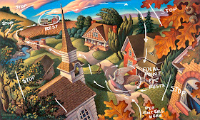
Autumn Rhapsody- Acrylic; 12" x 19"

Discussion in my class recently have revolved around composition and one of the things that came up was the importance of creating an eye path in your work. A composition should take the viewer on a visual journey through the piece. There should be logical points of emphasis and uncomfortable pauses, starts, stops and "eye traps" should be avoided. I frequently seem to fall back on my old favorite Creative Illustration by Andrew Loomis to explain these concepts.

From Creative illustration by Andrew Loomis- click to enlarge

This page in the book discusses the importance of a comfortable eye path, which if done correctly will effortlessly guide your viewer through the piece, prompting them to linger where you want and then continue on and enjoy secondary points of interest along the way.


I thought it would be interesting to do this same sort of analysis on one of my own pieces. Sort of a "reverse engineering" of my composition. In hind sight it was interesting to discover that in this piece from The Touch of the Master's Hand picture book I indeed followed the important guidelines laid out by Loomis. One such essential tool is to have elements that stop the eye from going out of the picture plane, or if something does lead you off, make sure there is another place where logical re-entry occurs. Of course there are other elements to creating a successful visual journey such as hierarchy of values among others, but understanding that as an artist you have complete control of the visual journey your viewer takes is a great first step toward powerful composition.

Creative Illustration PDF at Alex Hays' website

Wednesday, February 2, 2011

Wyeth Demo


Today I took about an hour of class and did a really quick and dirty demo of Andrew Wyeth. I always get a little nervous doing this. Sort of like a magician on stage worrying that his trick won't work and he will be uncovered as a fraud. It did not go exactly like I wanted and is far from finished, but I thought I'd bring it into Photoshop and put in a few tweaks. I intend to finish it a bit more with paint, but here it is for now. Ron Spears , a great artist and friend of mine has been painting some really great historical costume models lately. In today's post, he bravely shows what happens when you bonk and have to start over in front of a group of fellow professionals. I love that he was able to pick it back up and come up with something nice in about the same time I did my little demo (and his is 16" x 20" not 5" x 9" like mine!).Go take a look at his inspiring work.

Tuesday, February 1, 2011

Persistence

Dandelion- Detail; acrylic on board

I am often asked what it takes to make it in this competitive world of art. Though there are many things, including luck, that factor into the potential for success, I would argue that the single most important contributor to an artist's success, is persistence. A plain old dogged stick-to-it attitude will take you places that God given talent will not. I have seen many naturally gifted artists wither and disappear because they did not possess the passion or the drive to plow their way to profitability in the art world. For whatever reason, the hard road seemed too rocky, or their psyche too fragile to make a go of it. I have also seen other less talented artists succeed through sheer force of will and make a career for themselves (or like some of us, through utter lack of any other viable skill). The common denominator for success has always been and will always be how hard you are willing to work to achieve your dreams.Like the dandelion that forces its way through seemingly the smallest of cracks to bloom improbably amid an expanse of concrete, the successful artist sticks to it and does it anyway.