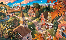
Autumn Rhapsody- Acrylic; 12" x 19"
From Creative illustration by Andrew Loomis- click to enlarge
This page in the book discusses the importance of a comfortable eye path, which if done correctly will effortlessly guide your viewer through the piece, prompting them to linger where you want and then continue on and enjoy secondary points of interest along the way.
I thought it would be interesting to do this same sort of analysis on one of my own pieces. Sort of a "reverse engineering" of my composition. In hind sight it was interesting to discover that in this piece from The Touch of the Master's Hand picture book I indeed followed the important guidelines laid out by Loomis. One such essential tool is to have elements that stop the eye from going out of the picture plane, or if something does lead you off, make sure there is another place where logical re-entry occurs. Of course there are other elements to creating a successful visual journey such as hierarchy of values among others, but understanding that as an artist you have complete control of the visual journey your viewer takes is a great first step toward powerful composition.
Creative Illustration PDF at Alex Hays' website


What an enjoyable and educational 'Reverse' post.
ReplyDeleteThank you for sharing!
Paula
I just wanted to let you know how inspirational this blog is. I am illustrating my first children's book right now and I love coming to your blog for a little "pick me up" if I have a rough day!
ReplyDeleteThanks!
Beautifully done and wonderfully written!
ReplyDeleteThanks everyone! It's response from readers that keeps me looking for interesting things to post. I am glad it is inspiring (that was the whole idea for blogging). Candace- Hang in there! The first book is always the hardest.
ReplyDeleteInteresting point of view. Also love the image and color. Nice job!
ReplyDeleteThanks for the little lessons :) and great work , very colourful and stylised !!
ReplyDeleteWow! Greg, not only do I love your work, but I love your lessons! I'll now be checking for a daily instruct. Thank you for spreading your incites and wonderful work!
ReplyDeleteThanks for sharing your thoughts on this. I monitored my eye path through your wonderful fall illustration before looking at your analysis of it, and that's indeed the way it works. Your picture is luminous and wonderfully detailed. That book Creative Illustration sounds interesting, but the only copies one can get from Amazon are well over $100. I'll keep my out out.
ReplyDeleteCoreopsis (and anyone else interested) Creative Illustration is a bit pricy so you might want to check out the PDF version you can find on Alex Hays' website http://www.alexhays.com/loomis/Andrew%20Loomis%20-%20Creative.Illustration.pdf
ReplyDeleteThanks for the amazing visual journey Greg! Bravo!
ReplyDeletelovely work.I love the educational angle.
ReplyDelete