Friday, September 30, 2011

Out of Hibernation

A Swimming Treat-  acrylic on canvas; 9" x 18"  by Greg Newbold

This painting was done for the sequel to Winter Lullaby called Spring Song. Both were written by Barbara Seuling. In rhyming couplets children learn about different animals as come come out of the winter hibernation. In this piece for the opening couplet, a bear wakes up to search out a "swimming treat". I thought it was a little funny that our bear friend is on the verge of gobbling up this poor fish and yet the publisher wanted it to look a little more like they were just old friends saying "Hi". 

Thursday, September 29, 2011

New T-Shirt Design


I volunteered to do the T-shirt design again for my son's varsity swim team this year. Apparently the previous design I did for them was such a hit, I  became top choice for the new one. The captains were great art directors and after a little concept direction, I pretty much got to come up with the entire design. It had to be simple and one color since budget did not allow a multiple color design. I also had to limit the time I could spend since it was a pro bono job (what we don't do for our kids, huh?). It's sort of fun to do these things though and get the reaction from the kids as well as see everyone wearing them around the school and at meets. This was all done in Photoshop.

Tuesday, September 27, 2011

Cityscape Painting Part 2

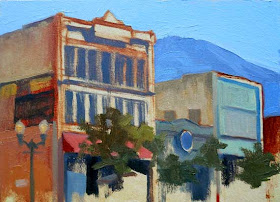
Progress after second session

Yesterday, I worked on this scene for a second time. It was interesting to continue a painting on location. In the past, I have finished a picture in a single session and sometimes touched it up in studio later. I got another hour and forty five minutes in on this one for a total working time so far of 3.5 hours.

Compare the progress from the first session

The main thing I noticed was that there were certain discrepancies in my drawing that I did not notice until I had some separation from the subject. I noticed that my perspective is a little more shallow than the actual buildings from the point of view where I stood. I also noticed that the main building on the left is wider than I painted it. This became more obvious when I began painting the windows which are narrower in my painting. I like the progress I made and will now finish the picture in studio. I'll post it when I am done. I'm right in the middle of some hairy deadlines right now, so I can't promise when that will be.

Thursday, September 22, 2011

Cityscape Painting Part 1

We camped in the grassy median while painting this scene.

I took my class to the historic district of downtown Provo, Utah to paint buildings this week. I began a scene of my own the first day and I have to admit the prospect of capturing buildings was much more challenging than I expected. Some of the things that I realized while attempting to paint my chosen scene are as follows:

Blocking in the basic shapes

1- The drawing aspect necessary to capture architectural elements is critical. You must take extra time and care in your observational drawing in order to make sure that your proportions and perspective are correct.
It became very important to capture  the vanishing perspective of the horizontal planes as well as keeping the verticals absolutely plumb.


2- Accurate perceptions of color and value are more difficult. The addition of many different local colors and values in buildings pose a challenge that is not so obvious in landscape painting. For instance, I noticed that the shadow side of a white building in my scene was nearly the same value as the sunlit dark gray facade right next to it. Color and value must be accurately observed and mixed in order to capture the right feel of solidity in your structures.


3- It takes much longer (at least for me right now) to paint a city scene on location, mostly because of the above two reasons.

Progress after an hour and 45 minutes.

I found myself really enjoying the challenge of painting a city scene and look forward to finishing this one up next week. I suspect there may be more urban painting in my future.  I'll post a picture of how it turned out when it's done.

Tuesday, September 20, 2011

Illustrators Utah! Show

Joe Bowler painting from the collection of Paul Mann

I had the pleasure last Friday night of attending the opening of  this years rendition of the Illustrators Utah! competition. This show has been a regular fixture in the Bountiful Davis Art Center rotation of exhibits over the past decade and I have been privileged to be a part of every one of the previous shows. The show runs through November 4, 2011.

In addition to this years contemporary illustration work, there is the added bonus of an entire room dedicated to showcasing illustrator Paul Mann's collection of classic illustration. The collection includes superb examples of work from highly regarded classic illustrators such as Robert McGinnis, Austin Briggs, Tom Lovell, Robert Fawcett, Bob Peak and Joe Bowler. Anyone with a background in classic illustration will want to make the trip to Bountiful just to see these works alone.

my honorable mention winner Dog-Fish

This year I had three pieces accepted into the show. Misty Morning,  Parade and Dog-Fish are all on display with Dog-Fish earning an honorable mention award. Juror Robert Neubecker said he chose my piece because "who can resist a gorgeously painted snarly bulldog fishy guy". Winners included Robert Barrett's first place winning pair of paintings depicting young Barrack and Michelle Obama for a children's book project, second place winner Rob McKay's "Kitchen Conversation", Shawna Tenney's "Ghost Watcher" taking third and another honorable mention went to Hilary Onyon's "Moonrat".

If You Go: Bountiful Davis Art Center is located at 745 S Main Street in Bountiful, Utah. Hours are Tuesday through Friday from 10 am to 6 pm and Saturday 2 pm to 5 pm. Closed Sunday and Monday.
Find Directions to BDAC here.

Sunday, September 18, 2011

Establishing The Shadow Family

I lay in the shadow family first

The more I paint, the more I am convinced that establishing an effective value pattern is the most important aspect of a successful picture. This can be quite a challenge when painting out of doors. The past several sessions of outdoor painting with my students has been evidence of this. I've been reading a lot these days about plein air painting including Carlson's Guide to Landscape Painting as well as from Fill Your Oil Paintings With Light And Color by Kevin D Macpherson.


In the book Macpherson advocates simplifying the value pattern into to "families" consisting of the light family and the shadow family. The light family is anything that the light source illuminates and the shadow family contains areas of the composition that are not directly illuminated. In order to create a clear matrix or value pattern, keep the two groups distinct and separate from one another. You can do this by remembering that the lightest area of the shadow family wants to remain darker than the darkest area of the light family.


By following this rule, you will not intermingle your value pattern with confusing lights and darks and your masses will be distinct. Of course this can be a challenge when the light is overcast. In this situation, you will rely solely on the local values of each mass within the composition and plan your value arrangement accordingly. Our painting session ended up more overcast than sunny so my light and shadow families are not as distinct, but the light and dark value pattern persists and the painting works for the most part because of this. I spent about an hour and 40 minutes on this study.

Tuesday, September 13, 2011

Will Terry Photoshop Painting Video


Check out Will Terry's new Photoshop Painting tutorial on Folio Academy. This one really rocks. Will is a very talented illustrator specializing in children's books. He'll take you all the way through his Photoshop painting process from sketch to full color and teach you a bunch of techniques along the way. Check it out as well as all the other great tutorial videos on Folio Academy.com.

Sunday, September 11, 2011

Where Were You? 9-11 Remembered


Where were you on September 11, 2001? I think anyone over a certain age has that day etched in their memory. We were getting the kids ready for school just like any other morning except for some reason, we turned on the TV to find the shocking pictures of a burning World Trade Center on every channel. We saw the second plane hit live as we watched and the reality of that day started to sink in. Grim news became sheer horror as the towers fell before our eyes and two other planes caused similar devastation.

Amid the unbelievable tragedy of that day I strangely remember regretting that I would never get to see New York from the top of the World Trade Center. The above photo was taken by my wife but I  have a nearly exact duplicate of it that I took in 1989 and I am sure countless other tourists have the same shot in their albums. We were in the Big Apple on  the Fourth of July, our country's birthday, and we went to the World Trade Center to see an exhibit of Norman Rockwell paintings. We left the show and walked across the plaza to where I snapped my version of this same scene. My companions and I debated about whether we should go to the top before heading back for the evening. It was decided that the hour plus wait in line was too long and that it was not worth the wait. I promised myself that there would be another time.

My next trip to New York was in 1998. I again thought about making the trip to the top but schedules that day made it unworkable and I missed my opportunity. Oh how I wish I had taken the time to go to the top on that Independence Day twenty-two years ago.

As we remember this day the loss of so many and the heroism and sacrifice of so many brave men and women, let us celebrate the freedoms we have and the love of those around us, for things can change in an instant. Don't be caught thinking "if only". When the Freedom Tower is complete, I want to make sure I visit the World Trade Center Memorial and this time I will make the trip to the top- this I promise.

The above photo comes from this great 9-11 tribute on Artwife Needs a Life

Thursday, September 8, 2011

5x5 Invitational


I have been invited to participate in a fundraising event for the new Westmont Museum of Art in Santa Barbara California. Each participating artist was asked to create something on a 5" x 5" piece of  Rives BFK paper and return it for the show. The piece could be a doodle or a more involved creation. All pieces are to be auctioned off to raise funds for the museum. Deadlines are looming, so I didn't feel I had time to do a full blown painting, but this was a nice warm up to the day. I decided on a little freehand version of my Devil-Fish and colored it a bit with Prismacolor pencils. The exhibit will open on November 30, 2011.

Get the full blown  Devil-Fish demo here.
  

Tuesday, September 6, 2011

Rebirth of an Unused Concept Sketch

Heart Girl-  12" x 16" Mixed Media/Acrylic

In a post last week, Amy mentioned that the concept sketch for my Songs of Power book cover looked a lot like another one of my later paintings. She was correct. I used the drawing as the basis for a painting I did for Love Communications. They used it on their website and also printed a five foot tall version for their office lobby.

Concept sketch from the Songs of Power cover project


I thought I'd show you how that sketch eventually became another painting. That is one thing about doing numerous idea sketches.Even if you don't end up using an idea at the time, there is no telling where that idea or composition might turn up later.

Revised drawing that was used for the above painting

I keep a file of all my sketches and refer back to them from time to time to see if there is a gem in there that has gone unused. I may have posted this image before, but even if I have, it's worth a look alongside the sketch that inspired it.

Saturday, September 3, 2011

Thoughts On Mixing More Vibrant Color

Beginning a demo in my Landscape class

One key I find to getting more vibrant color is to keep the colors as clean as I can. Do not  mix fresh color on a dirty palette and clean your palette off if you don't have a space to mix a fresh color. I try to mix the color to the hue and value I want as simply as possible. If you can get to the color you want using only only two or three colors (plus white if needed), you'll get fresher color. Color mixing is a subject unto it's own, but I try to keep it as straight forward as I can. Also, I try to avoid mixing my color around too much on the surface of the painting.  Put it down and leave it. A little blending with a clean brush or a little direct mixing while a stroke goes down is OK, but don't mush colors around once they leaves the brush or you'd just make mud. I also try to load my brush every couple of strokes with fresh paint. I load the brush with enough paint so that only the paint on the brush comes off instead of  "picking up" the paint on the surface. You want the paint you carefully mixed to be the paint that stays visible. If you push it around too much it intermixes with what is already there and can make a mess.


If I am changing colors to a drastically different hue, I clean my brush in mineral spirits as the paint in the brush will pollute the new color. If it's only a slight change in hue, I'll just wipe my brush and let part of the existing hue mix into the new color. Also, Squeeze out enough paint on your palette to cover your painting. I find students or beginners are hesitant to use enough for fear that they will waste paint. It's like trying to paint the Sistine Chapel with a thimble full of color. Give yourself enough paint to do the job right. Usually two or three times as much as you think will be enough. Students cringe when I say that, but my philosophy is if the painting turns out great, you didn't waste paint, regardless of whether there is paint left over.


The concept of warm and cool colors could be a whole book if not it's own series of posts. I'll be as simple as I can, but I try to balance warm and cool colors in my painting. If the light source is warm, I go for relatively cool colors in the shadows. If the light source is cool, I try to inject warmth into the shadows. Mixing a cool pigment with a warm will neutralize the temperature and muddy up the color. For instance if you try to make a purple with cadmium red and Ultamarine blue, you just get a muddy brownish color. If you take a cool version of red like Quinacridone Red, and try the same thing, you get a lovely purple. The best way to learn what colors will mix best with others is to try it. Richard Schmid in his book Alla Prima suggests you tape off a grid of squares on canvas panels and paint all the possible mixing combinations from light to dark with two of each of the colors on your palette until you have mixed all possible combinations. That way you'll get a feel for what each color will do when intermixed.

Class Landscape Demo- 6" x 8" oil

My brushes are mostly synthetic nylon bristle brushes. I beat my brushes up pretty good and the synthetics seem to hold up better  for me than the hog hair brushes. I pick ones that have a nice spring to them but I have yet to find the perfect brush. I keep trying different brands and sometime I'll guess I'll settle on a favorite or two. I clean my brushes thoroughly with Gamsol odorless thinner and then with soap and water. After that, I use a little hair conditioner on them to help them hold shape while they dry. I throw a little travel size bottle of it in my paint box in case I am away from home when I clean the brushes. Hope that helps!

Friday, September 2, 2011

Songs of Power Cover

Cover for Songs of Power by Hilari Bell, 14" x 9" acrylic

The cover for "Songs of Power" by Hilari Bell called for a mysterious feel. The protagonist in this YA science fiction/fantasy was a teenage girl of Inuit descent who had the telepathic power to communicate with whales.

First proposed concept sketch

My first concept was a rather straight forward depiction of the girl meditating on the talisman given to her by her grandfather that helped her talk to the whales. Through the porthole of the undersea city where she lived, the whales began to gather.

Final approved sketch. 

The art director Irene Gallo asked me to come up with a more ethereal and mysterious solution. After a fair bit of sketching, I settled on what became the cover image. It became a wraparound image covering both front and back covers. Note the lack of value on the back of  the cover. I would never submit a sketch today without some indication of value patterns. It's a mystery as to why I didn't always do that back in my early career, but I did. I guess I have learned a few things since then.  I went on to create three more cover paintings for Hilari Bell's novels.

Thursday, September 1, 2011

My Outdoor Painting Palette

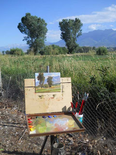
My plein air painting palette 
Life Needs Art follower Mike Blake recently asked the following question: 
"What would you say the core ABSOLUTELY necessary colors are when painting outside?  I have a hard time getting vibrant natural colors...thanks." 
I am not an expert in outdoor painting, since I have have really only been seriously pursuing it for about a year, but I'll give you my opinion. My choice of colors has shifted slightly as I learn which colors work the best for me outdoors and in general. I have tried slight variations of this palette during each painting excursion, so it's never exactly the same. Color selection is not absolute and will change according to preference. You'll keep going back to the colors that seem to give you the best results.

My Palette in the field prior to wiping it down. 
Here is the selection I am currently using and I am pretty happy with the results I am getting at the moment. From the bottom left going up and around, the colors are as follows:
Titanium White; Cadmium Yellow Light; Cadmium Orange; Raw Sienna; Napthol Red; Quinacridone Red; Burnt Sienna; Viridian; Ultramarine Blue Deep; Cobalt Blue; Cerulean Blue.
I like to have a warm and a cool version of each color and sometimes a dark version as well. I also from time to time will use Alizarin Crimson, and Black, though I have increasingly gone away from Alizarin because I find it's tinting strength to be relatively weak. It tends to gray down pretty quickly and become muted with any mixture so it is very hard to get a clean purple with it. I use black if I feel the subject has a lot of strong darks that I need to mix, though I never use it straight from the tube. I always tint it with another color to shift the hue and liven it up. I got writing and found that there is more to this subject than I want to cram in today, so I'll do another post tomorrow to continue this.