I had to keep this project for Barnes & Noble under my hat for a while but I just got the green light to show it. I got the cal a few weeks back to work on a table display poster for kids to showcase books that have been turned into movies.
Rough concept sketches- the center sketch won out
The poster will roll out nationwide and may already be sitting atop displays in your very own local B&N bookstore! I'm really excited to have had the opportunity to work on this one.
Detail of the adventurous kids
Always fun to do a fat little pencil
The client loved it so much, I am currently working on two other projects for them. I will show more of those projects when they are final, but suffice it to say, I am pleased that my work seems to be a good fit for Barnes & Noble and hope to continue working with them for a long time to come!
I am not sure that Romeo and Juliet is the best example of love on a day like today, especially given that these teenage lovers knew one another for a grand total of four days before they both DIED. Like it or not, there is no arguing that the story has resonated and endured through the centuries.
It is a common misconception that Shakespeare created the plot as well as the characters in his tragic tale of star crossed lovers, but this would be far from the truth. Read a great account of the history of the Romeo and Juliet myth as well as the many incarnations and adaptations of the most famous love story in history at Artwife Needs a Life.
I painted this version of Juliet as part of a season series I did for the Utah Opera several years ago. It appeared in all their advertising as well as on the posters and program covers
Advertisement for data recovery company, circa 1999
If you have ever had a hard drive crash or accidentally deleted something, you know what a pain it is to try to remedy the situation. I did this piece a while back for Power Quest, a software company that specialized in recovery of lost data. They no longer exist since being absorbed by Symantec.The concept was a frantic PC owner watching as his hard drive gets operated on. The technology probably looks a little dated now, but the concept was fun to paint. It ran in a bunch of computer magazines back in the day.
I am doing an editorial piece right now of a construction worker which reminded me of a similarly themed piece I did a couple of years ago. The painting was intended to be enlarged to the size of a construction trailer for a developer in Arizona. The mountain in the background depicts the vista seen from the development. I tried to create a heroic feel with a bit of a worms eye view combined with the stylized landscape and monumental sky.
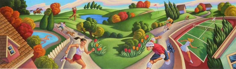
A couple of weeks back, I posted some of the labels I did for Mountain Sun Natural Juices.Those pieces actually made it onto the product, but I also did two background labels for proposed product lines that never actually (as far as I know) went into production. This is the piece I did for the proposed "sport drink" line of juices. It was intended to be a natural alternative to Gatorade and would consist of real fruit juices with added electrolytes and vitamins, etc.
Sport Drink label for Mountain Sun Natural Juices- approx. 17" x 5"- acrylic
They wanted the background illustration to depict all sorts of outdoor athletic activities such as runners, cyclists, etc., in a more urban setting (parks, neighborhoods and such.). The logo and the flavor spot would go dead center as in the other labels, so I curved the path around and placed the other characters and elements so that they would not be obscured by the type (at least I tried- this didn't exactly work with the other labels either). Here's how it turned out, and I did get paid for the piece.
A few years back I did a series of fruit juice labels for Mountain Sun Natural Juices. I created four different background paintings as well as about twenty different flavor spots that were inserts into the logo.Here are a few of the labels as they were printed. Packaging tastes changes about as fast as the tides, so these labels have long since disappeared, but I thought they turned out beautifully.
They were also nice enough to send along a case of assorted flavors of juice with my labels on them. I still have a bottle of the cherry cider (which was probably one of the tastiest) on my studio bookcase. It's far past it's "best if used by" date, but I can't bring myself to crack the top and dump it just yet. I guess if the cap explodes someday, then the decision will be made for me.
Hope everyone takes time today to show those around you how much you love them. Reach out with a kind word, a hug, flowers, a card, a phone call or whatever seems appropriate. It's the people around us that make life worth living. I did this piece a few years back for an advertising firm I have done a fair amount of work with called Love Communications. They still use it on their website (hit refresh once or twice if it doesn't right up on the masthead). There is also a six foot tall version of it smack in their lobby right behind the receptionist desk.
Continuing a bit further with my Look at Andrew Loomis' Creative Illustration. I pulled a page that discussed the importance of overlapping form and contour in the arrangement of objects in the picture plane. Loomis insists and I agree that almost any subject can make a compelling picture if the forms are arranged in a visually pleasing way. I was looking back though my work to find a piece that strongly illustrates this principle and I found this piece I did for the Natural history museum in Albuquerque, New Mexico. They held an exhibit of artifacts discovered by William Flinders Petrie, considered by many to be one of the fathers of modern archaeology. The character of Indiana Jones was based partially on his persona, including the fedora. I used a lot of overlapping objects in the composition both to add depth as well as compress the picture space enough to allow numerous objects to be shown within the frame.
The Illustration Friday theme this week is "Transportation". Contrary to popular belief, Santa doesn't always travel by reindeer borne air taxi. When in the islands, he has been known to deliver presents via outrigger canoe. I have been fortunate enough to spend Christmas in Hawaii twice with my family and both times it was absolute heaven. I thought I would miss the trappings of our traditional Christmas celebration back home but I have to say I did not miss it at all. There was something magical about snorkeling on Christmas morning and I found myself supremely relaxed. And you know what? The snow and cold was still there when we got home (ughh). This piece was done as a Christmas card for a client a couple of years back.
Ghost of the Bayou - Greg Newbold 9" x 24", acrylic
Beneath the surface of the water lies lurking a silent death.... whatever. This painting was done for Utah's Hogle Zoo for their special exhibit Ghost of the Bayou which featured "Antione", a leucistic American alligator. Leucistic is not a true albino condition, thus the electric blue eyes. This painting was accepted into the 50th Annual Society of Illustrators Annual among other awards.
He was found along with his 17 brothers and sisters in a bayou outside of New Orleans in 1987. Born without skin pigment, it was feared that the babies would not survive long in the wild because of an inability to conceal themselves from predators or survive the threat of constant sunburn. They were captured and taken to the New Orleans Zoo to reside.At last report, nine of them are still living today. It was really fun to paint this creature and even more fascinating to see him in real life. One of the great living oddities of nature. Sometimes fact is stranger than fiction.
The garden is running away from me this fall. Too much produce and not enough time to get it all into jars. Must find a few hours to take care of the tomatoes and help make pickles. I am grateful for the productivity though, and the garden has done as well as any in previous summers. I have had the chance to work on a number of packages and labels for produce growers through my associations with California agency Ball Design Group. John Ball is great to work with and it's always fun to be waltzing down the produce aisle of the local grocery store and see your work. This is a little thing I did a couple of years back that is still floating around in the stores. It made it's way onto boxes for a number of things including the tomatoes and peppers. I always do a little fist pump when I see it, even if it only printed two inches wide and nobody else really knows or cares.
I posted this project the other day, but thought I'd show a peek from the concept to the final application.
This is the sketch I got from the the creatives at Integrated Marketing Group. I was to incorporate my type of signature farmscape into the background as well as adding some clouds in the sky.
The client was still wavering a bit on whether this concept could work, but after seeing my drawing, they were convinced.
Here's how the print ad layout came together. Matt Aller, the creative director and co-owner there added the cool retro feel type and pertinent info about their services. This advertisement will run in several trade magazines that cater to the natural food industry.
Green Thumb - 13" x 16" Acrylic on illustration board
I just finished a painting for Integrated Marketing Group, a design shop here in town that works on a lot of accounts for the Whole Foods type market. This will run as a promo for IMG in industry rags and on their website. The concept headline is "A Green Thumb For Growing Natural Brands". It was a bit of a tight schedule to get it done considering I only had about a total of four days at home between trips before I had to deliver it to the photographer to get shot. I lost some sleep, but it got finished and the client is very pleased. I'll show a little of the process when I get a PDF of the final ad from the client.
All images and content are copyright 2010-2015 Greg Newbold and/or their respective owners. For those wishing to use text or images in any traditional print media or for commercial licensing rights, please email me regarding permissions.
If you want to quote this site for use on a non-commercial blog, website, or Facebook page, please feel free as long as you give a credit and link back. Students may also quote text or reference images in their school reports.