Showing posts with label children's illustration. Show all posts

Tuesday, September 11, 2018

If da Vinci Painted a Dinosaur Launches


"If da Vinci Painted a Dinosaur", the follow up to last year's hit "If Picasso Painted a Snowman" is now printed and we received advance copies a few days ago. This one was also a collaborative project written by my talented wife Amy Newbold and illustrated by yours truly.

Opening up a box of new books and holding one for the first time is always a satisfying experience. I hate to make an unrealistic comparison, but it's a bit like the illustration equivalent to holding your newborn baby for the first time. It's magical and you love it in spite of the pain it took to get it there.


This new book follows the same premise as our last book, posing the question, "what would a dinosaur look like if painted by (fill in the name of a famous artist)"? We really beat ourselves up this time by increasing the number of artists from seventeen to nineteen.  I bit off a little more than I wanted to chew from a work required standpoint, but I got it accomplished and visually it works well.


Our guide Max the hamster makes a command performance as we tour how a new crop of famous artists might have depicted a dinosaur. Included are imaginative works in the styles of well known artists such as Andy Warhol, Mark Rothko, Frida Kahlo, Diego Rivera, Henri Matisse and Edvard Munch.


We also found several lesser known artists that were no less worthy of recognition, such as Aaron Douglas, Alma Thomas, Lois Mailou Jones, Qi Baishi and Marguerite Zorach to include in the mix. Of course da Vinci bookends the tour with playful depictions of "Vetruvian Microraptor" and "Dino Lisa".


Both of our books are an invitation for kids to make art without the constraints of what someone else might perceive as the right or the wrong way. All the artists depicted became famous for their own unique ways of seeing the world and creating art. If da Vinci Painted a Dinosaur is a celebration of creativity and an extrapolation of individual style that we hope gives kids permission to express in art what they see and feel in whatever way they choose. That's what art is all about.

COME JOIN US!
Our first official book signing will be Saturday, September 29, 2018 at the Barnes & Noble Authorpalooza event from 2-4 pm. The store is located at 330 East University Parkway in Orem, Utah. If you are in the area, please join us!

Wednesday, December 6, 2017

If Picasso Painted a Snowman

The following is an interview I did with Howard Lyon for  Muddy Colors regarding the creation of our new book If Picasso Painted a Snowman. Thanks Howard for permission to repost it here!

My friends Amy and Greg Newbold have recently collaborated on a book called If Picasso Painted a Snowman. I think this is the first children's book that I have ever reviewed on Muddy Colors (I hope it isn't the last, there are so many great picture books out there). I happened to stop by Greg's house on the same day received pre-release copies of his book (I was there to pick up some black walnuts, he has a GIANT giving tree that I believe, without exaggerating, will let me produce about 30 gallons of ink).

This a wonderful book! Many of the readers of MC have kids or are aunts and uncles. This book is for you and yours (I'm including an Amazon link here and at the end of the interview). It is a great introduction to a large variety of artists and their work, but also opens up the imagination to all the possibilities of different artists paint, but also how different thinkers might approach the same challenge.

I asked Greg and Amy if I might interview them for MC. Here goes!


Where did the idea for the book come from?

It all started several years ago when my wife Amy visited Paris with her sisters on a girl’s trip. During a visit to the Picasso Museum she asked the question “What would it look like if Picasso painted a snowman?” She envisioned a book that would teach kids about significant artists and art movements in a fun and engaging way. Honestly, it was to be the book that we could never find for our kids in all the years of taking them to museums. For several years she polished the manuscript, we showed it around and reworked it. Nobody caught the vision of what we wanted to do until Tris Coburn at Tilbury House Publishers in Maine bought our pitch.


What was the most challenging part of creating illustrations in the styles of such a variety of artists?

Since I was young, I have always enjoyed the challenge of learning new styles or techniques. Like most budding artists, I started by trying to copy other artists’ work. In high school I did Prismacolor replicas of album covers and copied drawings from guys like Frank Frazetta and the Hildebrandt brothers. I sold some of them for ten or twenty bucks. Once in college I had the legitimate option of creating an old master copy painting instead of writing a paper. My professor told me my Van Gogh was the best copy she had ever seen because I tried so hard to get the materials and surface texture correct.

Because I like to experiment with new materials and processes, I also find it very instructive to paint these master copies. Studying and trying to recreate the works of great artists allows you to deconstruct and learn from the masters and it’s something I have done on and off over the years. This book gave me the opportunity to learn about the materials and processes of seventeen different artists. Some of those chosen for the book were quite familiar, as I had studied the likes of Grant Wood and Van Gogh. Others Like Jacob Lawrence and Sonia Delaunay were previously unknown to me.

Grant Woods Snowman - The stern coal mouths are perfect
I dug into their processes online and tried to find books that described the way they worked and what materials they used. My goal was to mimic each artist’s materials and process as much as was practical. Of course there are new materials available today and the time crunch I was under forced me to make some adjustments. For instance, the Roy Lichtenstein piece was created digitally as I had neither the time or inclination to figure out where to screen print it and there was no way I was going to get the Ben-Day dots right painting it by hand. Also, scale was sacrificed on a number of pieces.

Roy Lichtenstein Snowman - I love this one!

The J.M.W Turner painting I made is a miniature compared to most of his other pieces as is the Georgia O’Keeffe, who also typically worked much larger than I could justify. Sometimes materials had to change. For instance I painted the Grant Wood in acrylic rather than oil. It was a speed issue and I rationalized that Wood painted his oils using layers of crosshatch anyway, so the result was very similar.

Georgia O'Keefe's snowman is beautiful.
Is there one that you enjoyed the most or least?

Honestly, this entire project was a dream to work on. It was just so fun to try new things. I learned how to make a direct drawing monoprint for the Paul Klee piece, played with gold leafing for the Gustav Klimt painting but the most fun was probably the Jackson Pollock painting. I went all in to figure out what he was all about. I had previously read Tom and Jack: The Intertwined Lives of Thomas Hart Benton and Jackson Pollock by William Taylor Adams and I was totally intrigued by Pollock.


As a young artist I scoffed at Pollock thinking that it was just a bunch of random drips on canvas, but as I dug deeper, I began to understand what his “action paintings” were all about. Also, watching the ten-minute documentary filmed in 1951 by Hans Namuth was helpful. In the film, Pollock is seen painting outside and his voice narrates the process. I purchased a large-ish piece of raw linen and several quarts of Pollock-esque colored latex paint for the painting, forgoing the oil enamel Pollock preferred in the name of practicality. I used sticks and hard brushes to drip and fling the paint while walking all around the perimeter just as Pollock did in the film (minus the cigarette and discordant music). It was a little windy and I even had some grass and sticks get embedded in the painting. It was so much fun, there are plans for a Pollock party to let some of our friends create their own “Jackson Pollock”.


What is your hope/goal for this book?

As I mentioned at the outset, this is the type of book we wished we could have found for our kids at one of the many museums we dragged them to. We tried to put across the idea that the possibilities are endless when creating art and that you should not be intimidated or limited by what some people perceive as “rules”. There is no right or wrong way to create art, simply techniques that either allow or prevent you from achieving the vision you have for your art.

We have tried hard to make it more than just an overview of different art styles. With it’s simple text, it also reads as a nice bedtime story, hopefully appealing to fans of snowman books, gift books, or art books in general. There are enough inside jokes to appeal to adults as well. At the end of the book we have also included expanded bios and art making tips. We hope that parents, teachers and children embrace this book as permission to explore art with freedom and joy.

After reading the book, I want to draw a Caravaggio/Bouguereau/Waterhouse/Watterson/Frazetta snowman!

Are there artists whose work you didn't imitate but you would have liked to?

There are too many to count. Luckily we are in negotiations with our publisher to create a follow up book, so hopefully I’ll get to play with another batch of styles with that project.


How did you decide what artists to include?

With so many artists to choose from, it became a question of which ones would be recognized, which ones would add variety and touch on major movements and also which ones whose styles I felt confident enough to try to mimic. We also tried to choose artists that we were fairly sure never painted a snowman. Some artists did not make the cut for one or more of those reasons. We also tried to include a variety of artists including women and ethnically diverse painters. Knowing the overwhelming majority of dead white European artists that crowd the annals of art history, we knew it was impossible to give any sort of equality of diversity to the group, so we did our best and focused on the overall variety in the book.

Gustav Klimt Snowman. Beyond the theme of the book and Klimt's style, this is a touching painting!
What other books or projects would you like the audience to know about that you have been part of?

This year was crazy in that I have never had two new picture books released in the same year, let alone create all the art in that same year. I did all the art for If Picasso Painted a Snowman from January to March and then all the art for The Little Match Girl (coming from Shadow Mountain October 17, 2017) from April to mid July. In the past, I would have shied away from both of those time frames, but I’m at a point now where I have enough confidence to just say yes and figure out the logistics later.

In my twenty plus years as a full time artist, I have worked for most of the large New York publishers and have been fortunate to have my work accepted into all the major juried illustration shows over the years including, Society of IllustratorsCommunication ArtsSpectrumAIGA and Society of Illustrators, Los Angeles. I’ve also done quite a bit of advertising work for clients like FedexAmerican ExpressSmuckersHeinz and the like.

Tuesday, August 25, 2015

A Little Early Christmas


I just finished this one for the Friend magazine. The funny thing about working for certain publications is the lead time. I end up doing summer images in March and Christmas stuff in August. This one was no exception as it will go to print in a few weeks to begin distribution right around Thanksgiving. I know not all magazines work this far in advance, but the Friend typically works so far ahead, that I often forget I even did something until it shows up in my mailbox.

The intent of this piece is to help remind folks that there is a bit more to Christmas celebrations than decorations and presents and that we should take a little time to remember the real reason for the season. It was nice to take a few days to think about the upcoming holiday and think about what it truly means. Enjoy!

Wednesday, May 20, 2015

Barnes & Noble Table Topper


I had to keep this project for Barnes & Noble under my hat for a while but I just got the green light to show it. I got the cal a few weeks back to work on a table display poster for kids to showcase books that have been turned into movies.

Rough concept sketches- the center sketch won out
The poster will roll out nationwide and may already be sitting atop displays in your very own local B&N bookstore! I'm really excited to have had the opportunity to work on this one.

Detail of the adventurous kids
Always fun to do a fat little pencil
The client loved it so much, I am currently working on two other projects for them. I will show more of those projects when they are final, but suffice it to say, I am pleased that my work seems to be a good fit for Barnes & Noble and hope to continue working with them for a long time to come!

Tuesday, April 21, 2015

Cactus Hotel Project Finished


Saturday afternoon marked the final upload of the art for the Cactus Hotel project. Here are a few more of my favorite pieces from the project in their final state. All final images were created in Photoshop using digital brushes and handmade texture over the top of the graphite drawings I posted about earlier.


Enjoy!

Monday, March 16, 2015

Baby Groundhogs


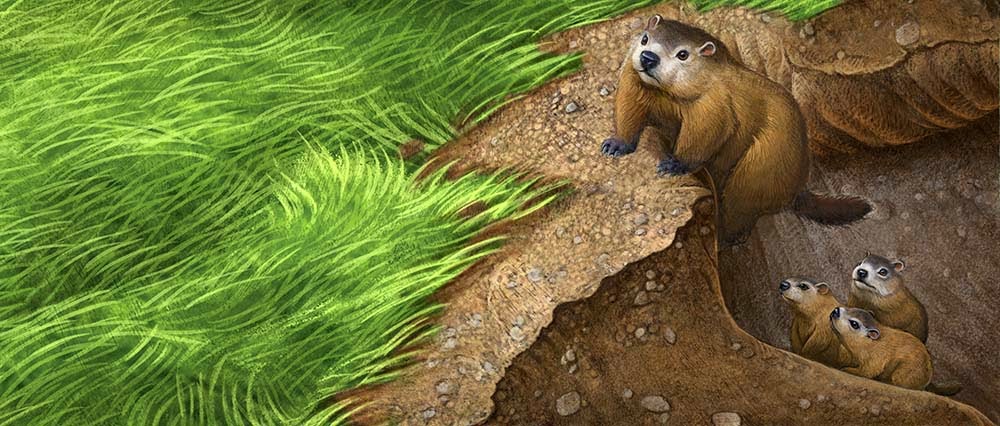
Here are selections for another easy reader book I just finished. The story follows a family of groundhogs as the babies venture out of their den for the first time.


They enjoy munching on the green grass for a time before escaping back to the den when a fox appears. I tried to give the little guys some personality despite the need to portray them as realistically and not stylize too much.


I would rather have made them more animated and characterized, but the art direction dictated they be "real" groundhogs. I think I struck the right balance between real and cute.


Once again, I made all the preliminary drawings traditionally and then scanned and painted them in Photoshop.

Tuesday, August 19, 2014

The Book Report


Just finished this little piece for the Friend Magazine for accompany a poem called The Book Report. It was a fun little piece to create. I focused most of my interest on the colors and shapes. I'm pretty pleased with the transitions between warm and cool. The light area on the banner is where the poem will print, so I had to leave it a little lighter than I normally would. This piece is digital over a graphite drawing.

Monday, June 30, 2014

Scuffy in 3X3 Picture Book Annual.


Last week I received the great news that pictures from  my personal project "Scuffy- A Scarecrow's Tale" have been accepted into the 3X3 illustration Annual. I've been trying to get the story published ever since I started the book as part of my MFA project back in 2009.


Finally, a picture book annual that had an unpublished category has come along and I am gratified to finally see at least part of the book in print. There was a snag in the process when I read in the submission guidelines that even unpublished entries needed to be submitted as "published" spreads and include the "cover".


I enlisted the help of friend and fellow artist Val Paul Taylor to give my spread mock ups and cover a nice type treatment. I am super excited with the wonderful type treatment he came up with for the "book". Scuffy is currently being shop by my literary agent, so hopefully I will actually get to finish the book at some point. Fingers crossed!

Tuesday, February 18, 2014

Butterfly Book - 4


These are the final two images in the Butterfly Book. The butterfly dries out his wings in the sunshine as the clouds clear and then flutters away to search for nectar among the field of flowers. Here again I utilized repeated butterflies from the other spreads, though flopping and rotating helps disguise that fact. It doesn't often work out to do re use elements without being obvious and short changing the product. In this case it made sense within the framework of a project and it sure was a time saver. 

Wednesday, February 12, 2014

Butterfly Book - 3


In these two pieces, I needed to show the contrast of the butterfly sheltering from the rain and then starting to dry out his wings after the storm passed. As I worked through sketching out this project, I decided that, in to make it easier to execute, I would reuse or modify any elements that made sense. For instance, at least one sky was cropped and reused, two butterflies were flopped and made a second appearance, and in these two illustrations, I made good use of the leaves that the butterfly is using for shelter. I kept the leaf layer separate from the sky which made it simple to swap the rain for a nice cloudy sky. Then I made some modifications to the colors and added a few highlights to the leaves as the butterfly from another spread made a command performance.

This type of planning made the execution of this project go much faster and only really observant kids (and adults for that matter) will ever notice that some of the elements repeat. Although this example is the most obvious repeat, it made total sense in the context of the book, so I was okay with it.

It's tempting to mine your digital archives for things that might speed up a project, but whenever I do reuse elements, I try to disguise them as much as possible. This includes, cropping, changing colors, flopping, rotating and more to make the old element new and to integrate it into the new piece. I only do this when I am either, short of time, short on budget, or both, but it's one more trick that can be helpful if not abused. Don't get sucked into the habit of constantly using shortcuts though, or your art will suffer. There's still no substitute for good drawing and original thinking.

Friday, February 7, 2014

Butterfly Book - 2


Continuing on with the finished pieces of the butterfly book. Here, the butterfly begins to look for shelter as the rain falls I did an alternate version of this one without the branch and bird. A cropped version of it will be used as the cover.


Working digitally makes what used to be nightmare changes in the old days very simple. I just created the different elements on separate layers and turned off the bird layer for the cover. The rainstorm in the background was also created on a different layer which made it very easy to "paint behind" all the other elements without disturbing anything and without having to paint around all the details.

See Butterfly Book paintings 1 and 2 here

Wednesday, February 5, 2014

Butterfly Book-1


Here is the opening two spreads for the butterfly book I just finished. I will post them all in sequence over the next few days. As I showed earlier, these were all sketched out full value and then painted in the computer using Photoshop. I think the hand texture from the drawings combined with the hand done scanned texture adds a real organic and hand done feel to the digital painting. This was a fun project. Stay tuned for the rest of the paintings.

Tuesday, January 21, 2014

Butterfly Drawings


Here are the first drawings from a new book project I am beginning. Much like the Egg Book that I did last summer, this book is an easy reader and there are only eight interior illustrations total. The book gently describes a butterfly caught in a rainstorm and how it must wait out the downpour and dry it's wings in order to once again take flight. By spending a little more time on the drawing, I hope to speed the process and cut the actual Photoshop painting time down to about a day apiece. So far so good. I started the first piece late yesterday morning and will finish it up this morning, so I am right on target. I will post the color versions as I go along.

Egg Book finished pieces start here (scroll forward to see them all)
See my Photoshop painting process here