Showing posts with label Thumbnails. Show all posts

Thursday, January 26, 2012

Boys' Life Poster Ideas

Boys' Life Poster Idea 1

Poster Idea 2

Poster Idea 3

Here are three ideas I submitted for a Boys' Life commemorative poster I am working on. The concept was to celebrate the outdoor aspect of scouting and to have the magazine plainly in view as the scout enjoys an outdoor adventure (#3 is less obvious as he holds the mag rolled in his hand). I liked both 1 and 2 but they liked idea #2 the best, so I will now be working up more involved sketches based on that idea as well as scheduling a photo shoot. I'll have to locate the right age and look of model with a full uniform. Should not be too hard with all the scouts in my neighborhood.

Monday, April 25, 2011

Christmas Gifts Rough Sketch

concept sketch- Pencil/digital 5.5" x 3.5"

I'm starting on another project for Boys' Life Magazine. This one is a feature fiction story about a young man arriving for Christmas at the home of his Aunt and Uncle in the foothills of the Sierra Nevada Mountains. Rather than being greeted with open arms, he finds neither of them in the cabin and must search the surrounding homestead in a blinding snowstorm to rescue them both. This is for the December issue and I am enjoying the rather extended lead time that I have been given. This should be a fun one- hopefully my concept will be approved and I can proceed with this sketch. If so, the next  step will be gathering effective costume and props and then shooting photos for reference.

Tuesday, January 18, 2011

Evolution Of A Picture- Part 1


For the next few days I will post pages from a packet that I put together for my Illustration 1 class a few years ago. I am teaching this class again right now and thought I'd post it here for everyone's benefit. This first page shows a bit about the project and how I begin the process with thumbnail drawings. These are all done from my imagination before I shoot any photographs. Click on the image to view large enough to read the text.

Evolution of a Picture part 1
Evolution of a Picture part 2
Evolution of a Picture part 3
Evolution of a Picture Part 4

Tuesday, January 11, 2011

Like Father Like Son

Indian Ambush- sketch by Andrew Wyeth

Years ago I came upon a copy of the October 1965 issue of American Heritage that contained an essay and portfolio on the work of illustration giant N.C. Wyeth. On the last page, son Andrew who's fame and accomplishment as an artist would eventually eclipse that of his father recounted his informal art lectures at the feet of N.C..
Such instruction  was typically general such as describing "the quality of folds in a drapery and the way light comes across it. But once young Andy was drawing an Indian ambush (see above) and his father showed him what was wrong: the [natives] had taken over the entire picture, obscuring the mounted soldier whose danger was the point of the drawing. In a quick pencil sketch (see below) the elder Wyeth brought the imperilled rider more to the foreground and hid his attackers behind the trees.

Revised Indian Ambush sketch by N.C. Wyeth

Of his father N.C, Andrew said "we had a remarkable friendship, of course he was my only teacher, and he was a wonderful, remarkable person. When he died, I was just a clever watercolorist- lots of swish and swash. When he died- well- now I was really on the spot and had this terrific urge to prove that what he started in me was not in vain." 
It is evident in this rough sketch the level of skill N.C. possessed as he so easily corrected the flawed composition. The fact that the drawing survived is proof of this lesson's impact on his son. Andrew learned well and, I think through him and grandson Jamie, the Wyeth tradition turned out just fine .

Wednesday, December 1, 2010

Tripped

Final drawing submitted for approval.

I'm working on another fiction feature for Boys' Life magazine. The story follows a young man working for a trail clearing operation in the Alaskan wilderness around 1900. The protagonist is nicknamed No-See-Um because of his slight build.

My initial thumbnail which was submitted for concept approval

I am creating three images for the story. This one shows a moment in the story when an older boy sets up a trip line to sabotage our hero while returning from the river with clean dishes. I'll post progress of this project as I go along.

Tuesday, September 21, 2010

Sometimes You Don't Get The Job


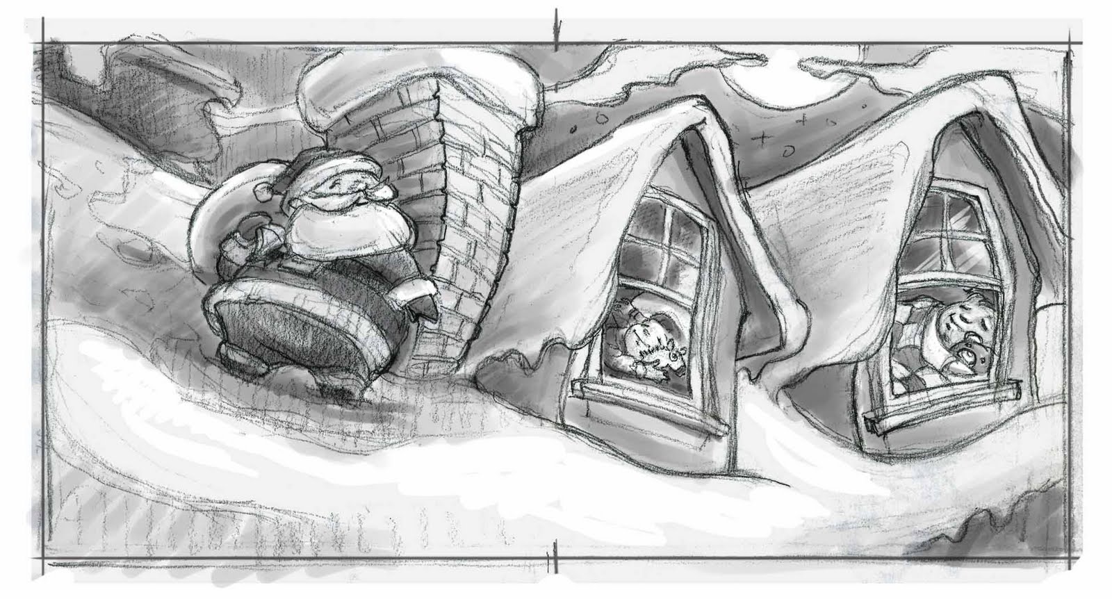
thumbnail sketches for proposed Christmas book.
1.5" x 3" graphite and digital

Here are a couple of comp sketches I did recently for Scholastic Books. The only direction I got was two kids in bed asleep with Santa on the roof. One kid is reacting to the noise. Pretty cryptic, but I assumed it was  going to be a version of Clement Moore's "Twas the Night Before Christmas", so I went that direction. In the end, I was informed that they "went in another direction" but that they liked what I did a lot and would keep me in mind for future projects. That's how it goes sometimes.

Monday, September 13, 2010

Grasshopper Thumbnail 2

Pencil with digital values added - 3 3/4" x 5 1/4"

Here's the sketch of the final spot illustration for Boys' Life fiction piece I mentioned a couple of posts ago. I got the go ahead on these, so I can start painting this week. The other two are more complex, so I need to gather more reference for those, but I will be getting this one on the board today.

Thursday, September 9, 2010

Grasshopper Thumbnail

Thumbnail sketch - 2 3/4" x 2" pencil with digital tone

Just got concept approval on a series of pictures I am doing for Scott Feaster at Boys' Life Magazine. The story is a fictionalized account of a young Lakota warrior who hones his skill with the bow and arrow to the point where he can hit grasshoppers in flight. He eventually grows up to become Chief Crazy Horse. This is the thumbnail sketch for the opening spread. I typically work this way as I prefer to work out the design and basic composition before I get to far into the process, especially before I shoot photos. Shooting photos first seems to result in less a dynamic feel to the pieces. This way I get the drama I want and I pose the models to match. Everyone seems excited about the direction this is going- including me. Now I need to do some more research to gather reference material, schedule a photo shoot, etc. I'll post more of this project as it goes along.

Wednesday, August 11, 2010

Green Thumb Final Ad

I posted this project the other day, but thought I'd show a peek from the concept to the final application.

 
This is the sketch I got from the the creatives at Integrated Marketing Group. I was to incorporate my type of signature farmscape into the background as well as adding some clouds in the sky. 


The client was still wavering a bit on whether this concept could work, but after seeing my drawing, they were convinced.


Here's how the print ad layout came together. Matt Aller, the creative director and co-owner there added the cool retro feel type and pertinent info about their services. This advertisement will run in several trade magazines that cater to the natural food industry.

Thursday, July 8, 2010

American Express project part 1

Salt Lake City - American Express POP label sketch 1

Salt Lake City - American Express POP label sketch 2

A couple of years back, I got the chance to do a picture of my hometown, Salt Lake City, for American Express. The were launching a program to do new point of purchase stickers for all the vendors that accept their card. Each would have an image of the city painted by an artist who lives in that city. I was chosen to paint Salt Lake. I had quite a bit of latitude. Other than the square format, I got to propose the design of the painting. I created two options and they chose option number one. Tomorrow, I'll post the color studies and the final drawing.

Tuesday, June 15, 2010

51st Sketch Goes Color

Photocopied sketches were pasted on a board and painted over - 18" x 5" - acrylic

Each color comp is 3" x 4"

I got a good feel for color options in a short time

I also often do this exploration using Photoshop to
add color to my drawings instead of acrylic.

I then took the final drawing of sketch 51 and created color comps. Here, I admit to having to break some bad habits. For many years I had become lax in my pre-painting color explorations. I would often skip right to paint from the final drawing without adequately working out the color scheme. This could often lead to frustration and less than satisfying results. I recommitted to working out my color palette before going to final paint. Here I used a simple technique of photocopying my sketch several times and pasting them side by side on the board using acrylic matte medium. I then simply painted over them all with an initial wash of acrylic to establish a basic color feel and temperature. I carried three of them further after deciding I preferred a warm palette for this piece. This was as far as I got during our class as we were not required to make a final painting from this study. I did subsequently create a painting based on the thumbnail explorations that was part of my MFA thesis show. I'll show that one later.

Monday, June 14, 2010

51st Thumbnail

 Thumbnail sketch #51 - 2" x 3"

The revised drawing - 4.5" x 6" black prismacolor

After less sleep than I wanted and a mad scramble to get to thumbnail 50, I finally hit on a design I liked for my project. I actually redrew number 50 and made a few adjustments to get to what I thought I wanted. I knew Howard Pyle Pyle was a genius illustrator, but it became clear to me why he was also considered the the greatest illustration teacher ever (Harvey Dunn, N.C. Wyeth, Frank Schoonover, the list goes on and on). If  a single principle of design could have such an impact on me, I can understand why he was so revered and why his students made such rousing success. The next step was to do color comps for a final painting. I'll post those next time.

Friday, June 11, 2010

50 Thumbnails

Sheep Shearing thumbnails
One of six 8 1/2" x 11" pages I filled with drawings

Howard Pyle taught his students that every painting should be preceded by at least fifty thumbnail sketches. His philosophy was that though you may hit on the best design on sketch 23 or 37, or even sketch 2, the real reason to do so many studies is to exhaust all of your options and to make sure that the one you ultimately choose to base the final painting upon is indeed the strongest solution. During my MFA studies, one of our assignments was to utilize this exercise in designing one of our "dream project" paintings. Admittedly, I hardly ever do more than a dozen thumbnail drawings, so this was quite a challenge to come up with fifty distinct designs. Despite drawing and designing for several hours, I was short of fifty when class rolled around the next morning. I sketched away during the beginning of class and hit on a design I liked at number 50. Looking back, I could easily turn several of these thumbnail drawings into paintings, but at the time it was a revelation to understand why Pyle so strongly advocated fifty drawings. Next post: Drawing number 51.

Monday, May 17, 2010

Using the Right Model-Part 3

Thumbnail compositions for Professor Plum

David VanWagoner as Professor Plum

Head Detail

Plant reference

The photo "Frankenstein"

 
"It wasn't the Rope in the Conservatory that Killed Him"
Acrylic on Illustration Board- 12"x13"

As I mentioned in my  last post, before I ever take photographs, I do many small studies to work out my composition and get a good idea of things like angle, cropping, overlap, scale, positive and negative shapes, value masses, etc. In short, I use these small sketches to give me a road map of sorts so I know where I am going. I can then engineer my photo shoot and pose my models to match my sketches. By working this way, I prevent my work from being held hostage to "whatever was in the photo" syndrome. Students and sadly  even some professionals fall victim to this and end up settling for what was "in the photo" instead of taking the photos to match the vision they established in their sketch. It can take more time to work this way since one needs to gather props, costuming, scout locations and coordinate models beforehand, but it is always worth the effort when working realistically.
The third painting in the Truth Against Tobacco campaign was to depict Professor Plum with the smoke from his pipe forming a noose around his neck. I had the perfect model in mind- my Uncle Dave. He is a total character and his energy sometimes wears me out. He agreed to pose as a smoker only because it was for an anti-smoking campaign. I ended up flopping the composition and took several poses though I ultimately went with the one shown in the lower right corner. I shot several dozen frames and picked my favorites for what I call a "Frankenstein". I often take my photographs into Photoshop and fit them over my thumbnail sketch. I then cut and paste parts from several photos to get a photo composition that matches my original drawing. I don't worry about the quality of the seams too much since this version is only for my reference as I create the final drawing and painting. The "Frankenstein" for this painting consists of about five different pictures pasted together, many of which are also manipulated before compositing to change things like angles of joints, etc. It's not always pretty but I end up getting what I need for the painting.