Friday, July 30, 2010

Joe

Joe - Oil on canvas 8" x 12"


Another study from my head painting class. This one was a lot of fun since Joe had a shaved head and the subtle shapes of the skull could be seen as well as the gray blue shade of the scalp where the hairline began. I become a bit more confident in my oil painting with each successive study.

Thursday, July 29, 2010

Painting Mount Hayden

Mount Hayden- Grand Canyon North Rim
Mount Hayden was backlit after an hour or so

Last Friday afternoon we went to Point Imperial on the North Rim of the Grand Canyon. I hiked out about a half mile to a vantage point where I could see Mount Hayden (named after the Arizona Pioneer Charles T. Hayden) which is the most distinctive formation on the point. The weather was threatening rain, so I opted for watercolor instead of oil since I figured I could make a quicker bolt for the car if the weather turned dicey.


Mount Hayden - watercolor 6" x 9"

It turned out that the rain held off but the shifting light from the scattered clouds presented a real challenge. In the end, I went for the first impression I had with the peak lit and background in shadow, though I have reference now to also paint the complete opposite. The result was not quite what I hoped for (is it ever?), but I had a great time painting the view.

Wednesday, July 28, 2010

Living On The Edge-Part 2

The Drop - I am in the little red box

The drop off would obviously have been a fatal one if I had made a mistep, but honestly I never felt in any danger and never got any closer than about six feet from the edge.

Angel's Window - 9" x 12" oil

The painting was a bit of an exercise in frustration mixed with the sheer fun of painting. The light shifted every few minutes and I had to decide whether to change the painting or go with my memory. I enjoyed myself very much and had a good time chatting with the many people who stopped to take photos and watch. I felt a bit like a celebrity for a moment. Here's how it turned out.

I guess he didn't know the backstroke

The only casualty of the whole afternoon was this unfortunate fellow that fell into my turpintine pot and drowned himself. For a while I thought that some sort of leaf had blown in, but when I cleaned my brushes, I realized I had pickled a wasp. So, R.I.P. my bug brother, you sacrificed for art.

Tuesday, July 27, 2010

Living On The Edge

Painting at Angel's Window - July 2010

I just got back from the North Rim of the Grand Canyon where my wife and I spent a few days on vacation. My dear wife was gracious and indulgent enough to let me paint a couple of times while we were there even though it gets a bit long and boring for her (thanks babe!).

In progress

One morning we went to Cape Royal where there is a great natural rock arch called Angel's Window. I found a nice little spot close to the rim and set up the oil painting rig. The light was not great due to overcast skies, but I gave it a shot. It was obviously not going to be about the result, so I just tried to enjoy the process of painting on location. Many people stopped to look and ask to take photographs. I bet I was the only artist they saw in the park, though I knew that was not the case since I ran into fellow artist Dilleen Marsh painting in the park earlier that morning.

On the Edge - Angel's Window

My wife went out to the window and took a few shots of me painting from across the chasm. I'll show everyone just how far the drop off was tomorrow. Let's just say I was careful every time I stepped back from the easel.

Thursday, July 22, 2010

Revelation

Revelation - 19" x 13" acrylic

This one is from the Scuffy project also. This is the moment when he looks back and realizes that all the stuff that scared him was really just everyday stuff. All of these pictures are done acrylic over a digital underpainting/drawing. I printed out the drawing after I added some color tones and then mounted it on museum foamcore and painted over the top. Here's a look back at the resolution of the story after Scuffy has captured the crow.

Wednesday, July 21, 2010

Attack of the Laundry

Attack of the Laundry - 19" x 13" acrylic

This painting is from the picture book that my wife and I wrote together called "Scuffy, a Scarecrow's Tale". In the story, Scuffy is scared of everything and imagines all sorts of dangers (including rabid scarecrow eating shirts and sheets).  I have been shopping it around to publishers (it's been rejected a few times so far) but no taker yet. It was part of my MFA thesis project so I have a complete story and dummy all sketched out and four finished paintings. It's ready to finish and I would love to have somebody pick it up. The closest we came was one of my previous publishers liked it a lot, but were already doing a Jane Yolen scarecrow story. Well, who really wants to compete with Jane Yolen? I posted another picture from this series a few weeks back.

Tuesday, July 20, 2010

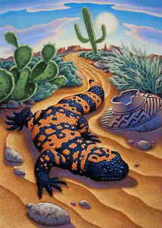
Gila Monster

Gila Monster - 11" x 14" Acrylic
by Greg Newbold

I did this painting for a 4th Grade Reading textbook cover. It sailed through all the approvals during the creative process and I was really looking forward to seeing it on the cover of a book. When I got the artwork back some months later, I was informed that it had been shot down by some of the higher up suits. When I asked why, I was told that someone decided that Gila Monsters were "too scary" for fourth graders. Really? I have had several small people living in my house for a few years now and none of them were ever scared by a picture of a lizard trundling through the desert. On the other hand, my boys love this piece, so now it hangs in the hall just outside their bedroom door. Someday, they may have to draw straws to see who gets it. But I got paid, so go figure.

Monday, July 19, 2010

Kadir Nelson

Josh Gibson on deck- From "We Are the Ship"
by Kadir Nelson


On Friday, I attended the BYU Symposium on Books for Young Readers. I had the pleasure of meeting and hanging out with Kadir Nelson for a while. He gave a terrific presentation where he showed his work and described his outlook on art and life. Kadir, like most of us artists says that he has been drawing for as long as he can remember. He studied at Pratt Institute and has enjoyed a very succesful career. Coming right out of the box he worked on Dreamworks films "Amistad" and the animated "Spirit" doing concept art. He said that this prepared him well for the 20 plus children's books he has illustrated since. One thing he said that really impressed me was that he tries to turn something negative into something beautiful. He said someone once told him that "beauty denies negativity".It reminded me of my own philosphy that I try to make the world a more beautiful place because "life needs art".

The Next Five - by Kadir Nelson


I have always been impressed with the design and the emotion that he embues in his work. I especially like the way he creates power and heroic stature in figures though his stylized elongation of the human form. His large scale oil paintings are beauty to behold. Many of the paintings for "We Are the Ship" are over five feet wide, including the one seen below.

Low and Away - by Kadir Nelson

It was really fun to meet him and have him sign a couple of books for me, including "We Are the Ship", a book he spent seven years writing and illustrating.

We Are the Ship has won several awards

It chronicles the story of the Negro Baseball League and contains over 40 of Kadir's stunning paintings. I would love to post a picture of the two of us together, but I forgot my camera - Dang! See more of Kadir's work here.

Saturday, July 17, 2010

Illustration Friday: Breakfast

Caveman Breakfast - by Greg Newbold
10" x 16" acrylic/mixed media

Up before the crack of dawn, our Neanderthal subject prepares for a rough day of mastadon hunting by consuming this sumptuous meal of roots, grubs and bugs. Mmmm, tasty! Obviously, significant frontal cortex development has already occured as exhibited by the fact that he is actually cooking the beetles (crispy on the outside, gooey chewy on the inside- yummy). Bon apetit!

Friday, July 16, 2010

Head Painting Progress

Matt - 12" x 16" - Oil on masonite - study

As I mentioned in an earlier post, I am working with my head painting class to capture the head in oil within the given three hour block. It has been a challenge to get the whole head down on the board. I did get one last week that came together pretty well. It's not perfect proportionally (the ear position is off) and I wish I had another hour to polish it, but I like the fresh quality of the paint and the more confident brush strokes (I only spent about an hour and a half, so didn't have time for anything but!).

Thursday, July 15, 2010

Enduring Image

"Looking for a Good Book"  12" x 12" acrylic
by Greg Newbold

If you work long enough in this business you will invariably create images that seem to transcend time and keep selling long after their inception. This is one of those images for me. It originally was conceived when I was given one of those "dream jobs". You know, the one where the art director calls and says "we need a cover for our catalog and here is the theme - take time for a good book - do whatever you want, just make it cool". I painted this image as a cover for book distributor Brodart. It ran on the cover and was later licensed as a poster for the same client.

As a Publisher's Weekly cover

With rare exception, I retain all subsequent copyrights for my work so that I can potentially resell them to other clients. Rarely does a client need, or even want, to secure all copyrights, so I always make sure my contracts only list the specific rights being licensed. Consequently, this piece has been picked up and used for probably a dozen different applications, including the cover of Publisher's Weekly, and seems to keep on chugging.

Scott Foresman Reading textbook adaptation

I even adapted it for use on a textbook cover by adding a wraparound piece of art along with a new toucan rider spot which was then Photoshopped together. Most recently (I got my copy last week) it appears on a library card for a branch of the San Bernardino County, California library system where it will also be blown up to mural size and be permanently affixed to the wall of the children's section.

Wow- my own library card!

I have also used it on a business card and since I have about a thousand of them, I still give it out from time to time. That may have been one reason why it keeps hanging around. The piece made it into the Spectrum annual and hung in the first Spectrum retrospective several years back at the Society of Illustrators. The moral of the story is keep your copyrights- you never know when someone might want to use your painting again.

Wednesday, July 14, 2010

One Minute Gestures


One minute gesture drawings- conte crayon on smooth newsprint

In the figure drawing class I am teaching this term, we have been giving a lot of focused effort to capturing the essence of a pose quickly. We usually start with one to three minute gestures and then build up to a more sustained pose by the end of the three hour block. One day recently we spent the entire three hours doing gestures including one minute gestures for nearly a half hour straight. The short time frame gave the models an opportunity to do a few more dynamic poses. At first it felt like no time at all with nothing to show for it on paper. By the end, I was surprised how much you could capture in just a few seconds of concentrated observational drawing. Here are a few of my favorite one minute poses.

Tuesday, July 13, 2010

Strong Starts

Lisa - 12"x16" Oil on masonite study

John - 12"x16" oil on canvas panel study


Sherin - 12"x16" oil on masonite study

I am teaching Head Painting this semester at BYU and I am enjoying it a lot. I have had the pleasure of painting alongside the students as well as helping them improve their paintings. I usually get something started and so far have only been able to get the whole head knocked in a couple of times. I am trying what Morgan Weistling describes as the "inside out method". I start with the minimum if indication lines to map where the head will sit on the board and then pick a strong shape (usually an eye) and then work outward. I try to use the exact color, value and stroke shape to describe each feature and then measure each successive feature against the previous one. In this way I build the face. Between running the class and helping students, I have maybe an hour to an hour and a half to paint these, but I beleive it is valuable for the students to see someone work everyday in class. I haven't gotten fast enough yet to  make the pictures look much like a finished painting, but I am having a lot of fun and getting better. I'll post a more finished one later.

Monday, July 12, 2010

American Express Project Finish

Salt Lake City - 12.5" x 12.5" acrylic on illustration board
Client: American Express

After the finished drawing was approved, I began the final painting. For several years I have been using what I call a "digital under painting" on a lot of my work. Basically, I take my final drawing and give it some color in Photoshop, establishing the basic color palette and values. I leave room for the light end of the value spectrum by keeping contrast a bit on the dark side. This allows me to bring up the brightest highlights with my paint. I printed the colored sketch out on my 13" x 19" Epson printer and mounted it on a piece of illustration board using acrylic matte medium. I use a heavy rag paper for my printouts so it won't buckle too much when I mount it. The Epson inks are pretty water stable so there is very little bleeding from this process. I then give the surface a bit of texture and start to paint right over the top with acrylic.

During the middle of this project, I was scheduled to be in New York City studying with my MFA class and knew I would need to work on this painting in the evenings at my hotel. When booking the trip, I figured that it was a good idea to save some money so I went with a sort of European type of accommodation, thinking we could deal with the whole "micro hotel" issue. Well, upon check in, classmate Val Taylor and I discovered we were booked into a broom closet with a bunk bed- bathroom down the hall. It was so small, that I could literally touch both walls of the room at the same time.

Here I am touching both walls of the NYC hotel closet...err... room

Needless to say, painting this picture cross legged on the top bunk while watching ESPN on my 6" personal TV was not my idea of ideal working conditions, but hey, I got a good story out of it. Note to the wise- go aheadspring for the big room if you ever stay at the Pod Hotel in NYC, better yet, find another hotel. I finished the painting up the day after my return and it has been such a hit, that American Express recently optioned a lucrative buyout of the remaining rights.

Friday, July 9, 2010

American Express project part 2

Salt Lake City- color study 1- graphite with digital color

Salt Lake City - study 2 - graphite with digital color

Salt Lake City - Final Drawing - black prismacolor, 10" x 10"

After the client decided on a direction for this project, they asked me to do a couple of color studies. I did a daylight version and sort of a golden evening version (which I thought was more dramatic but that the client did not choose). They settled on the daylight version and I went ahead with a much more detailed drawing. I incorporated some of the adjustments that were suggested, including a more forced foreground perspective. The final drawing is an improvement over the sketch  and was approved to go to final art. Anyone familiar with Salt Lake will recognize such landmarks as the Salt Lake L.D.S. temple, The City and County building, the State Capitol, the Rio Grande Depot, Energy Solutions Arena and Rice Eccles Stadium. All the other buildings also make part of the city skyline though I have taken some liberties in the orientation and arrangement of the buildings. Next post I'll show the final painting and tell the adventure of painting it.

Thursday, July 8, 2010

American Express project part 1

Salt Lake City - American Express POP label sketch 1

Salt Lake City - American Express POP label sketch 2

A couple of years back, I got the chance to do a picture of my hometown, Salt Lake City, for American Express. The were launching a program to do new point of purchase stickers for all the vendors that accept their card. Each would have an image of the city painted by an artist who lives in that city. I was chosen to paint Salt Lake. I had quite a bit of latitude. Other than the square format, I got to propose the design of the painting. I created two options and they chose option number one. Tomorrow, I'll post the color studies and the final drawing.

Wednesday, July 7, 2010

Overpainting part 2

Lady of the Camelias - Acrylic/mixed on illustration board
Seen here as it ran for the playbill and poster

I did a series of paintings a few years ago for the Pioneer Theatre Company. One of the pictures was for a new play called Alexadre Dumas & the Lady of the Camelias. It was about Dumas, the man who wrote the novel upon which Verdi based his opera La Traviata. In the play he reminisces about his love affair with the woman he based his book upon, all while a rehearsal of La Traviata plays out on stage.

Reworked version eliminated the old man

I fought to not include the old man in the picture and focus instead on the love story, since I felt it looked like he was leering at the young lovers. Alas, I was overruled and I reluctantly included him in the background. I was always dissatisfied with it, so when I got the painting back from the client, I painted him out. I like this version better, but you can decide for yourselves.

Tuesday, July 6, 2010

Overpainting: Triumph or Tragedy?

On Friday I posted a retrospective on the work of Arnold Friberg. I love his work and by no means do I intend this post to diminish the work of an incredible artist, but I thought the following comparison worthy of contemplation. The following painting demonstrates the danger an artist can fall into when they revisit their own work. We have all done it. I have over painted or retouched a number of my own paintings over the years (I'll post an example tomorrow). I think any artist has the prerogative to change anything he creates if it is still in his possession, but when does such an effort cross over from improving a work to ruining one?

The Risen Lord - by Arnold Friberg

The above Painting by Arnold Friberg was painted sometime in the 1960's - I couldn't locate an exact date - but have heard that it was sometime after his iconic Book of Mormon Paintings were completed and sold to The Church of Jesus Christ of Latter Day Saints. It is evident that Friberg was at the height of his dramatic and compositional powers at the time. This particular work was never sold to the church because, as the story goes, the brethren of the church had asked Friberg to paint the robe of Christ to cover his chest and Arnold refused and kept the painting. Fast forward to around 2005 and you get the following version of the same painting.

The Light of Christ - by Arnold Friberg
after it had been extensively over painted 

I saw it at a special exhibit that was held in 2006 of his Ten Commandments paintings and was shocked to see how different it looked from the version I remembered. Surely this was a different version because I figured that there was no way that an artist whose work was so valuable and revered would so severely over paint such a popular and well known work. The curator indicated that it was indeed the same painting but that Friberg had extensively over painted it to achieve what he deemed a more holy effect of light. He even changed the title to "The Light of Christ" In comparing the two, you can see numerous differences, most notably the light source which now seems to emanate from the risen Lord, but he also changed costumes, beards, skin tones and hairstyles throughout the painting. The change in lighting also flattened out the modeling on many of the faces to what I think is almost a cartoonish level. From my own perspective, I feel that he dramatically diminished one of the most stunning depictions of Christ I had ever seen. One can only hope that in the wake of his passing, someone will purchase the painting and have it restored to it's former glory by removing the subsequent layers of paint. I would think that it might be possible if he did not resort to severe scraping before the over working was done. Everyone can draw their own conclusions as to whether Friberg improved or ruined the painting, but I believe he should have let it stand as it was when he first painted it.

Monday, July 5, 2010

Rocket's Red Glare

Rocket's Red Glare- 13" x 19" - acrylic on illustration board

Happy Independence Day everyone! OK, I know it's not really the 4th of July today, but I do have the day off from teaching classes today. I thought I'd post an interior shot from my recent Boys' Life Magazine project. The story is a fictional account of the writing of the Star Spangled Banner.  I showed the cover image in an earlier post - have a look if you missed it. I just found out Friday that I will indeed be travelling to the 2010 National Boy Scout Jamboree at Fort A.P Hill, Virginia to sign posters of the cover at the Boys' Life Magazine booth. It should be a fun, albeit quick trip. I'll post photos of the excursion sometime after I get back. So now go eat a good burger and watch some fireworks - nothing more American than that, right?

Friday, July 2, 2010

Remembering Arnold Friberg

Prayer at Valley Forge - 1975


On Thursday July 1st, the world lost an artistic icon with the death of illustrator and painter Arnold Friberg at age 96. I also bid farewell to one of my  idols, one of the last of the old guard of American figurative illustrators. Born in 1913, Arnold Friberg created thousands of works of art over his lengthy career, including a set of paintings that established the entire look of Cecil B DeMille's classic film The Ten Commandments (for which he received an Academy Award nomination for costume design), as well as over two hundred paintings of Royal Canadian Mounted Police subjects for the Northwest Paper Company.

Into The Valley - By Arnold Friberg
one of his over 200 paintings of the Canadian Mounties

Tales from the Force- by Arnold Friberg

 He was perhaps best known though for his iconic painting of George Washington, "Prayer at Valley Forge" commissioned prior to the United States Bicentennial in 1976.

Arnold Friberg painting "Prayer at Valley Forge - 1975

I only had the pleasure of meeting Arnold once, though I have lived less than ten miles from his home and studio for nearly twenty years. He was a very private individual and his wife Heidi zealously guarded his solitude. In retrospect, I wish I had tried harder to visit with him in his studio. I grew up on Friberg's work, though I did not connect the pictures to the man until much later as I studied illustration in college. As a boy, his heroic depiction of the scriptural accounts contained in the Book of Mormon never failed to inspire me.

Abinidi  before King Noah- by Arnold Friberg


Waters of Mormon - by Arnold Friberg

 I poured over these scenes that instilled in me a wonder that one could actually capture such emotion and drama on canvas. I had the pleasure of hearing him speak on a couple of separate occasions, but never met Arnold personally until February 15th, 2008.

Friberg painting - circa 1971

I was at the local art supply store looking for some paint when I overheard a deep voice chiding one of the clerks for not having the item he had called ahead for. I thought I recognized the voice and rounded the corner to come face to face with Arnold Friberg himself. He was searching the rack for tube of paint but could not read the small print.He asked me if it was Ivory Black or Lamp Black. I found the one he wanted and we began to chat. I told him that he was one of the reasons I became an artist and he responed that "you should have told me sooner and I could have warned you off!".  The conversation progressed for fifteen minutes or so and we talked of everything from his associations with illustrators such as Andrew Loomis, F.R. Gruger and how he studied with Harvey Dunn to working with Cecil B. DeMile on the Ten Commandments and his world famous portrait of George Washington at Valley Forge.

A Ten Commandments commemorative print portfolio was
produced in the early 1960's. I own an original copy.
Not great reproduction, but fun to have.

My real delight was seeing this visibly frail older gentleman perk up and get a twinkle in his eye when he spoke of these bygone days and artists. He obviously was delighted to share these stories with someone who knew the names and work- we were speaking the same language. He shared the story of his first contact with a New York art director. He didn't have cab or subway fare so had walked the blocks from 12th to 42nd street to speak with the man which he had no appointment to see. The "office boy" said he had to have an appointment and the receptionist was on vacation, besides, you had to "call ahead"  to schedule a meeting. Friberg didn't have the nickel for a phone call, so he walked clear back to his flat to use the phone there. Everyone was out to lunch, but the art director himself answered the phone and promptly told him to come on down. He got his first job that day and upon delivery, the A.D asked what he owed him (the going rate was about $50). Feeling bold, Friberg asked for $75. The A.D said he thought he could do better and paid him $125.

Thunder Wagon- by Arnold Friberg

According to Friberg, this was the beginning of his  career as one job led to another and soon placed him in great demand (though he had been illustrating local jobs while living in Chicago, including his first Mountie subjects- he considered this his big break).  Arnold shook my had and took my card as I thanked him for his time and conversation. He told me he had to get back home since he wasn't supposed to be driving anyway due to lingering effects of a slight stroke (he was 94 at the time!).

Arnold in his Studio-2008-(Keith Johnson-Deseret Morning News)

I smiled to myself and treasured the memory of meeting one of my heroes. I was surprised by the sadness I felt upon hearing news of his passing, he felt familiar to me though I had only the briefest of encounters with him personally. Next time I have a chance to meet one of my idols, I hope it's because I had the nerve to seek him out. Still it was a thrill to bump into one. Those wanting more in depth detail, please follow the links below to more coverage of Arnold Friberg's life and career.

Friberg-Deseret Morning News Article