Wednesday, November 23, 2011

Provo Tabernacle-Finished Version


I finished up my Provo Tabernacle painting last week in preparation for the upcoming show my class has set up at the Window Box Gallery next weekend. As you can see from the preliminary study below, there were a lot of refinements that took place. I think the most glaring issue I had to deal with was the vertical lines. As I studied my progress, I realized that some of the walls canted to the east rather glaringly. I also was struggling with how to depict the rather rigid structure of the scaffolding. 


I decided to try a trick that I learned from painter friend Rob Adamson which involved using metal straightedges to get straight lines. I dug my eight inch and three inch drywall knives out of the shed and put them to work. By resting the straight edge on my painting and making a clean stroke, I found I could keep lines parallel, consistent and surprise, straight. It's also important to keep the edge clean after every stroke to prevent unintended transfer of paint to other areas of the work. This made a big difference and It is something I plan to continue using when I need a crisp line while painting.

The show including this painting and all the other wonderful work created by my students will be at the Window Box Gallery during December. Opening social will be  during the Friday Night Gallery Stroll, December 2, 2011 from 6;00 pm to 9:00 pm.

Monday, November 21, 2011

Leconte Stewart-Landscape With Soul


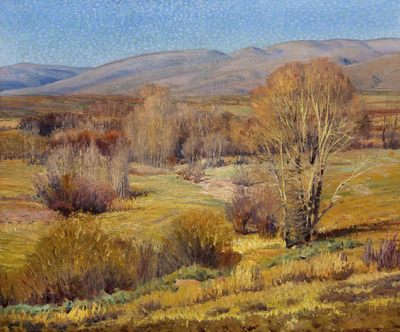
Leconte Stewart was perhaps the best landscape painter nobody has ever heard of. At least outside of his native Utah, that is. Stewart has long been one of my favorites and I was thrilled to have the chance to see his work up close and personal in a pair of joint exhibits here in Salt Lake City.


I featured part one of the Stewart Exhibit  at the Utah Museum of Fine Art previously and I recently got to see the second half of this show titled Leconte Stewart: The Soul Of Rural Utah at the Church History Museum. If the first half of the show was impressive, I dare say the show at the Church Museum is even better.


The focus is on Stewart's landscapes exclusively and the selection shows his the range and the breadth of his artistic exploration.  You see a progression of stroke technique as the paint becomes thicker for certain periods and ranges from pointillistic at times to very bold and expressive. The rural Utah land he depicts takes on a character and personality of its own during different times of year. One section of the exhibit documents how Stewart painted the same country farm over and over in different seasons.


It was fascinating to see his approach to the same subject at various times of year and under a range of weather conditions. Given the results, it is easy to see why he was so attracted to the place. As I mentioned in the previous post, Leconte Stewart was extremely prolific, painting on location nearly every day into his nineties. As a result, there are thousands of Stewart works in existence.


With so much time under the brush, Stewart became a master of nuance. His color and temperature shifts across the surface of any give work are stunning to behold. I left in awe and respect for his vision and craft.


On a side note, I was also pleased to learn that we will finally be graced with a coffee table sized volume of Stewart's work. It will be forthcoming next year from Gibbs Smith. You can see a preview of the book here. Hopefully this book will go a long way towards placing Leconte Stewart among the greats of American landscape painting where I believe he belongs. In the meantime, Be sure to check out both of the Leconte Stewart shows:

Leconte Stewart: The Soul of Rural Utah at the Church Museum of Art through January 15th, 2012
The museum is located at 45 North West Temple, Salt Lake City, UT 84150 and admission is free.

Leconte Stewart: Depression Era Art at the Utah Museum of Fine Art also through January 15th, 2012
The museum is located at 410 South Campus Drive on the University of Utah campus, Salt Lake City, UT 84112. Admission info here


Leconte Stewart bio and more work here

Saturday, November 19, 2011

Sam Weber Demo


Illustrator Sam Weber has become a household fixture in the industry in just six short years. Looking at Sam's work today, you would scarcely believe he spent the first couple of years of his career with relatively little work on the table, which makes his rise to success even more impressive.


Sam earned a BFA in Calgary, Canada where he met his wife artist Jillian Tamaki and continued on to earn an MFA at the School of Visual Arts in New Your City. He credits his time there with instilling within him a more independent attitude toward art. It also shattered some of his illusions about famous illustrators saying that living in New York rids you of being star struck pretty quickly.


A few weeks ago, I had the opportunity to meet Sam and see him work during his visit to Brigham Young University where I teach. He shared many words of wisdom with those in attendance as well as a  wonderful demonstration of his working process.


Sam Begins by sketching out his ideas and then gathers reference material from a variety of sources. He stressed the importance of creating your own reference in order to control your vision. He frequently brings professional models into his Brooklyn, New York studio to shoot, ensuring that he gets exactly the pose and details he wants. Once the drawing is established, he uses a graphite transfer method to get the drawing onto his painting surface.


Weber prefers painting on Fabriano 300 lb. hot press paper. He likes the smooth surface and ability to remain relatively flat even during successive washes of wet paint without stretching. Because Weber's work frequently requires large areas of white or nearly white paper, he masks off these areas using a high tack frisket film. Sam likes to build up areas of color and value slowly using multiple washes of very thin acrylic in a watercolor style. His paint of choice is Golden Fluid acrylic paint since it requires less dilution to it reduce to the consistency he likes.


When building up value and texture, Sam employs many different tools to achieve organic results.He has a collection of natural sponges that he uses and also likes to press a sheet of Plexiglass into a wet wash to get random textures. Weber continues glazing wet into wet and building up values that retain soft edges and textures.As he gets more layers built up, the paint becomes dryer and he scumbles the paint more.


Throughout the demo, Sam threw out advice and hard gained wisdom to the group He said the sketching process is his favorite part because that is when all the potential still exists. The excitement swells and then sinks to uncertainty in the middle and then settles into relief at the finish when it all works out. Weber advocates setting aside time for personal work as the most interesting leaps and growth come from exploration.


After a little more than two hours of building up the acrylic washes, Sam then shifted to Photoshop for the finishing touches which is how he finishes nearly all his work. He scanned the image full size at 700 dpi. Using multiply layers, he continues with digital glazes of color to refine the value patterns and sharpen edges. Color dodge was used to achieve highlights toward the end. This was a fairly simple subject, so there were not a lot of tricky digital effects, but Sam will employ various selections and quick masks in order to get the effects he wants.


Of the first couple of dry years, Sam said that it was only when he shifted his subject matter to be more accessible that he became popular. He likened it to two slightly overlapping circles. In one is the work you like to do. The other contains what people want. Within the space that overlaps lies the work that you should pursue. Weber advised students to create an entirely new portfolio every six months stressing that illustration is not a part time job and that you may never feel ready to begin an illustration career- this is normal. Proceed as planned. It appears to me that Sam Weber is proceeding very nicely.

Saturday, November 12, 2011

Painting the Provo Tabernacle

Provo Tabernacle- 8" x 10" oil on board by Greg Newbold

A couple weeks ago our class decided to paint the Provo Tabernacle. Built in the 1880's, the Provo Tabernacle had been an iconic city landmark as well as a religious meeting hall for over a century when a spectacular midnight fire consumed all but the facade and towers last December.


The building was stabilized using an extensive scaffolding network while decisions were made as to what would happen to the remaining walls. At the October  General Conference of the Church of Jesus Christ of Latter-Day Saints it was announced that the historic building would be restored and rebuilt as a temple.


With this news in hand I decided it would be a fun opportunity to document a building would soon be resurrected to its former glory and serve a new purpose for another century. While we were all gathered painting, the owner of the Window Box Gallery across the street approached us and asked if we would like to show our collected works in her gallery during December.


Painting the tabernacle now seems like an inspired decision as all the students in the class will now have a chance to show and sell their work. I'l be finishing my picture for the show as well. The pieces will all be on display starting Dec 2, 2011. The opening will coincide with the Provo Gallery Stroll from 6:00 - 9:00 pm that night.

Window Box Gallery is located at 62 West Center, Provo UT, 84601
More about the purpose of LDS temples

Thursday, November 10, 2011

Shane Jackman CD Cover Art


Cover for Shane Jackman's new album "Peace"

I have always loved the peaceful silent nature of new fallen snow. My musician friend Shane Jackman and I have wanted to collaborate on a project for some time. I finally got the chance to do a piece of cover art for one of his albums, so here is a sneak peek. After concept discussions for the cover of this album, we settled on the idea of a peace sign pressed into a snowy hillside at evening. Shane is crafting this recording to appeal to all denominations as more of a holiday album but it will have songs that are obviously Christmas themed. The bright star in the sky stands as a little reminder of that. Shane is an incredibly gifted singer and songwriter and I am excited to be a part of this package. The album will be simply titled "Peace" and will have a mix of original Christmas and holiday themed tunes as well as a few traditional carols Shane has arranged.

Check out Shane's website here

Friday, November 4, 2011

Woodland Skunk

Woodland Skunk- 9" x 18" -by Greg Newbold
acrylic on canvas 

This week, I got one of those nice surprises in the mail- a royalty check. It was for my book Spring Song, which unfortunately has fallen out of print for the moment. I think the art in this book is actually stronger than the companion book I illustrated called Winter Lullaby, also written by Barbara Seuling. So how did I get a royalty check on a book that is out of print you ask? Well, the anthology rights to the book are still very much active and it was picked up again to be published in a children's reading textbook.Granted, the check was not huge, just a few hundred dollars, but it's always nice to get money when you don't expect it!


Tuesday, November 1, 2011

More Walter Everett

Walter Everett- couple on hillside (unfinished?)

Last week I got an email from artist Kevin Ferrara regarding a previous post I did on the work of Golden Age Illustrator Walter Everett (1880-1946). 


As a result, we happily traded Walter Everett scans which were new to both of us. This exchange motivated me to have another look at Everett's work and I came away with a renewed appreciation of his skill. I continue to be especially impressed by his design sense, bold brushwork and color use. 

Washer Woman- finished painting

Sketch for the above painting- notice design differences from finish

A student of Howard Pyle, during the first quarter of the 20th century, Everett established himself as one of the most sought after illustrators. He founded  the program at the Philadelphia College of Art (formerly the School of Industrial Arts) in1911 where he taught until the conformity of academia chafed too much. He abandoned teaching in 1915. 


His ego and tendency to push deadlines to the last possible moment or beyond, made him an art director's nightmare. But Everett's brilliant work made him a headache that publishers were obviously willing to tolerate as his work continued to appear in all the major publications of the day.


At the height of his career in the mid 1930's, Everett famously burned the bulk of his life's work to ash according to several accounts including this post on David Apatoff"s Illustration Art blog. He then disappeared from illustration forever. nobody seems to know why.


Walter Everett spent the rest of his life creating personal work such as the one below which was on his easel at the time of his death in 1946


Very little remains by way of Everett's original art and tear sheets of his printed work. I would love to find more examples, but for now I'll be satisfied with digesting the samples I have. If you have any scans of Everett's work that may be more obscure and that you are willing to share, I would appreciate it.


Walter Everett was one of the most talented of the Golden Age of Illustration, giving nothing to the likes of Dean Cornwell, N.C. Wyeth, Harvey Dunn. He was certainly one of the very best from an era of illustration giants.