Showing posts with label digital painting. Show all posts

Tuesday, April 21, 2015

Cactus Hotel Project Finished


Saturday afternoon marked the final upload of the art for the Cactus Hotel project. Here are a few more of my favorite pieces from the project in their final state. All final images were created in Photoshop using digital brushes and handmade texture over the top of the graphite drawings I posted about earlier.


Enjoy!

Saturday, April 11, 2015

Cactus Hotel Progress


Here's a little sneak peek of the final for the book I am working on called Cactus Hotel.  Just a little full page of a roadrunner having a little lizard snack in the shade of a big Saguaro. A few more of the drawings were posted earlier, if you would like to have a look. I have been a bit busy the last week or two working on this project as well as a little thing for Barnes & Noble, which I will post in a few weeks when it hits the stores. It's nice to be busy again with nice illustration projects. I have a lot on the plate, but will try to post more regularly as the work progresses. Thanks for having a look.

Monday, March 16, 2015

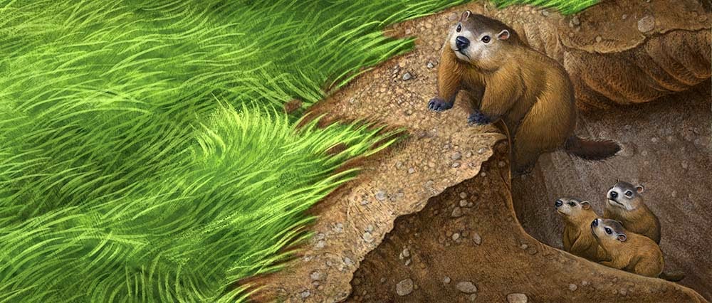
Baby Groundhogs


Here are selections for another easy reader book I just finished. The story follows a family of groundhogs as the babies venture out of their den for the first time.


They enjoy munching on the green grass for a time before escaping back to the den when a fox appears. I tried to give the little guys some personality despite the need to portray them as realistically and not stylize too much.


I would rather have made them more animated and characterized, but the art direction dictated they be "real" groundhogs. I think I struck the right balance between real and cute.


Once again, I made all the preliminary drawings traditionally and then scanned and painted them in Photoshop.

Saturday, December 20, 2014

Wolf Den Cutaway


Just a little sketch for a textbook project I am working on. This is the preliminary drawing that will be painted digitally next. I'm not sure how I became the "cutaway" specialist for this particular client (this is the third or fourth such project this year) but I am OK with that. It's a fun challenge to show what goes on inside the different animal's dens without making it look weird or cheesy. See the previous cutaway I posted earlier of the beaver lodge here.

Tuesday, November 4, 2014

Who's Afraid of Photoshop?


Who's Afraid of Virginia Woolf? Digital by Greg Newbold
Another fun theater poster project just came off the table (or the desktop, rather) and I am pretty happy with how things progressed from concepts to finish. This one was also for the Footlight Players in Charleston, South Carolina. Who's Afraid of Virginia Woolf was written by Edward Albee in 1962. In 1966, the play became an award winning film starring Elizabeth Taylor and Richard Burton. It tells the sad tale of two middle aged people in a caustic marriage as a drunken night of verbal and emotional abuse plays out in front of a younger couple. 


Step one was to watch the film. I readily admit that I had a hard time watching it and wondered how it has become so critically acclaimed over the years. It was like watching a train wreck and I felt like I needed to take a shower afterward. It's possible that this was the intent of the author, but I would rather not subject myself to that subject matter. That said, I had a job to do and I dug in and came up with the three above options. The client gravitated to the screaming mouth, which was appropriate given the amount of bickering that pervades the work.

Photo collage with some painted shapes around edges.
This rough is a combination of painted shapes and sections of my own photos pieced together in Photoshop. I make these types of roughs quite often and then I usually create a  separate finished drawing which becomes the basis for my final art. This one was so simple and was already working so well, I decided to just paint over the top of the photo comp. Now, there has been a lot of discussion on various blogs about whether this type of "photobashing" is cheating, so I will put in my two cents here. 
Photobashing is a common practice in concept art circles where the essence of a scene must be captured quickly to convey the idea to the production staff.  An artist takes existing photos and cobbles them together and paints over the top, adding effects and shifting colors as needed to get the result that tells his story. Of course with the pervasiveness of Photoshop in the commercial art world in general, this technique has spilled over into illustration and even trickled into the college classroom. 

Starting to refine the shapes and paint textures over the top
The most common complaint is that photobashed pieces are not really art because the artist did not draw the piece "by hand". Don't get me wrong, I respect the amount of time and drawing skill that many artists put into their work and would never want to downplay that. I am one of them. That said, my approach to this piece was to get the best result possible in the quickest amount of time. I used the tools and knowledge at my disposal to do so. I created the concept, took my own photos and rendered it in my own style. I just don't see how this piece is any less a piece of art than one of my oil paintings. 

adding more over painting, shadows and textures
I am fairly certain that if Leonardo Da Vinci or Johannes Vermeer had had Photoshop at his disposal, they would have been using it to the full extent of it's capability. It's just a tool. Essentially, digital technology is no different than a tube of paint, or a palette knife. In the hands of a talented artist, the results can be amazing. When wielded by an artist with an under developed skill set, it becomes a crutch. The resulting work from these two artists can be like night and day. One will likely be individual, stunning and highly crafted while the other will be clumsy, stiff and carry the telltale signs of a piece that has been heavily digitally manipulated.

Final work with final detail, lettering, and signature added
So what makes the difference? I think the bottom line is that those who allow tricks to overpower what they have to say and allow the easy use of photos to squash the way they naturally draw, will stifle their creative potential. When I teach college courses, I always encourage students to draw first. I make it mandatory that each student show me thumbnails and roughs before doing a photo shoot. Then they are required to show me final drawings before executing the finished art. It is paramount that the student have a concrete idea of what they want to achieve before getting caught up in the deceptive lure of photography. Photos have their place. I use them a lot.  But make photos fit your vision, do not resign your vision to merely what the camera gives you.

Monday, October 13, 2014

Miracle in Bedford Falls


I recently had the chance to create a new poster for Miracle In Bedford Falls For Footlight Players in Charleston South Carolina. This play is a musical stage version of my all time favorite Christmas film It's A Wonderful Life. In case you somehow live in a cave and have missed the 1946 Frank Capra classic starring Jimmy Stewart and Donna Reed, you can watch it on Christmas Eve this year, like I do practically every year, much to my family's chagrin. I have somehow not instilled a love for the film in my children, but there is still hope. Anyway, back to the project at hand.


Creating new art for a story that is so iconic is a bit daunting and I didn't want to copy the familiar climactic family embrace that features prominently on most of the video versions of the film, so that was automatically out. Also, since this is a musical version, I wanted to somehow imply this aspect in the art. Other iconic symbols that I considered in the sketch phase were snow, Christmas bells, George Bailey, fir trees, holly, angel wings and more snow. I came up with four possible options to show the client of which, they chose the snow globe idea. We decided to add George to the snow globe from sketch one and add some musical notations to the swirls of snow.


Once again I created the hand lettering for this poster and incorporated it into the illustration. The client is thrilled with the result and I hope that it adds to the popularity of the production.

Tuesday, February 18, 2014

Butterfly Book - 4


These are the final two images in the Butterfly Book. The butterfly dries out his wings in the sunshine as the clouds clear and then flutters away to search for nectar among the field of flowers. Here again I utilized repeated butterflies from the other spreads, though flopping and rotating helps disguise that fact. It doesn't often work out to do re use elements without being obvious and short changing the product. In this case it made sense within the framework of a project and it sure was a time saver. 

Wednesday, February 12, 2014

Butterfly Book - 3


In these two pieces, I needed to show the contrast of the butterfly sheltering from the rain and then starting to dry out his wings after the storm passed. As I worked through sketching out this project, I decided that, in to make it easier to execute, I would reuse or modify any elements that made sense. For instance, at least one sky was cropped and reused, two butterflies were flopped and made a second appearance, and in these two illustrations, I made good use of the leaves that the butterfly is using for shelter. I kept the leaf layer separate from the sky which made it simple to swap the rain for a nice cloudy sky. Then I made some modifications to the colors and added a few highlights to the leaves as the butterfly from another spread made a command performance.

This type of planning made the execution of this project go much faster and only really observant kids (and adults for that matter) will ever notice that some of the elements repeat. Although this example is the most obvious repeat, it made total sense in the context of the book, so I was okay with it.

It's tempting to mine your digital archives for things that might speed up a project, but whenever I do reuse elements, I try to disguise them as much as possible. This includes, cropping, changing colors, flopping, rotating and more to make the old element new and to integrate it into the new piece. I only do this when I am either, short of time, short on budget, or both, but it's one more trick that can be helpful if not abused. Don't get sucked into the habit of constantly using shortcuts though, or your art will suffer. There's still no substitute for good drawing and original thinking.

Wednesday, December 18, 2013

Daisy Dog


A recent piece I did for Angels on Earth magazine. The story deals with an abused pit bull dog that a family adopts and names Daisy. Despite the serious neglect, her spirit was not broken and adapted readily to her new home. The concept was to show how content and happy the dog was once she got out of the abusive situation. I had particular fun with all the little details on the dog house as well as the flowers. This one was done digitally over a rough graphite drawing. Unlike some of my previous digital paintings, not much of the original drawing is evident in this one. All the textures were created by hand and imported into the textures palette or applied in multiply mode at the end (crackle texture). 

Thursday, August 29, 2013

River Dreams


In commemoration of the 50th anniversary of Dr. Martin Luther King's famous speech this week, I thought I'd show a little illustration I recently finished. This piece will accompany a poem by another famous African American author Langston Hughes. The text of the poem will be printed in the golden waters of the winding river. It's always a little tricky to allow space for text in situations like these, but I think I solved the problem well and have created a nice mood. It will run in a prominent children's magazine in the next few months.

The Negro Speaks of Rivers

by Langston Hughes
I’ve known rivers:
I’ve known rivers ancient as the world and older than the flow of human blood in human veins.

My soul has grown deep like the rivers.

I bathed in the Euphrates when dawns were young.
I built my hut near the Congo and it lulled me to sleep.
I looked upon the Nile and raised the pyramids above it.
I heard the singing of the Mississippi when Abe Lincoln went down to New Orleans, and I’ve seen its muddy bosom turn all golden in the sunset.

I’ve known rivers:
Ancient, dusky rivers.

My soul has grown deep like the rivers.

Thursday, August 15, 2013

Mystery Creature


In the Mystery of Grady House story I am illustrating for Boys' Life Magazine, young Evan is asked to care for his injured neighbor's Capuchin monkey while he recuperates in the hospital. In the story there is a buildup to the revelation as to what the creature making noises in the back really is. The AD and I did not want to give this reveal away in the illustration feeling that the power of suggestion should override literal depiction. I decided a long, somewhat threatening cast shadow would do the trick. Once again, I am painting digitally over the top of a full value graphite drawing.

The opening spread sketch is posted here
A more lengthy description of this process is posted here.

Friday, July 26, 2013

The Bluebird of Happiness

Bluebird- 8" x 6" - Digital over graphite, by Greg Newbold
OK, so I wasn't so happy with the drawing of this one. Of the eight pieces I did for the egg book I just finished, I liked this one the least. That is, until I put color to it.  In fact if you look back at the posts I did of the sketches here and here you'll notice this one is missing. I think it was because this one is different from all the rest and somehow didn't seem to fit into the group. This is the only one in which the bird is in flight and also the only one where the egg is not visible. The lack of value contrast in the sketch around the bird was also a factor.

 I was following the AD specifications for picture content, so, as often happens in the illustration world,  I did as requested. As soon as I got it done though, I decided it was not bad at all and the action of the bird swooping out of the nest box is interesting and fun. When I added the bright blue of the bird though, the focus became clearer also. The shadow falling away from the bird was also a nice element that I think worked out well. Inventing believable cast shadows is an issue for many artists. I am still glad that my basic drawing class in college covered this topic effectively.

Monday, July 22, 2013

Photoshop Painting Process - Meadowlark

Meadowlark - Digital over graphite, 6" x 8" by Greg Newbold
I just finished up the bird book I was working on and I have to admit, I am loving my streamlined digital process. At least for this project, my working method proved to be seamless, fast and yielded consistently good results. I thought I would go over the process a little to show you how utilizing the flexibility that Photoshop provides, without sacrificing the look of hand done work can make a digital painting look like a traditional work. One of my biggest problems with digital work is that so much of it "looks" digital. When I look at something and it has that plastic "computer" feel or I can tell which brush or filter gave a certain effect, I cringe. Below I will outline a little about how I took my graphite drawing to a fully rendered digital "painting". Infusing the hand done nature of an actual drawing into my work has been a helpful starting point.


1- I start with a full value traditional drawing. This was done with regular old number 2 pencils on Stonehenge printmaking paper. I like the tooth of the paper for smudging, but it is not so soft that I can't get nice lines. It will tolerate a fair amount of erasure as well. After scanning, I isolate the drawing by using the following steps: In Channels, I make a copy of the red channel. With a black and white drawing, it doesn't seem to matter which channel is copied. At the bottom left of the channel palette, there is a dotted line box. Click it to select pixels. This selects the all the white pixels.  I then go to the "Select" tab at the top of the Photoshop Menu and "Select Inverse". Now all the pixels that are black or shades of gray are selected. I create a new layer and use my paint bucket to fill with straight black. Now I have a layer that includes only the pixels of drawing. I click the "lock transparent pixels" button at the top left of the layers palette (right next to the word "lock"). Now that layer is transparent but I can also paint those "locked" pixels any color I want without messing up my drawing. I usually paint parts of  the drawing layer to compliment what is going on in the overall color scheme. In this case I painted much of the bird brown as well as some of the grasses. I "hide" the original drawing layer in case I need it later.


2-  I add a layer underneath the drawing and do a tan to brown gradient fill. The above shot is with the drawing visible so I can see how the new background wash reacts with the drawing layer. If I don't like how things are looking, I adjust the colors or try again. I don't like painting against a white background because it is hard for me to judge values and colors against stark white. I prefer a mid value upon which I can contrast lights and darks. The hue of the mid value wash also acts to unify and make harmonious the color scheme as it will influence all the other colors you place against it. and if painted over transparently, influences the color yet again. Some people call it an illustrator's "cheat" or lazy color scheme, but it works for me. With the drawing and the background gradient in place, I now have my mid-tones and darks in place.


3- I now add the deep shadows of the grass. I have clicked off the drawing for this shot to show you what it looks like, but I paint "behind" the drawing on another new layer that is between the background gradient and the drawing. This allows me to erase or change things without disturbing the background layer or the drawing.


4- Adding yet another layer above the deep shadows above, I continue laying in the grass colors for the background. Here again the drawing layer is switched off just to show what the colors on this layer look like.

Here is how it is looking at this point with the drawing visible. I want to isolate the overlapping shapes from the background which will simplify things like painting around and behind edges. To do this, I create another layer for the bird and egg to sit on which is just one layer below the drawing


5- Here is the layer with the base colors of the egg and bird visible. I turned off the grass and drawing layers to make it more visible. I use the lasso select tool to get the shapes based on the drawing and then filled them with solid colors using the paint bucket. I then painted more tones over this selected shape. Selecting the entire shape lets you paint freely to the edge without running off into the background- another advantage that speeds up digital painting. 


OK- so here is what the painting looks like at this stage with all layers visible. I have now reached the point where everything is looking pretty good but it lacks depth and detail. The highlights, details and roundness of the shadows are missing. I purposely leave everything a little dark to this point, so I have room for my highlights, just as I would with traditional paint. 


6- Now I add what I call the "overpaint" layer which is the top layer so far, covering all other layers. I leave it in normal mode and paint over the top of everything. Here is where I add detail, texture and highlights, I fix, soften or sharpen edges and generally make sure I like how everything is looking. Here is where I add the bells and whistles like the detail and highlight in the eye and crisp details on the bird's head and feathers. I still want it to look like a painting and not a photograph, so I resist going into too much detail and I try to make my strokes visible. 


7- The final step is to add just a bit more to the shadows. I wanted a bit more depth in the core and cast shadows and wanted to add a cast shadow to the egg. This was done using a soft brush and warm gray on a multiply layer above the overpaint layer. I erased out shadows where I added too much and sharpened the edge of the shadow on the egg. At this point I am finished with the painting and give it the once over to make sure I like it. I usually end up fiddling a little with the layers and contrasts a bit to get it looking just right. 

I mentioned using organic texture to paint this and I think it is one key to making digital painting feel more natural and hand made. I did a previous post that details how I import and use hand made texture in Photoshop here.


Tuesday, May 21, 2013

Dragon Mountain 2 Finish


Just finishing this one up today from the Boys' Life story I am working on. I may adjust some of the shadows a little but for the most part I like it. I posted the preliminary sketch here.  Having a well worked out value drawing definitely seems to speed up the painting phase. I spent about four or five hours rendering this in Photoshop. I am hoping the opening spread comes together as quickly since I have about five deadlines that are one on top of the other at the moment.

Friday, February 22, 2013

Rough Trail

Jane Manning James was a Mormon Pioneer and also one of the first black members of the Church of Jesus Christ of Latter-Day Saints. As part of the article I am illustrating for BYU Magazine, I am illustrating little known stories from the lives of church members. The story is told of how Jane travelled several hundred miles of the journey with inadequate footwear. In an autobiographical sketch she wrote,
“We walked until our shoes were worn out, and our feet became sore and cracked open and bled until you could see the whole print of our feet with blood on the ground. We stopped and united in prayer to the Lord, we asked God the Eternal Father to heal our feet and our prayers were answered and our feet were healed forthwith.”
For this illustration I wanted to portray the hardship but also inject hope. The sage sparrow represents the Bible verse which teaches that not a sparrow shall fall without our Father knowing. (Matthew 10:29). Hopefully I struck the right balance of strength and faith here.

Friday, November 23, 2012

Glen Society Logo

I Just finished this logo illustration for Macalester College in St. Paul, Minnesota. They are a private liberal arts college and I was asked to do this little bit for their Glen Society. It was a fun little piece to work on and it was painted in Photoshop.

Wednesday, November 21, 2012

Turning Summer to Winter


On Sunday, the newspaper brought with it the new City Creek Center Holiday insert, so now that it is public, I figured it was time for me to claim credit. I was approached in late August to do illustrations for City Creek Center, the new multi billion dollar redevelopment project in downtown Salt Lake City, UT.

Concept art provided by the client
Of course I jumped at the chance since the mall and surrounding properties are practically in my back yard. The development spans multiple city blocks and there is a distinctive pedestrian bridge that connects it together. One of the images needed would showcase this architectural feature. the time frame and complexity of the architecture, as well as the continuity with existing City Creek advertising necessitated a much more Photoshop based approach than usual. I also would need to transform summer into winter, complete with twinkling lights and snow and decorations.

Left side of the panorama
Center section with sky cut out
Right side of the scene
I took the concept art from the client and took photos around the mall from which to work. I could not get the entire bridge panorama into my camera in one shot, so I pieced the three parts together using the photo merge utility, which us incredibly good at matching things up. I then adjusted exposures to get them all matching and then went to work painting over the entire scene.

City Creek Bridge- Final version

City Creek bridge starting point
Then came all the work of adding the holiday cheer to the scene. I added a nice moonlight sky and stars to the background, edited out the power poles and barricades, replaced all the people with bundled up shoppers, added all the garlands and trees and tossed in thousands of twinkling lights. I also added a generous sprinkling of snow on the ground and light flakes falling. By the time I finished, I had painted over and added textures to pretty much the whole scene. I like how it turned out, though it was not my traditional method of working. Bottom line was that the client was very pleased and that is what really counts.

Saturday, September 15, 2012

Change in the Weather


Well, if it seems like it has been a while since I posted anything, you would be correct. It is not for lack of interest or work. Believe me, I have been plenty busy, just not with the kinds of things one wants to be engaged in. A couple of months back, my wife and I got the news nobody wants and we have been waging a battle with cancer ever since. Amy gives her perspective on what we have been going through on her blog here. Needless to say, there has been a radical shift in perspective as I focus on the things that are most important right now which does not necessarily including regular posts on my blog. After countless doctor visits, tests and a couple of surgeries, things are settling into a routine that seems more manageable so I expect that blog posts will get back to normal in the near future. Amy is doing well and we are hopeful for a complete recovery. We feel blessed and are grateful for excellent medical care, the love and prayers of good family and friends and most of all for the blessings and mercy of a gracious Father in heaven. We feel the prayers of all those who have sent them heavenward in our behalf and I look forward to more regular blogging moving forward. This piece was painted in Photoshop for the upcoming December 2012 issue of The Friend magazine

Monday, April 16, 2012

Fruit Crate Detail


Just a detail shot of a work in progress. This is for a California fruit grower and will go on their packing crates. The rows between the trees still need some work, but the trees are finished. This is about a fourth of the overall piece. I'll show the finish when I wrap it up.