Showing posts with label Photoshop. Show all posts

Monday, December 7, 2015

Barnes & Noble Tribeca Store Mural

Tribeca Barnes & Noble Facade Mural by Greg Newbold
Last spring, I was approached by Barnes and Noble about creating a full front facade window mural for their Tribeca, New York store. The store facade consists of floor to ceiling windows divided into six sections. The storefront look was a little tired and they wanted to upgrade by installing a site specific mural.
Existing Store front windows were pretty bland
The goal was to spice up the facade, make it more inviting and give a little flavor of what Barnes & Noble has to offer. Having never done a project that was specifically intended to be enlarged to building size, I was excited to tackle something this big.
Initial client provided direction sketch
We went through an initial round of sketches where the focus was to be primarily about what the store offered by way of services and ambiance on the inside. One of the main criteria was to feature the Cafe' cup, so I created a concept that included it prominently. The steam swirling above the cup would fall behind the store logo to add interest in an otherwise empty space.

First round idea sketch
Here is what the first concept sketch looked like with individuals browsing books and a group of kids enjoying a story time. They also wanted to give the impression that gifts other than books were a big part of the store vibe, so we went with some swirling Lego blocks and a gift card along with the books. I sent the sketch off and as sometimes happens, the concept was killed. After seeing what was requested, the client decided that they would scrap this approach and brainstorm something else and get back to me. Of course that's always disappointing, but I was paid a sketch fee and moved on to other projects.

Woolworth Building
Franklin Street Subway entrance with it's distinctive arched roof
A few months went by and then I got word that the Tribeca mural project was back on with a revised direction. This time, rather than focus on the inside of the store, they determined that the focus should be on the the Tribeca neighborhood and include a couple of landmarks that would be recognizable to everyone, namely the Woolworth Building and the Franklin Street subway entrance. The carryover from the first concept was the cafe' cup with it's swirling steam, which the client loved. I also needed to include a space that would be cut out to allow the events poster to be changed out every week as well as the hours of operation. I though it would be fun to have these areas as pages of a book.
Approved rough sketch
Final Drawing with adjusted Events and Hours sections
I set out to revise the sketch and try to capture a bit of the eclectic feel of the neighborhood and New York in general. I wanted something very NYC and after some discussion, we decided there was nothing that said New York more than a yellow taxi cab. Here's the rough sketch as it was approved and the final drawing that I used to create my Photoshop painting.

Final drawing with window template in place to check fit
I wanted a warm palette with nice contrasts of blue and lavender in the shadows and I think I achieved a nice color balance. I particularly like the angle of light coming from the late afternoon sun filtering through the clouds. Below is a later stage progression as I moved from underpainting to final details ( I forgot to save out earlier stages). The most evident areas of change were to the left side of the painting where you can see the purple undertones.


The scale was big for this project. It was determined that the art needed to be somewhere around 100 pixels per square inch on the full size reproduction, so I worked on a file that stretched the RAM capacity of my machine the final file was over 700 MB. I tried to merge layers as much as possible during the process in order to keep the file size down but even so, the finished file was the biggest I have ever dealt with. The upload alone to about three hours thanks to my less than lightning fast upload speeds.
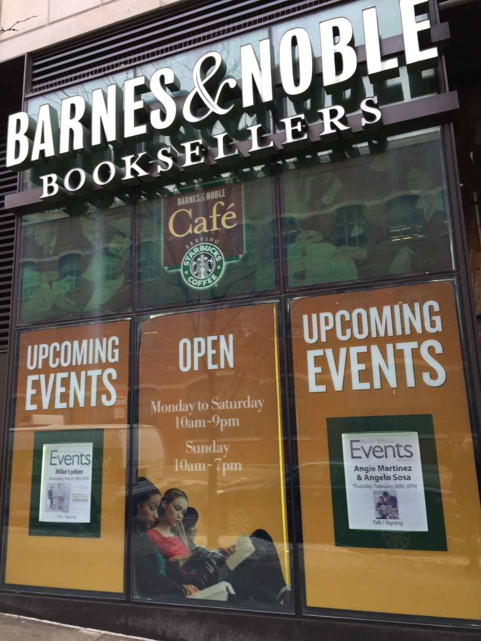
Final are mocked into place on facade
Here is a digital mock up of the store facade with the painting in place. Barnes & Noble is currently working on installation of the full size vinyl reproduction and I will post an update when I get pictures of it. It's kind of fun to know that thousands of people will enjoy my art on the streets of New York in the coming months and years.

Also, see a previous Barnes & Noble Project here

Wednesday, November 21, 2012

Turning Summer to Winter


On Sunday, the newspaper brought with it the new City Creek Center Holiday insert, so now that it is public, I figured it was time for me to claim credit. I was approached in late August to do illustrations for City Creek Center, the new multi billion dollar redevelopment project in downtown Salt Lake City, UT.

Concept art provided by the client
Of course I jumped at the chance since the mall and surrounding properties are practically in my back yard. The development spans multiple city blocks and there is a distinctive pedestrian bridge that connects it together. One of the images needed would showcase this architectural feature. the time frame and complexity of the architecture, as well as the continuity with existing City Creek advertising necessitated a much more Photoshop based approach than usual. I also would need to transform summer into winter, complete with twinkling lights and snow and decorations.

Left side of the panorama
Center section with sky cut out
Right side of the scene
I took the concept art from the client and took photos around the mall from which to work. I could not get the entire bridge panorama into my camera in one shot, so I pieced the three parts together using the photo merge utility, which us incredibly good at matching things up. I then adjusted exposures to get them all matching and then went to work painting over the entire scene.

City Creek Bridge- Final version

City Creek bridge starting point
Then came all the work of adding the holiday cheer to the scene. I added a nice moonlight sky and stars to the background, edited out the power poles and barricades, replaced all the people with bundled up shoppers, added all the garlands and trees and tossed in thousands of twinkling lights. I also added a generous sprinkling of snow on the ground and light flakes falling. By the time I finished, I had painted over and added textures to pretty much the whole scene. I like how it turned out, though it was not my traditional method of working. Bottom line was that the client was very pleased and that is what really counts.

Saturday, September 15, 2012

Change in the Weather


Well, if it seems like it has been a while since I posted anything, you would be correct. It is not for lack of interest or work. Believe me, I have been plenty busy, just not with the kinds of things one wants to be engaged in. A couple of months back, my wife and I got the news nobody wants and we have been waging a battle with cancer ever since. Amy gives her perspective on what we have been going through on her blog here. Needless to say, there has been a radical shift in perspective as I focus on the things that are most important right now which does not necessarily including regular posts on my blog. After countless doctor visits, tests and a couple of surgeries, things are settling into a routine that seems more manageable so I expect that blog posts will get back to normal in the near future. Amy is doing well and we are hopeful for a complete recovery. We feel blessed and are grateful for excellent medical care, the love and prayers of good family and friends and most of all for the blessings and mercy of a gracious Father in heaven. We feel the prayers of all those who have sent them heavenward in our behalf and I look forward to more regular blogging moving forward. This piece was painted in Photoshop for the upcoming December 2012 issue of The Friend magazine

Monday, April 16, 2012

Fruit Crate Detail


Just a detail shot of a work in progress. This is for a California fruit grower and will go on their packing crates. The rows between the trees still need some work, but the trees are finished. This is about a fourth of the overall piece. I'll show the finish when I wrap it up.

Tuesday, April 3, 2012

3 Hog Night


I was approached a couple of weeks ago by a group in Emory Texas about using a piece of my artwork I had originally done for the Dueling Banjo Pigs blog and exhibit. The Lake Country Neighbors hold an annual pig roast fundraiser for their local food bank and wanted to use a piece I had done on t-shirts promoting the event.

The original piece on which I based the shirt design

I offered to design the shirt for them and this is the result. The piece in question needed a little adjustment in order for it to translate better into silk screen and I added the typography as well. I removed the textures and flattened out the colors for a cleaner design. I think it will be fun to see it on the shirts and they will even be sending me enough for my family. Fun times! I hope they send me some photos of the actual event with people wearing my design.

Thursday, February 9, 2012

Olive Oil Label


Last fall I got the call to create an olive oil packaging label for a major big box club store. This sounded right down my alley, so of course I put forward my proposal.  The designer was a little cryptic about who exactly the client was (Sam's Club) until I landed the job a few days later.

Final Sam's Club Olive Oil label

The challenge with most packaging illustration is the fact that the art rarely gets to take center stage. I usually gets relegated to subordinate player with logos and product names front and center. For this one, I could have simply illustrated the perimeter, but I wanted to have a complete piece at the end and not just another illustration with the center missing. I chose to paint all the area behind the logo as well. I couldn't talk about it until now, but since the product in on shelves, I figure it is public knowledge. This one is painted in Photoshop.

Friday, February 3, 2012

Suspense


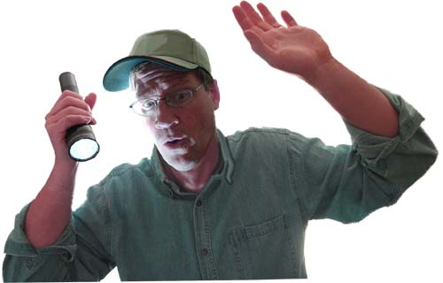
The Illustration Friday theme for the week is "suspense". I did this piece for a magazine article a couple of months ago. In the article, the father feels prompted to check on his young sons sleeping in the back of the camper truck while traveling on an early morning camping excursion. He finds them passed out from carbon monoxide poisoning, but they are revived because he listened to the prompting. The moment I chose to depict is that moment of suspense when the father doesn't quite know what is going on as he looks in the back of the truck. The light from the flashlight served to illuminate the bottom of this full page article. I cropped off the fade to white.


Once again, it's nice to have a willing model in a pinch as I used myself for this project. My indulgent wife shot the photos which I pieced together to get my photo comp from which to draw. This piece was painted entirely in Photoshop after I scannned in my drawing.

Saturday, November 19, 2011

Sam Weber Demo


Illustrator Sam Weber has become a household fixture in the industry in just six short years. Looking at Sam's work today, you would scarcely believe he spent the first couple of years of his career with relatively little work on the table, which makes his rise to success even more impressive.


Sam earned a BFA in Calgary, Canada where he met his wife artist Jillian Tamaki and continued on to earn an MFA at the School of Visual Arts in New Your City. He credits his time there with instilling within him a more independent attitude toward art. It also shattered some of his illusions about famous illustrators saying that living in New York rids you of being star struck pretty quickly.


A few weeks ago, I had the opportunity to meet Sam and see him work during his visit to Brigham Young University where I teach. He shared many words of wisdom with those in attendance as well as a  wonderful demonstration of his working process.


Sam Begins by sketching out his ideas and then gathers reference material from a variety of sources. He stressed the importance of creating your own reference in order to control your vision. He frequently brings professional models into his Brooklyn, New York studio to shoot, ensuring that he gets exactly the pose and details he wants. Once the drawing is established, he uses a graphite transfer method to get the drawing onto his painting surface.


Weber prefers painting on Fabriano 300 lb. hot press paper. He likes the smooth surface and ability to remain relatively flat even during successive washes of wet paint without stretching. Because Weber's work frequently requires large areas of white or nearly white paper, he masks off these areas using a high tack frisket film. Sam likes to build up areas of color and value slowly using multiple washes of very thin acrylic in a watercolor style. His paint of choice is Golden Fluid acrylic paint since it requires less dilution to it reduce to the consistency he likes.


When building up value and texture, Sam employs many different tools to achieve organic results.He has a collection of natural sponges that he uses and also likes to press a sheet of Plexiglass into a wet wash to get random textures. Weber continues glazing wet into wet and building up values that retain soft edges and textures.As he gets more layers built up, the paint becomes dryer and he scumbles the paint more.


Throughout the demo, Sam threw out advice and hard gained wisdom to the group He said the sketching process is his favorite part because that is when all the potential still exists. The excitement swells and then sinks to uncertainty in the middle and then settles into relief at the finish when it all works out. Weber advocates setting aside time for personal work as the most interesting leaps and growth come from exploration.


After a little more than two hours of building up the acrylic washes, Sam then shifted to Photoshop for the finishing touches which is how he finishes nearly all his work. He scanned the image full size at 700 dpi. Using multiply layers, he continues with digital glazes of color to refine the value patterns and sharpen edges. Color dodge was used to achieve highlights toward the end. This was a fairly simple subject, so there were not a lot of tricky digital effects, but Sam will employ various selections and quick masks in order to get the effects he wants.


Of the first couple of dry years, Sam said that it was only when he shifted his subject matter to be more accessible that he became popular. He likened it to two slightly overlapping circles. In one is the work you like to do. The other contains what people want. Within the space that overlaps lies the work that you should pursue. Weber advised students to create an entirely new portfolio every six months stressing that illustration is not a part time job and that you may never feel ready to begin an illustration career- this is normal. Proceed as planned. It appears to me that Sam Weber is proceeding very nicely.

Thursday, November 10, 2011

Shane Jackman CD Cover Art


Cover for Shane Jackman's new album "Peace"

I have always loved the peaceful silent nature of new fallen snow. My musician friend Shane Jackman and I have wanted to collaborate on a project for some time. I finally got the chance to do a piece of cover art for one of his albums, so here is a sneak peek. After concept discussions for the cover of this album, we settled on the idea of a peace sign pressed into a snowy hillside at evening. Shane is crafting this recording to appeal to all denominations as more of a holiday album but it will have songs that are obviously Christmas themed. The bright star in the sky stands as a little reminder of that. Shane is an incredibly gifted singer and songwriter and I am excited to be a part of this package. The album will be simply titled "Peace" and will have a mix of original Christmas and holiday themed tunes as well as a few traditional carols Shane has arranged.

Check out Shane's website here

Thursday, September 29, 2011

New T-Shirt Design


I volunteered to do the T-shirt design again for my son's varsity swim team this year. Apparently the previous design I did for them was such a hit, I  became top choice for the new one. The captains were great art directors and after a little concept direction, I pretty much got to come up with the entire design. It had to be simple and one color since budget did not allow a multiple color design. I also had to limit the time I could spend since it was a pro bono job (what we don't do for our kids, huh?). It's sort of fun to do these things though and get the reaction from the kids as well as see everyone wearing them around the school and at meets. This was all done in Photoshop.

Tuesday, September 13, 2011

Will Terry Photoshop Painting Video


Check out Will Terry's new Photoshop Painting tutorial on Folio Academy. This one really rocks. Will is a very talented illustrator specializing in children's books. He'll take you all the way through his Photoshop painting process from sketch to full color and teach you a bunch of techniques along the way. Check it out as well as all the other great tutorial videos on Folio Academy.com.

Monday, July 18, 2011

December Boys' Life Cover

Boys' Life Magazine cover- 9.5x' x 12" Digital

I just finished uploading this image to Boys' Life for the December 2011 cover. I already posted the other two illustrations for this project here and here. I had a soft deadline on this since it won't publish until December and my procrastination skills meshed with other deadlines to delay finish. I left this one until last partly because I knew I would want more time on it and partly as a delay tactic hoping that along the way I would magically get better at Photoshop. Well, I actually think that I did get better. In between the first two pieces and this one, i had a series of pieces with short deadlines that forced me to work quicker and more efficiently. As a result, when I returned to this piece, I felt like I had new skills and processes to draw upon and I think this is a stronger piece as a result.

Thursday, July 14, 2011

Dangerous Snake

Exaggeration is to paint a snake and add legs.
-Chinese Proverb

Just finished this piece for a magazine story where a Man and his boys are out gathering firewood but lose their keys. I am continuing with my pursuit of some semblance of Photoshop painting proficiency. I feel more successful with each finished project, so I think I am almost where I want to be.  I doubt anyone can master all the nuances of Photoshop but at least I am getting comfortable with the tools I need to paint a pretty good picture.

Tuesday, July 12, 2011

Reaching


The man who never in his mind and thoughts 
travel'd to heaven is no artist.
-William Blake

Thursday, June 23, 2011

A Warm Gesture

Spot illustration for Boys' Life- digital

Here's the finished spot for the Boys' Life project I have been working on. It is the final piece in a historical fiction story about an orphaned boy who arrives at his aunt and uncle's ranch in the high Sierra mountains just in time to rescue them from a Christmas Eve blizzard. The gestures here assure the boy that he is both welcome and loved. Once again, all digital (except for the under drawing). Each successive piece I do digitally brings more confidence and comfort with the process. I hope the results are showing this as well. 

Wednesday, June 15, 2011

Christmas Gifts Spread-Finished


Just finished up this one for Boys' Life magazine. Once again, this is painted in Photoshop and I am continuing to enjoy experimentation with brushes and textures to make this match my traditional acrylic style. I posted the final drawing earlier here. Now on to the cover illustration and spot for this same article.

Tuesday, May 31, 2011

Painting With Texture in Photoshop


I recently learned how to import my own gesso texture into Photoshop and paint with it (see previous post here for full image). Some of you Photoshop pros are now saying something like "well, duh", but for me it was a big step forward. It's also much easier than I thought it would be. I am working with Adobe CS4, so I don't know how closely the following applies with newer or older versions.
STEP ONE was to chose a gessoed masonite panel- the type I usually prepare for my oil and acrylic paintings. I took black acrylic paint and with a sponge, worked paint down into the textured surface. I wiped most of it back out with slightly damp paper towels so that the deep texture retained the paint but most of the high texture peaks were wiped clean. I then scanned this 8" x 10" panel on my flatbed scanner at 600 dpi.

detail of my gessoed texture

With this scan now open in Photoshop, I adjusted the levels to exaggerate the contrasts a bit, pushing the darks and lights further apart. Next, under the EDIT tab at the top of Photoshop, scroll down to DEFINE PATTERN and click it. A box will come up with a thumbnail of your new pattern and a prompt to name it. Click OK and your pattern is now saved in the textures section of your Brushes Palette. To paint with this new texture, simply open the brushes palette and check the texture box. Click the word TEXTURE and your current selected texture will show up. To the right of your texture thumbnail is a small arrow pointing down. Click it and the textures in this palette will pop open. Your newly scanned texture will be at the bottom of the list. Select it and you are ready to paint with it.


Things to keep in mind when painting with texture:
If you want your texture to echo exactly what you have scanned and mimic a real gessoed board, DO NOT CHANGE THE SCALE SLIDER after you begin to paint. If you do, the size of your texture will not be consistent across the canvas.
You can choose to paint either the highlights or the valleys of the texture by leaving it NORMAL or by selecting INVERT. Normal will paint the "high" points of the texture much as with drybrushing and if you select invert, the paint will fill in the low points of the texture and leave the high spots relatively paint free. I found this to be very effective when I wanted to "glaze the shadows" without killing my texture. Keep in mind that when switching back and forth between the two, it is easy to forget and you may end up painting your highlights in the depths and the shadows on the peaks of the texture. I decided that INVERT would be for darks and normal would be for lights, so I could keep it straight in my mind.
Also, the depth slider allows you to determine how prominent or subtle you want the texture to appear. I found I liked the texture depth at about 70-75%. Using the OTHER DYNAMICS setting in the brush palette also is incredibly useful in order to take full advantage of your Wacom tablet capabilities, as it allows for softness at the edge of brush strokes, but that is fodder for another post. I hope this makes sense. if you have any questions after having tried this out for size, just shoot me an email or comment.

Wednesday, May 25, 2011

Angler Fish Goes Green- Color

Angler Fish Goes Green- 7" x 6" digital

A while ago I posted a drawing from my sketchbook of this eco-conscious angler fish. My initial intention was to paint it traditionally like my Cat-Fish and Dog-Fish pieces, but I decided to paint it in Photoshop instead. I give myself projects to create digitally in order for me to continue to improve and increase my digital skills. I learned something very helpful from my friend and fellow illustrator Will Terry about how to mimic my painting textures digitally. He coached me through creating a texture using the Define Pattern tool  under the Edit tab in Photoshop.


I know there are probably a few people out there saying "how in the world did you not know that?", but it was an important revelation for me and I think it will change the look of my digital work for the better. It allows me to use digital versions of my own painting textures to give my illustrations a more random and organic look. I'm pretty excited about it. If enough people are interested, I'll do a little step by step sometime to show you what I have learned. I'll be using this as a self promotional piece.