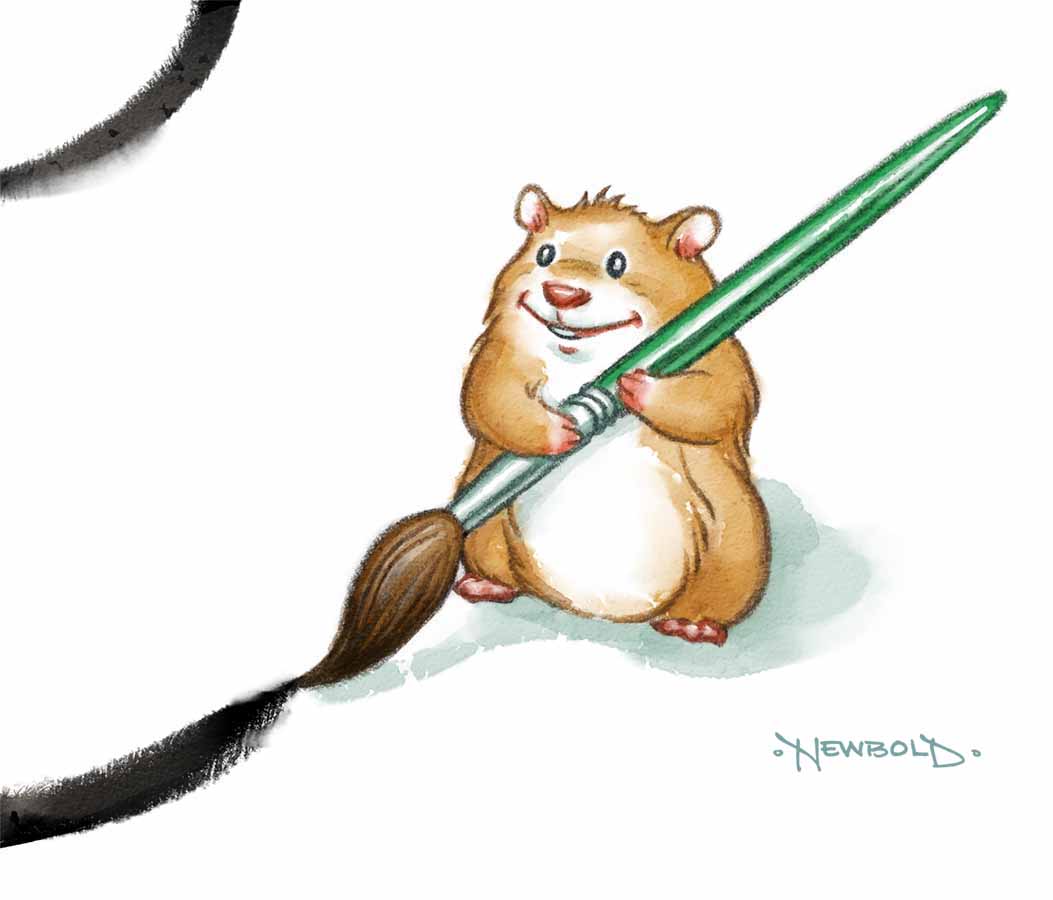
The following is an interview I did with Howard Lyon for Muddy Colors regarding the creation of our new book If Picasso Painted a Snowman. Thanks Howard for permission to repost it here!
My friends Amy and Greg Newbold have recently collaborated on a book called If Picasso Painted a Snowman. I think this is the first children's book that I have ever reviewed on Muddy Colors (I hope it isn't the last, there are so many great picture books out there). I happened to stop by Greg's house on the same day received pre-release copies of his book (I was there to pick up some black walnuts, he has a GIANT giving tree that I believe, without exaggerating, will let me produce about 30 gallons of ink).
This a wonderful book! Many of the readers of MC have kids or are aunts and uncles. This book is for you and yours (I'm including an Amazon link here and at the end of the interview). It is a great introduction to a large variety of artists and their work, but also opens up the imagination to all the possibilities of different artists paint, but also how different thinkers might approach the same challenge.
I asked Greg and Amy if I might interview them for MC. Here goes!
Where did the idea for the book come from?
It all started several years ago when my wife Amy visited Paris with her sisters on a girl’s trip. During a visit to the Picasso Museum she asked the question “What would it look like if Picasso painted a snowman?” She envisioned a book that would teach kids about significant artists and art movements in a fun and engaging way. Honestly, it was to be the book that we could never find for our kids in all the years of taking them to museums. For several years she polished the manuscript, we showed it around and reworked it. Nobody caught the vision of what we wanted to do until Tris Coburn at Tilbury House Publishers in Maine bought our pitch.

What was the most challenging part of creating illustrations in the styles of such a variety of artists?
Since I was young, I have always enjoyed the challenge of learning new styles or techniques. Like most budding artists, I started by trying to copy other artists’ work. In high school I did Prismacolor replicas of album covers and copied drawings from guys like Frank Frazetta and the Hildebrandt brothers. I sold some of them for ten or twenty bucks. Once in college I had the legitimate option of creating an old master copy painting instead of writing a paper. My professor told me my Van Gogh was the best copy she had ever seen because I tried so hard to get the materials and surface texture correct.
Because I like to experiment with new materials and processes, I also find it very instructive to paint these master copies. Studying and trying to recreate the works of great artists allows you to deconstruct and learn from the masters and it’s something I have done on and off over the years. This book gave me the opportunity to learn about the materials and processes of seventeen different artists. Some of those chosen for the book were quite familiar, as I had studied the likes of Grant Wood and Van Gogh. Others Like Jacob Lawrence and Sonia Delaunay were previously unknown to me.
I dug into their processes online and tried to find books that described the way they worked and what materials they used. My goal was to mimic each artist’s materials and process as much as was practical. Of course there are new materials available today and the time crunch I was under forced me to make some adjustments. For instance, the Roy Lichtenstein piece was created digitally as I had neither the time or inclination to figure out where to screen print it and there was no way I was going to get the Ben-Day dots right painting it by hand. Also, scale was sacrificed on a number of pieces.
The J.M.W Turner painting I made is a miniature compared to most of his other pieces as is the Georgia O’Keeffe, who also typically worked much larger than I could justify. Sometimes materials had to change. For instance I painted the Grant Wood in acrylic rather than oil. It was a speed issue and I rationalized that Wood painted his oils using layers of crosshatch anyway, so the result was very similar.
Is there one that you enjoyed the most or least?
Honestly, this entire project was a dream to work on. It was just so fun to try new things. I learned how to make a direct drawing monoprint for the Paul Klee piece, played with gold leafing for the Gustav Klimt painting but the most fun was probably the Jackson Pollock painting. I went all in to figure out what he was all about. I had previously read Tom and Jack: The Intertwined Lives of Thomas Hart Benton and Jackson Pollock by William Taylor Adams and I was totally intrigued by Pollock.

As a young artist I scoffed at Pollock thinking that it was just a bunch of random drips on canvas, but as I dug deeper, I began to understand what his “action paintings” were all about. Also, watching the ten-minute documentary filmed in 1951 by Hans Namuth was helpful. In the film, Pollock is seen painting outside and his voice narrates the process. I purchased a large-ish piece of raw linen and several quarts of Pollock-esque colored latex paint for the painting, forgoing the oil enamel Pollock preferred in the name of practicality. I used sticks and hard brushes to drip and fling the paint while walking all around the perimeter just as Pollock did in the film (minus the cigarette and discordant music). It was a little windy and I even had some grass and sticks get embedded in the painting. It was so much fun, there are plans for a Pollock party to let some of our friends create their own “Jackson Pollock”.


What is your hope/goal for this book?
As I mentioned at the outset, this is the type of book we wished we could have found for our kids at one of the many museums we dragged them to. We tried to put across the idea that the possibilities are endless when creating art and that you should not be intimidated or limited by what some people perceive as “rules”. There is no right or wrong way to create art, simply techniques that either allow or prevent you from achieving the vision you have for your art.
We have tried hard to make it more than just an overview of different art styles. With it’s simple text, it also reads as a nice bedtime story, hopefully appealing to fans of snowman books, gift books, or art books in general. There are enough inside jokes to appeal to adults as well. At the end of the book we have also included expanded bios and art making tips. We hope that parents, teachers and children embrace this book as permission to explore art with freedom and joy.
Are there artists whose work you didn't imitate but you would have liked to?
There are too many to count. Luckily we are in negotiations with our publisher to create a follow up book, so hopefully I’ll get to play with another batch of styles with that project.

How did you decide what artists to include?
With so many artists to choose from, it became a question of which ones would be recognized, which ones would add variety and touch on major movements and also which ones whose styles I felt confident enough to try to mimic. We also tried to choose artists that we were fairly sure never painted a snowman. Some artists did not make the cut for one or more of those reasons. We also tried to include a variety of artists including women and ethnically diverse painters. Knowing the overwhelming majority of dead white European artists that crowd the annals of art history, we knew it was impossible to give any sort of equality of diversity to the group, so we did our best and focused on the overall variety in the book.
What other books or projects would you like the audience to know about that you have been part of?
This year was crazy in that I have never had two new picture books released in the same year, let alone create all the art in that same year. I did all the art for If Picasso Painted a Snowman from January to March and then all the art for The Little Match Girl (coming from Shadow Mountain October 17, 2017) from April to mid July. In the past, I would have shied away from both of those time frames, but I’m at a point now where I have enough confidence to just say yes and figure out the logistics later.
In my twenty plus years as a full time artist, I have worked for most of the large New York publishers and have been fortunate to have my work accepted into all the major juried illustration shows over the years including, Society of Illustrators, Communication Arts, Spectrum, AIGA and Society of Illustrators, Los Angeles. I’ve also done quite a bit of advertising work for clients like Fedex, American Express, Smuckers, Heinz and the like.
My friends Amy and Greg Newbold have recently collaborated on a book called If Picasso Painted a Snowman. I think this is the first children's book that I have ever reviewed on Muddy Colors (I hope it isn't the last, there are so many great picture books out there). I happened to stop by Greg's house on the same day received pre-release copies of his book (I was there to pick up some black walnuts, he has a GIANT giving tree that I believe, without exaggerating, will let me produce about 30 gallons of ink).
This a wonderful book! Many of the readers of MC have kids or are aunts and uncles. This book is for you and yours (I'm including an Amazon link here and at the end of the interview). It is a great introduction to a large variety of artists and their work, but also opens up the imagination to all the possibilities of different artists paint, but also how different thinkers might approach the same challenge.
I asked Greg and Amy if I might interview them for MC. Here goes!
Where did the idea for the book come from?
It all started several years ago when my wife Amy visited Paris with her sisters on a girl’s trip. During a visit to the Picasso Museum she asked the question “What would it look like if Picasso painted a snowman?” She envisioned a book that would teach kids about significant artists and art movements in a fun and engaging way. Honestly, it was to be the book that we could never find for our kids in all the years of taking them to museums. For several years she polished the manuscript, we showed it around and reworked it. Nobody caught the vision of what we wanted to do until Tris Coburn at Tilbury House Publishers in Maine bought our pitch.

Since I was young, I have always enjoyed the challenge of learning new styles or techniques. Like most budding artists, I started by trying to copy other artists’ work. In high school I did Prismacolor replicas of album covers and copied drawings from guys like Frank Frazetta and the Hildebrandt brothers. I sold some of them for ten or twenty bucks. Once in college I had the legitimate option of creating an old master copy painting instead of writing a paper. My professor told me my Van Gogh was the best copy she had ever seen because I tried so hard to get the materials and surface texture correct.
Because I like to experiment with new materials and processes, I also find it very instructive to paint these master copies. Studying and trying to recreate the works of great artists allows you to deconstruct and learn from the masters and it’s something I have done on and off over the years. This book gave me the opportunity to learn about the materials and processes of seventeen different artists. Some of those chosen for the book were quite familiar, as I had studied the likes of Grant Wood and Van Gogh. Others Like Jacob Lawrence and Sonia Delaunay were previously unknown to me.
 |
| Grant Woods Snowman - The stern coal mouths are perfect |
 |
| Roy Lichtenstein Snowman - I love this one! |
 |
| Georgia O'Keefe's snowman is beautiful. |
Honestly, this entire project was a dream to work on. It was just so fun to try new things. I learned how to make a direct drawing monoprint for the Paul Klee piece, played with gold leafing for the Gustav Klimt painting but the most fun was probably the Jackson Pollock painting. I went all in to figure out what he was all about. I had previously read Tom and Jack: The Intertwined Lives of Thomas Hart Benton and Jackson Pollock by William Taylor Adams and I was totally intrigued by Pollock.

As a young artist I scoffed at Pollock thinking that it was just a bunch of random drips on canvas, but as I dug deeper, I began to understand what his “action paintings” were all about. Also, watching the ten-minute documentary filmed in 1951 by Hans Namuth was helpful. In the film, Pollock is seen painting outside and his voice narrates the process. I purchased a large-ish piece of raw linen and several quarts of Pollock-esque colored latex paint for the painting, forgoing the oil enamel Pollock preferred in the name of practicality. I used sticks and hard brushes to drip and fling the paint while walking all around the perimeter just as Pollock did in the film (minus the cigarette and discordant music). It was a little windy and I even had some grass and sticks get embedded in the painting. It was so much fun, there are plans for a Pollock party to let some of our friends create their own “Jackson Pollock”.


What is your hope/goal for this book?
As I mentioned at the outset, this is the type of book we wished we could have found for our kids at one of the many museums we dragged them to. We tried to put across the idea that the possibilities are endless when creating art and that you should not be intimidated or limited by what some people perceive as “rules”. There is no right or wrong way to create art, simply techniques that either allow or prevent you from achieving the vision you have for your art.
We have tried hard to make it more than just an overview of different art styles. With it’s simple text, it also reads as a nice bedtime story, hopefully appealing to fans of snowman books, gift books, or art books in general. There are enough inside jokes to appeal to adults as well. At the end of the book we have also included expanded bios and art making tips. We hope that parents, teachers and children embrace this book as permission to explore art with freedom and joy.
 |
| After reading the book, I want to draw a Caravaggio/Bouguereau/Waterhouse/Watterson/Frazetta snowman! |
Are there artists whose work you didn't imitate but you would have liked to?
There are too many to count. Luckily we are in negotiations with our publisher to create a follow up book, so hopefully I’ll get to play with another batch of styles with that project.

How did you decide what artists to include?
With so many artists to choose from, it became a question of which ones would be recognized, which ones would add variety and touch on major movements and also which ones whose styles I felt confident enough to try to mimic. We also tried to choose artists that we were fairly sure never painted a snowman. Some artists did not make the cut for one or more of those reasons. We also tried to include a variety of artists including women and ethnically diverse painters. Knowing the overwhelming majority of dead white European artists that crowd the annals of art history, we knew it was impossible to give any sort of equality of diversity to the group, so we did our best and focused on the overall variety in the book.
 |
| Gustav Klimt Snowman. Beyond the theme of the book and Klimt's style, this is a touching painting! |
This year was crazy in that I have never had two new picture books released in the same year, let alone create all the art in that same year. I did all the art for If Picasso Painted a Snowman from January to March and then all the art for The Little Match Girl (coming from Shadow Mountain October 17, 2017) from April to mid July. In the past, I would have shied away from both of those time frames, but I’m at a point now where I have enough confidence to just say yes and figure out the logistics later.
In my twenty plus years as a full time artist, I have worked for most of the large New York publishers and have been fortunate to have my work accepted into all the major juried illustration shows over the years including, Society of Illustrators, Communication Arts, Spectrum, AIGA and Society of Illustrators, Los Angeles. I’ve also done quite a bit of advertising work for clients like Fedex, American Express, Smuckers, Heinz and the like.