Showing posts with label Greg Newbold Illustrator. Show all posts

Wednesday, March 8, 2017

Here's the Scoop!


I am pleased to be working with Pioneer Theater Company again this year after a single season gap. I have done probably close to twenty posters for their various productions over the years reaching back to very early in my freelance career. It's always a pleasure to create new work for stage productions and I look forward to it whenever I get the chance.

This year's assignment happens to be for the musical version of Newsies. I admit I have never seen the film but I am looking forward to seeing the stage version later this year.  Here's some of the process.

Theater provided this photo as direction
The theater provided me with an historical photo of a newsboy that they thought had the feel they were going for and I in turn found a few more that I felt added a little more of the feel I wanted.


Since the intent was clear as far as the pose, I did something I don't normally do which is bypass the rough sketch and go straight to the photo shoot. Two willing neighbor boys, with the help of their mom, who held the lights for me were my models.


They did a great job and I ended up combining details from both of their shots to come up with my drawing.


After some consultation with the client, I was asked to make the boy look a few years older. I stretched out his face, gave him more of a jawline and beefed up his shoulders and arms a bit to age him to about fifteen rather than the younger age of my models.


The background was composed of actual newspaper articles from the 1899 newsies strike. I composited them  and changed a couple of the headlines to match the director's requests.

Overall, I am pretty pleased with the result. Physical drawing was scanned and painted in Photoshop and the entire background was composed digitally also with hand made aged paper textures. Total working time was about two and a half days.

Tuesday, February 28, 2017

If Picasso Painted a Snowman- Progress Update


If you follow me on Facebook or Instagram (yes, I have finally joined the Insta crowd) you have already seen some of this work, but for everyone else, here's a little update. If Picasso Painted a Snowman was written by my wife Amy after a visit to the Picasso museum in Paris where she wondered what a snowman painting by Picasso might look like.

Picasso's Snowman- By Greg Newbold
That thought generated the idea for the book and expanded to ask the same question about more than a dozen other artists. What might all these snowmen look like? Well, this book answers all those tough questions! At least it will answer the question of how I might paint a whole bunch of snowmen, attempting to do so in the style of each of the artists mentioned in the book. It's been so much fun to work with Amy to make her vision of this book a reality.

Mondrian's Snowman- By Greg Newbold
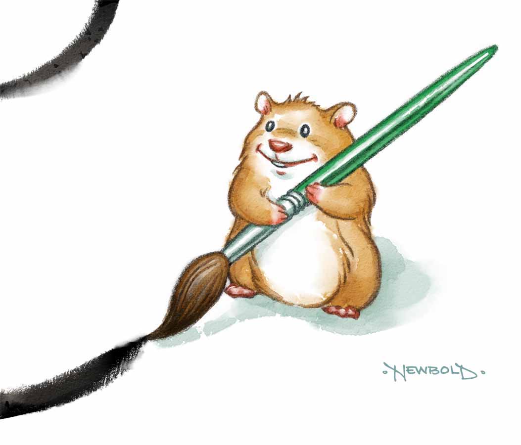
If you don't like snowmen, we have thrown in a cute hamster to act as museum guide. This book has been a blast so far and also a lot of stress. The timeline for production has been compressed to just over two months painting time. I did all the sketches in early December and then had to bust out a big project that took the better part of a month. I'm scrambling to get all the paintings done and hopefully do them justice. You can't imagine how challenging (and fun) it is to change stylistic gears every painting unless you have attempted it. Switching gears each piece has required a lot of homework. I have studied up on the materials and techniques of each of the artists before painting each piece.

Pollock's Snowman- by Greg Newbold
Some concessions have been made for each piece for practicality or necessity. The time crunch is a factor here. For instance, Jackson Pollock used an oil based house enamel called Duco for his paintings. I opted for  a more affordable and faster drying latex house paint.

O'Keefe's Snowman- by Greg Newbold
Georgia O'Keefe created her works at a monumental scale. Covering so much real estate was not in the cards on this deadline, so I painted my version about fourteen inches high rather than four feet.

Lichtenstein's Snowman- by Greg Newbold
My version of a Roy Lichtenstein snowman was created digitally. I saw no other practical way to create the Ben Day dot patterns by hand and I think the digital version looks adequately passable. The cover and all the little hamster character spots are black Prismacolor drawings. I then scan them into Photoshop and color them using some awesome watercolor Photoshop brushes from Brandon Dorman.


I'm pleased how much these brushes and textures look like hand done watercolor. I continue to be impressed with the increasing pace of digital artists' ability to make pixels look and behave like natural media. Click in the photo to see the texture a little closer. and click Brandon's link above to get your own set. I am now over halfway done with the project but the next few weeks will be a real challenge, as I have a couple of other assignments in the hopper also. I'll post more as I get closer to finishing this.

The book will be released this fall through Tilbury House Publishers, just in time for Picasso's birthday and all your Christmas giving!

Follow me on Instagram

Monday, November 28, 2016

Rejected...Oh Wait...Accepted!


I recently got word that three of my pieces have been accepted into the Society of Illustrators Los Angeles Annual Illustration Show. This welcome news comes on the heels of complete rejection at the NY Society of Illustrators just a week ago.


While I am always disappointed whenever my work doesn't get accepted in any particular show, I have resigned myself to the fact that any given juried show is highly subjective. Different juries have different tastes and I have absolutely no control over their opinions. These same pieces were ignored in New York while making the cut in L.A. Go figure. But this is not an uncommon scenario and other artists have voiced the same frustrations. Rejection even varies from year to year in the same competition. I have had a piece get the ax two years in a row and then win an award on the third attempt. I have diligently tried to brush off the numerous rejections over the years, Though it never feels good, I have stopped moping around for days on end feeling sorry for myself. In fact this year, for several days I didn't even mention the NY snub to my wife and then, it was only in passing. This new maturity level made the acceptance in L.A. feel a little more satisfying. I think that these competitions with their frequent rejections and occasional successes are a microcosm for life. I have over the years started to worry less about stuff that is beyond my control and focus more on things that I might actually be able to do something about. Things like doing my best work, working hard as well as smart and shutting down shop to be with family more often.


There is a great line from the film "Bridge of Spies" in which the convicted KGB spy Rudolf Abel, played brilliantly by Mark Rylance, is asked if he is worried. He replies "Would it help?" I'm learning to let stuff go when worrying about it won't help. Maybe I am finally learning to be a grown up.

Previous posts about this project can be seen here, here and here.

Thursday, September 1, 2016

King George III for Scholastic

King George III for Scholastic By Greg Newbold
Earlier this year I did a cover and interior spot for one of Scholastic's news publication. If you remember from elementary school, they are the little folded educational paper flyers that came about every two months or so with all sorts of interesting classroom articles and games. I have done a few things for them in the past including one on Ben Franklin and they are always fun projects.

Cover Rough #1
This one featured the Declaration of Independence and they wanted a portrait of King George III reacting to news that the colonies had broken free. One of the biggest problems with historical recreations is that there aren't any photos. I had to rely on old paintings to come up with somewhat of a likeness.

Cover Rough #2
When my first two takes on what the cover would look didn't quite fit the editors' vision, it was finally decided that they really wanted me to riff a political cartoon from the era.

Period Political Cartoon of George III
I was asked to pretty much mimic the expression and exaggeration from the original cartoon, but obviously handle it in my own style and this is what we ended up with. Digital technology made it possible for me to take a photo of one of the original prints of the Declaration and warp it to fit my illustration. I'm pretty pleased with how it turned out and so was the client. Thanks to Sandy Mayer at Scholastic for running interference when needed and giving encouragement at that moment of hair pulling. Always nice to work with a great art director.


There was also an interior spot of colonists celebrating the news which actually took more time and work than the cover, but oh well. that's how assignments go sometimes and often you don't realize what you have bitten off until you start chewing. All in all, I am happy how it turned out as well.

Tuesday, August 9, 2016

Murder at the Male Revue


I just finished up the cover for the third book in the Bucket List series by Elizabeth Perona. The novels feature a sixty something group of friends who become involved in solving murder mysteries. The first two covers, Murder on the Bucket List and Murder Under the Covered Bridge can be seen here and here.

Murder at the Male Review- Cover by Greg Newbold-Digital
This particular story revolves around a murder that happens during a blackout at a society ladies' fund raiser which features Chippendale style male dancers. The editors wanted to highlight a particular slapstick moment that happens right before the blackout in which a cherry cobbler is spilled, tables are toppled and the slip and slide action literally leaves Francine left holding the beef.


I always feel it is my duty to give at least one alternative solution, which I did with a more dramatic angle of one of the dancers holding the murder weapon behind his back. I admit I didn't have time to read the entire manuscript before the deadline, which I often like to do, so I don't know whodunit.


As often happens, the editors opted to continue with the original idea, which I was fine with. After taking a bunch of photos to get a better grip on lighting and anatomyI created a final drawing and moved ahead to the final color art.  As you can tell from my rough sketch, working out roughs without photos can lead to proportion and other issues, but I think I get better design and flow that way, so I always do initial roughs out of my head or with minimal reference. I just like to get my ideas down and establish the mood and overall design. The finished piece was painted in Photoshop over the full value graphite drawing.

Tuesday, July 26, 2016

Farm Panorama Reveal

Crop of the large  BioMerieux panorama- by Greg Newbold
The client from my recent great advertising project as seen in the previous two posts here and here can finally be revealed. The company that chose me to create all this goodness is called BioMerieux, a French based multi-national corporation with a US division that specializes in testing for biological pathogens.

The Poultry Farmer stand alone image
My particular set of illustrations is for a testing machine and process called Gene Up that tests food products before they go out to market to make sure they are safe and free from any food borne pathogens or contamination. I know, exciting stuff, right? Their previous advertising and that of all their competitors has historically been dominated by photos of dudes in lab coats looking through microscopes and similarly boring imagery. I am hoping that the imagery will soon filter into their website, but print and trade show applications are in full swing.

Left side crop of the panorama
I think it will be refreshing to see something different and unique in this industry. I believe the response will be a very positive one for BioMerieux, one that will definitely distinguish them from their competitors. These illustrations will debut at a large trade show coming up this week, so I am excited to see how my imagery will be used in the BioMerieux booth space and hear how it is received.
Full Panorama size is 37.5 inches wide at 400 dpi!
The giant panorama will dominate the backdrop of the booth and the other images will also be used at large size. The kicker will be a twelve foot circle of sky suspended above the whole setup, Sounds cool, I can't wait to see pictures. Anyway, there you have it.


The final reveal from the best project of the year, or recent years, for that matter. Thanks BioMerieux, as well as Preston Wood and Kim Sorrentino at Love Communications for making this project such a pleasure to work on. Knock 'em dead at the show!

Wednesday, July 13, 2016

More From the Farm


Last post I mentioned that my recent huge project included nine pieces, well, here are three more to enjoy. I had a blast working on these and think they turned out especially nice.


Once again, these are for a multi national company in a field where the pictorial and advertising norm includes dudes in lab coats looking very stuffy as they gaze into microscopes and stuff like that. I am fairly convinced that this approach will garner more notice than their competitors.

Thursday, July 7, 2016

Down on the Farm


I have just wrapped up a huge advertising illustration project for a multi national company and thought I would give a sneak peek at the results. This has been a very fun and satisfying set of paintings for me. The agency asked that I leave the actual client anonymous for a bit longer, until the launch at the end of the month, but I got the OK to show some of the art.


Once again, these are all digital painted over full graphite drawings. I have enjoyed this project as much as any I have done in the last couple of years. Thanks to Love Communications for the project and for being so great to work with.

Sunday, January 31, 2016

Ben Franklin for Scholastic

Ben Franklin, Inventor by Greg Newbold
In the last few months I have done several jobs that I couldn't show immediately and this one for Scholastic's Science Spin was one of them. I got the chance to do one of the classic inventors and statesmen in American history, Benjamin Franklin. When I was in elementary school, I loved the Weekly Reader and other publications from Scholastic and now I get to work with them. This project involved a cover depicting Ben along with of several of the things he invented, namely, The gas street lamp seen out the window, a book grabbing tool, the famous "Franklin Stove", bifocal glasses and one that didn't catch on. In case you can't locate this lesser known invention in the picture, Ben is sitting in a chair that he engineered with a foot pedal powered flapper that would move the air above his head to shoo away flies while he was reading. Needless to say, it didn't catch on.

Ben's Lightning Rod- by Greg Newbold
The interior article illustrates a live demonstration of his lightning rod, a concept that all modern lightning rods are based on. Not only was Franklin a great inventor, he was a writer, printer, theorist, statesman and diplomat, along with being a signer of the Declaration of Independence. I had a great time working on this, and I'm currently working on another similar project for Scholastic that, of course, I will show at a later date when it is published.

Monday, January 11, 2016

At Night In Tribeca


"One belongs to New York instantly.
One belongs to it as much in five minutes as in five years." 
-Tom Wolfe
Anyone who has been to New York knows that evening can be a vibrant and fun time to hit the town. I'm pleased to have my work add to the enjoyment of a night out in the Big Apple, so here's a little show and tell. I couldn't resist sharing this shot of the window mural I did for the Tribeca Barnes & Noble store all lit up for the evening. If you get a chance to drop by the store, check out my contribution to the New York City scene!

Read all about the Tribeca mural project here

Wednesday, December 30, 2015

Ed Eyestone For BYU Magazine


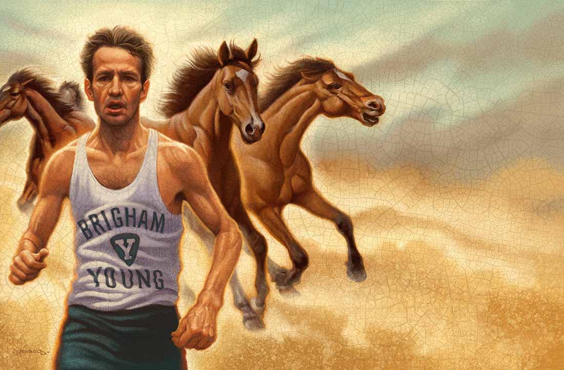
I finished these three pieces up a few weeks back for BYU Magazine to accompany an article by All American and Olympic runner Ed Eyestone.


First concept for opener
Eyestone shares several life lesson anecdotes in the article including the time when he gave his last ounce of energy during a race and collapsed short of the finish line.  His coach told him that he had "run like a horse" meaning that a horse will run until it collapses and never gives up simply because the task is too hard.

Final Drawing
A mule on the other hand, will simply stop and refuse to continue on when it tires, despite prodding. He had pushed himself until he dropped and that made his coach proud. This experience was the inspiration for the opening spread.

Another spot dealt with Eyestone's interaction with the team trainer when as a freshman, he wanted the same post workout massage as the senior runners. The Finnish trainer said "you don't waste the black powder on the small birds" but then relented and treated him the same as the rest of the team. This experience taught him that everyone is important.
The final spot dealt with how small things can help you reach your goals. Kyle perry had set the goal to run a sub four minute mile and then concentrated on all the small things that would help him reach his goal, including a strict training regimen and diet and focusing on a list of ten small things he would do every day as he trained. He dropped from a 4:05 to a 3:59.16. Concentrating on the small things had helped Perry reach his goal.

All pieces were drawn first in graphite and then scanned and painted in Photoshop. Handmade crackle texture was added at the end.