Wednesday, December 7, 2016

Henry Patrick Raleigh- Serious Drawing Skills


Just in time for Christmas, Auad Publishing has unveiled a new book that would make Jay Gatsby drool. In keeping with the long tradition of fantastic books from Manuel Auad, comes Henry Patrick Raleigh-The Confident Illustrator.


This coffee table worthy volume is printed in glorious full color despite the fact that much of Raleigh's work was black and white or limited in it's color range. The extra touch of full color throughout lends nuance and depth to each of Raleigh's monochromatic pieces.


But the star here is Raleigh's unbelievable skill as a draftsman and storyteller. And boy could this guy draw! His characters pop to life with just enough stylization to be animated without dropping into the caricature zone. His confident line and deft use of value pattern makes each illustration in the volume study worthy. No detail is overlooked from the costumes to the furniture to the automobiles. Raliegh's art is a master class in telling just enough and telling it with flair. Lines jump off the page and exude confidence. No wonder he earned the nickname "The Confident Illustrator".


The text of the book is nicely written by Raleigh's own grandson Christopher and reading it, you get a wonderful glimpse into an era when illustrators were rock stars and paid accordingly. Raleigh reportedly was paid $200-$300 per quick spot drawing and as much as $3500 per color piece throughout the 1920's and 1930's. It is estimated that he produced some 20,000 works, or an average of around 800 illustrations per year over the first 25 years of his career. He worked quickly, sometimes spending under an hour on a spot drawing or possibly a few days on a larger piece which facilitated the completion of so many works.


If you do the math, 800 illustrations in 1930, even at an average of just $300, calculates to nearly $3.5 million in today's dollars. Raleigh was a wealthy man and his spending habits bore this out. He loved rubbing elbows with the rich and famous where he arrived at lavish parties in custom tailored suits while driving expensive cars. Despite his incredibly prolific output of work, Raliegh often traveled abroad for upwards of three to four months of the year, making his productivity even more amazing.


The book is divided into sections like The Gatsby Era, Advertising (He did Maxwell House coffee ads for years), Lithographs and Etchings (featuring the famous posters Raleigh did for World War I war bonds)The Authors (including illustrations he created for serialized stories from such notables as F. Scott Fitzgerald and H.G. Wells).


This hardback book with full  color dust jacket (featuring an alternate image) is beautifully reproduced. I would rank the print quality right up there with any high caliber art book in my collection. Also included are a couple of nicely done gatefold reproductions and a nice 9"x12" full color print is tucked into the flyleaf.


If you are an illustration junkie like me, this volume is a must have for your library. Auad Publishing's titles nearly all sell out and past titles can be hard to find and expensive. His previous books on Robert Fawcett and Albert Dorne are sold out and online prices for those tomes are now way out of my price range. I'm happy to own them already. If you are thinking about getting this new one, I suggest not waiting around too long.

Buy Henry Patrick Raleigh here
and also:
Al Parker is momentarily on sale from Auad for a ridiculous price of $20

Monday, November 28, 2016

Rejected...Oh Wait...Accepted!


I recently got word that three of my pieces have been accepted into the Society of Illustrators Los Angeles Annual Illustration Show. This welcome news comes on the heels of complete rejection at the NY Society of Illustrators just a week ago.


While I am always disappointed whenever my work doesn't get accepted in any particular show, I have resigned myself to the fact that any given juried show is highly subjective. Different juries have different tastes and I have absolutely no control over their opinions. These same pieces were ignored in New York while making the cut in L.A. Go figure. But this is not an uncommon scenario and other artists have voiced the same frustrations. Rejection even varies from year to year in the same competition. I have had a piece get the ax two years in a row and then win an award on the third attempt. I have diligently tried to brush off the numerous rejections over the years, Though it never feels good, I have stopped moping around for days on end feeling sorry for myself. In fact this year, for several days I didn't even mention the NY snub to my wife and then, it was only in passing. This new maturity level made the acceptance in L.A. feel a little more satisfying. I think that these competitions with their frequent rejections and occasional successes are a microcosm for life. I have over the years started to worry less about stuff that is beyond my control and focus more on things that I might actually be able to do something about. Things like doing my best work, working hard as well as smart and shutting down shop to be with family more often.


There is a great line from the film "Bridge of Spies" in which the convicted KGB spy Rudolf Abel, played brilliantly by Mark Rylance, is asked if he is worried. He replies "Would it help?" I'm learning to let stuff go when worrying about it won't help. Maybe I am finally learning to be a grown up.

Previous posts about this project can be seen here, here and here.

Thursday, September 1, 2016

King George III for Scholastic

King George III for Scholastic By Greg Newbold
Earlier this year I did a cover and interior spot for one of Scholastic's news publication. If you remember from elementary school, they are the little folded educational paper flyers that came about every two months or so with all sorts of interesting classroom articles and games. I have done a few things for them in the past including one on Ben Franklin and they are always fun projects.

Cover Rough #1
This one featured the Declaration of Independence and they wanted a portrait of King George III reacting to news that the colonies had broken free. One of the biggest problems with historical recreations is that there aren't any photos. I had to rely on old paintings to come up with somewhat of a likeness.

Cover Rough #2
When my first two takes on what the cover would look didn't quite fit the editors' vision, it was finally decided that they really wanted me to riff a political cartoon from the era.

Period Political Cartoon of George III
I was asked to pretty much mimic the expression and exaggeration from the original cartoon, but obviously handle it in my own style and this is what we ended up with. Digital technology made it possible for me to take a photo of one of the original prints of the Declaration and warp it to fit my illustration. I'm pretty pleased with how it turned out and so was the client. Thanks to Sandy Mayer at Scholastic for running interference when needed and giving encouragement at that moment of hair pulling. Always nice to work with a great art director.


There was also an interior spot of colonists celebrating the news which actually took more time and work than the cover, but oh well. that's how assignments go sometimes and often you don't realize what you have bitten off until you start chewing. All in all, I am happy how it turned out as well.

Tuesday, August 9, 2016

Murder at the Male Revue


I just finished up the cover for the third book in the Bucket List series by Elizabeth Perona. The novels feature a sixty something group of friends who become involved in solving murder mysteries. The first two covers, Murder on the Bucket List and Murder Under the Covered Bridge can be seen here and here.

Murder at the Male Review- Cover by Greg Newbold-Digital
This particular story revolves around a murder that happens during a blackout at a society ladies' fund raiser which features Chippendale style male dancers. The editors wanted to highlight a particular slapstick moment that happens right before the blackout in which a cherry cobbler is spilled, tables are toppled and the slip and slide action literally leaves Francine left holding the beef.


I always feel it is my duty to give at least one alternative solution, which I did with a more dramatic angle of one of the dancers holding the murder weapon behind his back. I admit I didn't have time to read the entire manuscript before the deadline, which I often like to do, so I don't know whodunit.


As often happens, the editors opted to continue with the original idea, which I was fine with. After taking a bunch of photos to get a better grip on lighting and anatomyI created a final drawing and moved ahead to the final color art.  As you can tell from my rough sketch, working out roughs without photos can lead to proportion and other issues, but I think I get better design and flow that way, so I always do initial roughs out of my head or with minimal reference. I just like to get my ideas down and establish the mood and overall design. The finished piece was painted in Photoshop over the full value graphite drawing.

Tuesday, July 26, 2016

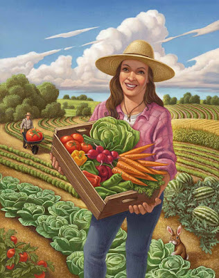
Farm Panorama Reveal

Crop of the large  BioMerieux panorama- by Greg Newbold
The client from my recent great advertising project as seen in the previous two posts here and here can finally be revealed. The company that chose me to create all this goodness is called BioMerieux, a French based multi-national corporation with a US division that specializes in testing for biological pathogens.

The Poultry Farmer stand alone image
My particular set of illustrations is for a testing machine and process called Gene Up that tests food products before they go out to market to make sure they are safe and free from any food borne pathogens or contamination. I know, exciting stuff, right? Their previous advertising and that of all their competitors has historically been dominated by photos of dudes in lab coats looking through microscopes and similarly boring imagery. I am hoping that the imagery will soon filter into their website, but print and trade show applications are in full swing.

Left side crop of the panorama
I think it will be refreshing to see something different and unique in this industry. I believe the response will be a very positive one for BioMerieux, one that will definitely distinguish them from their competitors. These illustrations will debut at a large trade show coming up this week, so I am excited to see how my imagery will be used in the BioMerieux booth space and hear how it is received.
Full Panorama size is 37.5 inches wide at 400 dpi!
The giant panorama will dominate the backdrop of the booth and the other images will also be used at large size. The kicker will be a twelve foot circle of sky suspended above the whole setup, Sounds cool, I can't wait to see pictures. Anyway, there you have it.


The final reveal from the best project of the year, or recent years, for that matter. Thanks BioMerieux, as well as Preston Wood and Kim Sorrentino at Love Communications for making this project such a pleasure to work on. Knock 'em dead at the show!

Wednesday, July 13, 2016

More From the Farm


Last post I mentioned that my recent huge project included nine pieces, well, here are three more to enjoy. I had a blast working on these and think they turned out especially nice.


Once again, these are for a multi national company in a field where the pictorial and advertising norm includes dudes in lab coats looking very stuffy as they gaze into microscopes and stuff like that. I am fairly convinced that this approach will garner more notice than their competitors.

Thursday, July 7, 2016

Down on the Farm


I have just wrapped up a huge advertising illustration project for a multi national company and thought I would give a sneak peek at the results. This has been a very fun and satisfying set of paintings for me. The agency asked that I leave the actual client anonymous for a bit longer, until the launch at the end of the month, but I got the OK to show some of the art.


Once again, these are all digital painted over full graphite drawings. I have enjoyed this project as much as any I have done in the last couple of years. Thanks to Love Communications for the project and for being so great to work with.

Thursday, June 16, 2016

Painting In Little Cottonwood Canyon


This morning I spent a couple of hours painting up Little Cottonwood Canyon about twenty minutes from my house. I should definitely get out and paint here more often since it is so close to home. I met up with a couple other artist friends Jesse Draper and David McClellan and settled in to see if I could make something happen.


It's always fun to observe and respond in paint to the subject in front of you. This one ended up being a challenge with a couple of misfires on the way to sorting out a decent composition. I particularly like the cloud shape I came up with and the shadow pattern on the peaks. The clouds were moving through so fast, I could hardly even snap a picture before they had blown past.

I ran out of time before I could fully resolve the foreground, but I like where things are going and will certainly be able to salvage a decent painting from it in the studio. I am sure I'll be looking at some good old Edgar Payne and Carl Rungius as I finish this one up.


As I was cleaning up to get home and back to the commercial projects, I saw a young bull moose about twenty yards off in the woods. His nubbin antlers were just beginning to form. By the time I reached the edge of the parking area, he had wandered up to say hello. I didn't get too close, but he could have cared less as he foraged his way along. I love getting out in nature to paint!

Friday, May 20, 2016

Zions Bank Show 2016 Is Tonight

This piece is my latest large canvas and is anchoring my display.
"The Golden Hour" is 24" x 40" - $4200
Just a reminder that the annual Zions Bank Art Show (and sale) is tonight. I will have over a dozen paintings on display along with the work of over forty other talented artists. Everything is original (no prints at this show) so come by, enjoy the art, have some delicious snacks catered by local restaurants and enjoy some live music also. Most of all, if you are considering buying original art, please do so tonight and support our vibrant Utah area art scene.

I'll be on the 3rd floor where all the good snacks are! Come say hi!

Shout out to my friend and fellow artist Rob Colvin for taking the photo that inspired this painting. I appreciate his graciously allowing me to use it!

Location:

Zions Bank Financial Center
180 N University Ave in Provo, Utah

Time: 6:00- 9:00 p.m.

Wednesday, May 18, 2016

Remembering Jack Unruh


The illustration world lost another superstar this week. Jack Unruh, one of the most talented men with a pen to ever grace the publishing world, left us and we are all the worse for his departure. He was an icon and a hero to all of us who wield a brush, pen or pencil. Sometimes in life you get to meet your heroes and I had the pleasure to interact with Jack on numerous occasions.


Rather than give a rundown of Jack's artistic accomplishments, which others have done so well in the posts that have flooded social media in the two days since he left us, I will just mention how Jack touched my life and career as a person. It seems many of the same posts are focusing on Jack Unruh the man more than the art anyway.


I first met Jack at a design conference in Park City, Utah in February of 1994. I almost didn't attend because of the cost but friend and organizer Don Weller allowed me the student rate even though I had graduated two years prior. The other reason to attend was that I would get to hear from and meet some of my heroes including C.F Payne, Braldt Bralds and of course, Jack Unruh. I was mesmerized by Jacks presentation and was equally charmed when he took a moment to look at my student portfolio and give some encouragement.


At the time, I was working full time at an educational software company creating clunky 16 bit illustrations and wishing I could figure out how to leave and begin my real illustration career. Little did I know that less than five months would pass before I would be laid off from that job and be thrown in with the sharks to sink or swim. In the back of my head I kept Jack's encouragement tucked in a safe spot for when I needed a boost. A few years passed and I had the chance to attend the very first ICON illustration conference in Santa Fe, New Mexico.


This was a watershed event for not only me, but for the entire industry. It was the first time in recent memory (or maybe ever to that point) that such a large group of illustrators were together in one place to discuss and celebrate the industry we all love. The very first evening, during the social hour, which by then had stretched past midnight, I found myself at the quieter edge of the lounge where I happened upon Chris Payne. I nervously reintroduced myself. He remembered me from the Park City conference and graciously agreed to look at my portfolio. My work had thankfully improved quite a bit from the previous years and we began to have a look. As we flipped the pages, I looked up and there was Gary Kelley who also joined in the perusal.


Each of them offered compliments and suggestions. I smiled and pinched myself. Two of my all time heroes were looking at my work! Just when I thought it could get no better, Chris looked up and saw Jack wandering the hall and called him over to join the critique. I could have died right there and been a happy man. Three of my favorite illustrators ever were looking at my work all at the same time! Better still, they had good things to say and offered much encouragement. I still remember Jack saying that he thought I was on a good track and that I just needed to keep working and I would make it. I ran into Jack again at the next ICON and he immediately remembered me. Jack had a wonderful way of remembering people and making you feel like a friend and that you mattered, even if years had passed since your last encounter.


The last time I got to be with Jack was in 2008 during a trip to Fort Worth, Texas. I was part of Murray Tinkelman's  University of Hartford Illustration MFA program and we were enjoying a week of remote contact in the Lone Star State. Of course, Jack was a local and Murray had asked him to come in and show his work to our group. As always, Jack knocked it out of the park showing his fantastic pen and ink and watercolor masterpieces. He Juxtaposed the visuals with tales of deadlines, nightmare projects, dream art directors and fishing. There was always fishing. I think Jack would admit that if he didn't love drawing so much, he would only do it to support his fishing habit.


One thing he said during the presentation that day that stuck with me was "If you aren't having fun with your art, then why do it?" I think he loved making art almost as much as he loved fishing. After his presentation, I weaseled my way into the lunch group with Murray, Jack and a couple of others. Jack of course, remembered me and we enjoyed a nice hour of good food and tales of the industry (and fishing). Jack always made you feel like you were important. He asked what I was working on and continued to give encouragement, adding that I probably didn't need it by now. Of course we can all use encouragement. I know I need it, even after twenty two years in the art business.


Jack Unruh was one in a million. He was prolific, diverse, unique, and a sense of humor that could biting at times.  He was a fantastic craftsman with a great sense of design a knack for brilliant use of negative space. We will not see anyone quite like Jack again, but I am grateful to have been a witness to his genius and to have rubbed shoulders at least a few times with this master of the pen. You will be missed Jack but take it easy on those trout in heaven. You've got eternity to wet that line.