Showing posts with label theater poster. Show all posts

Wednesday, March 8, 2017

Here's the Scoop!


I am pleased to be working with Pioneer Theater Company again this year after a single season gap. I have done probably close to twenty posters for their various productions over the years reaching back to very early in my freelance career. It's always a pleasure to create new work for stage productions and I look forward to it whenever I get the chance.

This year's assignment happens to be for the musical version of Newsies. I admit I have never seen the film but I am looking forward to seeing the stage version later this year.  Here's some of the process.

Theater provided this photo as direction
The theater provided me with an historical photo of a newsboy that they thought had the feel they were going for and I in turn found a few more that I felt added a little more of the feel I wanted.


Since the intent was clear as far as the pose, I did something I don't normally do which is bypass the rough sketch and go straight to the photo shoot. Two willing neighbor boys, with the help of their mom, who held the lights for me were my models.


They did a great job and I ended up combining details from both of their shots to come up with my drawing.


After some consultation with the client, I was asked to make the boy look a few years older. I stretched out his face, gave him more of a jawline and beefed up his shoulders and arms a bit to age him to about fifteen rather than the younger age of my models.


The background was composed of actual newspaper articles from the 1899 newsies strike. I composited them  and changed a couple of the headlines to match the director's requests.

Overall, I am pretty pleased with the result. Physical drawing was scanned and painted in Photoshop and the entire background was composed digitally also with hand made aged paper textures. Total working time was about two and a half days.

Tuesday, June 16, 2015

Fiddler on the Roof Poster

Fiddler on the Roof- Digital Over Graphite, by Greg Newbold
For several years I have done at least one poster for Pioneer Theater Company. They are the regional professional theater here in Salt Lake City and always do a knock up job on their productions. I like to support the arts here in town and they are kind enough to supplement the budget by throwing in a few show tickets. This year I was offered  the chance to create a new poster for this season's production of Fiddler on the Roof. I enjoy a good challenge and the task at hand here was to create a piece of art that would be both iconic and recognizable but fresh at the same time.


As I scrolled through the dozens of Fiddler poster versions I found online, I realized that almost all of them depicted the "fiddler" sawing away while perched precariously on the roof. I find nothing inherently wrong with going with the status quo, but I wanted to do something that might separate this production from the countless other versions out there. I came up with three idea sketches that I proposed to the theater.


The first one was to be a close up of the protagonist Tevye that would focus simply on his face in a tight crop. I really liked this idea and was hoping this would be the favorite. I didn't find any other versions of Fiddler that employed this idea.


My second sketch was the typical fiddler shot but a little closer in than the long shot which allowed me to give the guy a lot of expression and character. This one was my second favorite and I felt like this would be another decent approach if it was chosen.


My third idea was the classic typical approach with the fiddler perched on a rooftop holding his violin. I played with the shapes of the figure in this one with the intent of taking a more graphic approach than normal to give it a different look than the rest of the posters I saw during my research.

I hopefully launched all the ideas off to the client and fully expected one of them to fly. I was a bit behind schedule already, so I needed to jump on the final rendering quickly. Well, two and a half of the ideas were shot down cold. It was felt that idea one would be too easily confused with Santa Claus. I disagree as the beard color in the final rendering would not have been white, but OK. One down, I still had two options left. Idea three died a fiery death because the  graphic approach was deemed to feel too much like a children's theater production than a full fledged professional theater offering. Understood. Now it was down to number two. In my zeal to do something new, I had forgotten that Tevye never actually plays the fiddle in the production, so it didn't make sense to portray what appeared to be the protagonist (Tevye) as the player. We agreed to adjust the idea and deep six the violin. I submitted a new drawing which was approved.

Final Approved Idea
Because of the different crops needed for the various advertising applications, I needed to add significant acreage to the sides and a bit to the top and bottom to give several cropping options. I rendered out the black and white drawing in full value and then started adding the color.


The final color version took about three days working time to complete and I am pretty happy with the result. I think it's a very classic looking approach to  a well known musical but at the same time, I think it is quite different than most of the posters I have seen. I feel like I got the balance right.

Tuesday, February 17, 2015

The Mystery of Edwin Drood

The Mystery of Edwin Drood- Digital by Greg Newbold
Can I tell you how much I love doing theater posters? This is one I just finished for Footlight Players in Charleston, SC, and once again I had a blast creating the art. The Mystery of Edwin Drood, is an unfinished novel by Charles Dickens that was turned into a musical play by songwriter and singer Rupert Holmes (he of Escape: The Pina Colada Song fame). Since the novel was unfinished, there have apparently been a number of possible endings proposed by various authors over the years and this play is no different. In fact, the audience gets to vote at intermission on how they want the play to end as well as "whodunit".


Inspiration for the art came from a painting by Caspar David Friedrich of a man standing over a foggy expanse. I liked the mysterious mood of the piece as well as the strong contrasts so I paid homage to it as I created my own mysterious vision for the play.


My son posed in an old overcoat to get needed information for my painting and off I went. I gathered as many photos as I could of the foggy English countryside to get a feel for what things might look like and pulled together ideas and details from many sources to create my reality. Reaction from the client has been very positive and I think that this will add nicely to the marketing of the theater's production. Once again, I took a stab at the lettering treatment and I like how it turned out. 

Thursday, January 15, 2015

Bus Stop Poster


Here is the latest theater poster I have finished for Footlight Players in Charleston, SC, for the romantic comedy Bus Stop.  The play was written in 1955 by William Inge and the film version starring Marilyn Monroe and Don Murray was released in 1956.


The story takes place as a snowstorm strands people at a diner in Kansas City that also serves as a bus stop. The main characters have to spend the night due to the raging weather. Cherie, a sort of hillbilly type attractive young woman is the nightclub singer trying to make her way up and out and Bo is the naive and boorish cowboy who is convinced that Cherie is meant to be his wife even though she has zero interest in him. Romantic relationships ensue between the young would be couple and several of the other supporting cast.


I didn't have access to a stage version, so I found a copy of the film at the library. It apparently takes quite a few liberties with the script, but captures the essence. I decided to focus on the romantic/comedy angle and proposed two options to the theater. One was more romance and the other was more flirty and fun. The theater chose the flirty angle and I jumped in head first.


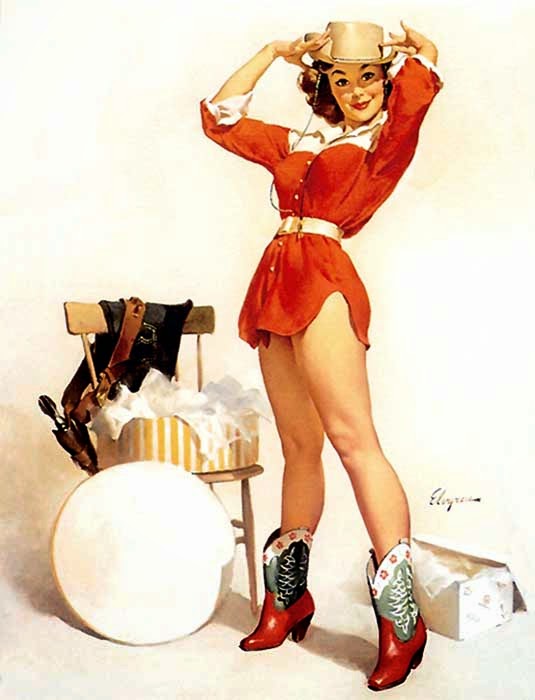
I knew I wanted a little bit of a retro feel with a nod to the pinup art of artists like Gil Elvgren. I made a more finished drawing and then painted it in Photoshop. The result is what I guess I would call my first pin up girl!

Monday, October 13, 2014

Miracle in Bedford Falls


I recently had the chance to create a new poster for Miracle In Bedford Falls For Footlight Players in Charleston South Carolina. This play is a musical stage version of my all time favorite Christmas film It's A Wonderful Life. In case you somehow live in a cave and have missed the 1946 Frank Capra classic starring Jimmy Stewart and Donna Reed, you can watch it on Christmas Eve this year, like I do practically every year, much to my family's chagrin. I have somehow not instilled a love for the film in my children, but there is still hope. Anyway, back to the project at hand.


Creating new art for a story that is so iconic is a bit daunting and I didn't want to copy the familiar climactic family embrace that features prominently on most of the video versions of the film, so that was automatically out. Also, since this is a musical version, I wanted to somehow imply this aspect in the art. Other iconic symbols that I considered in the sketch phase were snow, Christmas bells, George Bailey, fir trees, holly, angel wings and more snow. I came up with four possible options to show the client of which, they chose the snow globe idea. We decided to add George to the snow globe from sketch one and add some musical notations to the swirls of snow.


Once again I created the hand lettering for this poster and incorporated it into the illustration. The client is thrilled with the result and I hope that it adds to the popularity of the production.

Wednesday, September 10, 2014

Wait Until Dark Poster

Wait Until Dark- by Greg Newbold 13" x 18"- Digital
I have been lucky enough to do a number of theater posters recently. The latest is for the stage version of Wait Until Dark by Frederick Knott which was adapted into the classic 1967 film starring Audrey Hepburn as the blind lead character terrorized in her own apartment by a group of thugs looking for a drug stuffed doll. Having only seen the film, I was not aware that it was a play first, but I revisited the film to get a fresh feel for what the play is all about. After seeing it again, I knew I wanted to focus on the lead character of Susy in a close up with dramatic lighting. The match plays a key part in the action when Susy douses the killer with gasoline and then threatens to light him on fire.


I set up a photo shoot with my wonderful model Betsy and photographed a couple of different options. I wanted to invoke the feel of old film noir movie posters in the color palette and also by adding the distressed  edges and scratches. I created and scanned my own hand made distressed folds to make it look like the poster was worn along the folds as well.


I also took the opportunity to handle the title design. I found a very retro feeling font that was appropriate for the overall feel of the poster. I also distressed the type layer to match the rest of the image. I'm thrilled with how it turned out and the client, Footlight Players Theater in Charleston, South Carolina, was as well.

Monday, June 23, 2014

Alabama Story


I recently finished another piece of art for Pioneer Theater. This one for a new play that will have it's world premier this fall called Alabama Story written by Kenneth Jones. The plot revolves around a little known incident (at least I had not been aware of ) that happened in Alabama during the racial tension of the late 1950's.


In 1958,  Garth Williams, famously the illustrator for Charlotte's Web and the Little House on the Prairie books, wrote and illustrated a charming little tale of two rabbits who frolic together and fall in love. At the end of the book the two rabbits  wed in a ceremony attended by their fellow woodland creatures. Innocent enough, right?

Well in the racially charged South, this book became the center of a firestorm because, in the book, one rabbit was white and the other was black. The book was censored and a lawsuit raised to remove the book from the state funded library system. The story revolves around a white librarian, her childhood friend who is a black man and various other lawyers and State legislators who are immersed in sorting out this murky topic.


As I began sketching the art, and admittedly before I read the script, I thought it would be fun to use the rabbits as symbols for the racial tension. Early sketches revolved around the idea of the black and white rabbits and the book that precipitated the argument. Even after I changed the setting to the library shelves, the client felt that the furry rabbit angle gave too much of an impression that this was a children's play so that idea was scrapped.


I still wanted to evoke a feeling racial tension and imply the idea that the story somehow revolved around books, so we switched to the idea of the black character and the white librarian being on opposite sides of the the divide, in this case, a stack of books. The light filtering from the left side illuminates her as she reads and the the other side is symbolically more in shadow.


After this idea was approved, I set to work. I took photos and proceeded to the final drawing and rendering. I think it turned out pretty well considering my deadline was cut about three days short due to a planned excursion with my son. I had to scramble to deliver the art before I left town which included a 2:00 am bedtime one evening. I don't enjoy the late nights and avoid them as much as possible, but sometimes the deadline just has to be met, regardless of the lack of sleep.

Monday, June 9, 2014

Peter and the Starcatcher Poster


Some of you may be familiar with the Peter and the Starcatchers series of books by Dave Barry and Ridley Pearson. Well, the story has been turned into a play that recently closed it's run on Broadway and is now being staged in other parts of the country. I had the luxury of picking a play to illustrate from several of the plays on the Pioneer Theater Company schedule for next season and this was among those on the list. I guess being old (or at least having a long track record working with the theater) has it's perks. It was a tough choice between  this and The Crucible but Peter ultimately won out.

For this one, I went through an unusually high number of comps before we settled on the winning design. At times this can be frustrating, because personally, I felt that they were all visually compelling and any one of the designs could work. But, I have learned over the years that the client is the one that has to be happy and I am hired to make that happen. Here's a run down of the idea sketches:


The theater wanted to play on the pirate idea, so the first two were pretty straight forward pirate cliche scenes with a nod to N.C. Wyeth.


 Idea three hinged on the "magic flying dust" that is being transported via old fashioned steamer trunk. I thought it would be fun to focus on that aspect of the story since everyone in the play wants to get their hands on it. That idea was liked except the creative director wanted more of a focus on the pirate ship.


 So the next idea I had was to do a split screen of sorts with the top of the ship above the water and the hull being shown below the water. The twist was to show the hull as a pirate skull. Great idea right? I love this one and will probably finish a version like this for fun, but the theater thought is was a little much. "Just a regular hull" was the directive, so back to the drawing board.


After decapitating the skull from the ship, it was obvious that there was something lacking in that big empty space. It needed a little magic, so I decided to let the sky full of stars filter down underneath the water. I intended to leave the area open for the title treatment, when I thought to myself, "why not do your own hand lettering?" Having done a few projects over the years with my own lettering, I decided to give it a shot. 


I came up with a nice "piratey" style that feels like it could have washed right up on treasure map. The theater loved it and agreed to bump up my fee to cover the hand done type. Moral of the story, if you happen to get an idea or two shot down, keep after it and find a way to make it your own. If I had not decided to tackle the lettering myself, I doubt I would be feeling so good about the final result. Who knows, maybe I will get more chances to do hand lettering after this.

Monday, March 3, 2014

Evita Poster Art

Evita- 12" x 16; mixed media by Greg Newbold.
I like to post on the weekly art challenge website Illustration Friday as often as I can. There is a new theme word posted every Friday and participants illustrate it however they want. Sometimes whatever I am working on can be massaged to plausibly fit the week's challenge and I post the current piece. Other times I am too busy to create something new and what I am working on doesn't fit. On those occasions, I like to post things I have created previously that fit the theme. This week the word is voice. I realized that even though this poster I did for a production of Evita was done years ago, I have never posted it here on the blog. So, for what it's worth, here is my take on Eva Peron.

Tuesday, February 11, 2014

Sugar Bean Sisters - Finished


As promised, here is the final artwork for the Sugar Bean Sisters poster. I really like how things turned out. Let me know what you think!

Saturday, February 8, 2014

Sugar Bean Sisters Final Drawing


While you are waiting for the aliens to come back and get you, here's a sneak peek at what it might look like. This is the final drawing for the Sugar Bean Sisters poster I am creating for Footlight Players Theater in Charleston, South Carolina. It is 7" x 13"; black Prismacolor and white charcoal on gray toned paper. This is the first time I have done a two tone drawing on gray paper in I can't remember how long and I really enjoyed it.. I am sure there will be more where that came from. The final digital
color version is about halfway finished and I will post it sometime next week when it is finished.

Sugar Bean Sisters thumbnail sketches

Thursday, February 6, 2014

Sugar Bean Sisters Sketches


Creating art for theater is always fun because the variety of stories is ever changing. I have had the opportunity to do numerous play and opera posters and I never get tired of it. Something about the blank slate and the open possibilities inspires me. I am currently working on a poster for a Footlight Players Theater in Charleston, South Carolina for their upcoming production of The Sugar Bean Sisters. The play focuses on two spinster sisters who live in a shack in the swampland of Florida. One pines for a husband while the other anxiously awaits the aliens to return and take her away. After a discussion with the theater director about poster concepts, it was decided that the poster should include elements of the UFO as well as the swamp locale. I set to work and these four sketches were submitted to the client. Ultimately they settled on sketch four, which happily was my favorite as well. I'll post the final when I finish.