Showing posts with label Advertising art. Show all posts

Wednesday, March 8, 2017

Here's the Scoop!


I am pleased to be working with Pioneer Theater Company again this year after a single season gap. I have done probably close to twenty posters for their various productions over the years reaching back to very early in my freelance career. It's always a pleasure to create new work for stage productions and I look forward to it whenever I get the chance.

This year's assignment happens to be for the musical version of Newsies. I admit I have never seen the film but I am looking forward to seeing the stage version later this year.  Here's some of the process.

Theater provided this photo as direction
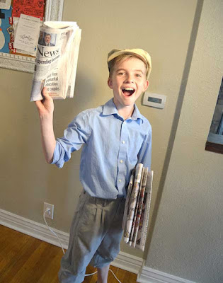
The theater provided me with an historical photo of a newsboy that they thought had the feel they were going for and I in turn found a few more that I felt added a little more of the feel I wanted.


Since the intent was clear as far as the pose, I did something I don't normally do which is bypass the rough sketch and go straight to the photo shoot. Two willing neighbor boys, with the help of their mom, who held the lights for me were my models.


They did a great job and I ended up combining details from both of their shots to come up with my drawing.


After some consultation with the client, I was asked to make the boy look a few years older. I stretched out his face, gave him more of a jawline and beefed up his shoulders and arms a bit to age him to about fifteen rather than the younger age of my models.


The background was composed of actual newspaper articles from the 1899 newsies strike. I composited them  and changed a couple of the headlines to match the director's requests.

Overall, I am pretty pleased with the result. Physical drawing was scanned and painted in Photoshop and the entire background was composed digitally also with hand made aged paper textures. Total working time was about two and a half days.

Monday, November 28, 2016

Rejected...Oh Wait...Accepted!


I recently got word that three of my pieces have been accepted into the Society of Illustrators Los Angeles Annual Illustration Show. This welcome news comes on the heels of complete rejection at the NY Society of Illustrators just a week ago.


While I am always disappointed whenever my work doesn't get accepted in any particular show, I have resigned myself to the fact that any given juried show is highly subjective. Different juries have different tastes and I have absolutely no control over their opinions. These same pieces were ignored in New York while making the cut in L.A. Go figure. But this is not an uncommon scenario and other artists have voiced the same frustrations. Rejection even varies from year to year in the same competition. I have had a piece get the ax two years in a row and then win an award on the third attempt. I have diligently tried to brush off the numerous rejections over the years, Though it never feels good, I have stopped moping around for days on end feeling sorry for myself. In fact this year, for several days I didn't even mention the NY snub to my wife and then, it was only in passing. This new maturity level made the acceptance in L.A. feel a little more satisfying. I think that these competitions with their frequent rejections and occasional successes are a microcosm for life. I have over the years started to worry less about stuff that is beyond my control and focus more on things that I might actually be able to do something about. Things like doing my best work, working hard as well as smart and shutting down shop to be with family more often.


There is a great line from the film "Bridge of Spies" in which the convicted KGB spy Rudolf Abel, played brilliantly by Mark Rylance, is asked if he is worried. He replies "Would it help?" I'm learning to let stuff go when worrying about it won't help. Maybe I am finally learning to be a grown up.

Previous posts about this project can be seen here, here and here.

Tuesday, July 26, 2016

Farm Panorama Reveal

Crop of the large  BioMerieux panorama- by Greg Newbold
The client from my recent great advertising project as seen in the previous two posts here and here can finally be revealed. The company that chose me to create all this goodness is called BioMerieux, a French based multi-national corporation with a US division that specializes in testing for biological pathogens.

The Poultry Farmer stand alone image
My particular set of illustrations is for a testing machine and process called Gene Up that tests food products before they go out to market to make sure they are safe and free from any food borne pathogens or contamination. I know, exciting stuff, right? Their previous advertising and that of all their competitors has historically been dominated by photos of dudes in lab coats looking through microscopes and similarly boring imagery. I am hoping that the imagery will soon filter into their website, but print and trade show applications are in full swing.

Left side crop of the panorama
I think it will be refreshing to see something different and unique in this industry. I believe the response will be a very positive one for BioMerieux, one that will definitely distinguish them from their competitors. These illustrations will debut at a large trade show coming up this week, so I am excited to see how my imagery will be used in the BioMerieux booth space and hear how it is received.
Full Panorama size is 37.5 inches wide at 400 dpi!
The giant panorama will dominate the backdrop of the booth and the other images will also be used at large size. The kicker will be a twelve foot circle of sky suspended above the whole setup, Sounds cool, I can't wait to see pictures. Anyway, there you have it.


The final reveal from the best project of the year, or recent years, for that matter. Thanks BioMerieux, as well as Preston Wood and Kim Sorrentino at Love Communications for making this project such a pleasure to work on. Knock 'em dead at the show!

Wednesday, July 13, 2016

More From the Farm


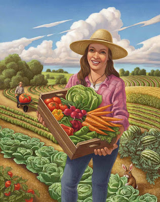
Last post I mentioned that my recent huge project included nine pieces, well, here are three more to enjoy. I had a blast working on these and think they turned out especially nice.


Once again, these are for a multi national company in a field where the pictorial and advertising norm includes dudes in lab coats looking very stuffy as they gaze into microscopes and stuff like that. I am fairly convinced that this approach will garner more notice than their competitors.

Thursday, July 7, 2016

Down on the Farm


I have just wrapped up a huge advertising illustration project for a multi national company and thought I would give a sneak peek at the results. This has been a very fun and satisfying set of paintings for me. The agency asked that I leave the actual client anonymous for a bit longer, until the launch at the end of the month, but I got the OK to show some of the art.


Once again, these are all digital painted over full graphite drawings. I have enjoyed this project as much as any I have done in the last couple of years. Thanks to Love Communications for the project and for being so great to work with.

Tuesday, June 16, 2015

Fiddler on the Roof Poster

Fiddler on the Roof- Digital Over Graphite, by Greg Newbold
For several years I have done at least one poster for Pioneer Theater Company. They are the regional professional theater here in Salt Lake City and always do a knock up job on their productions. I like to support the arts here in town and they are kind enough to supplement the budget by throwing in a few show tickets. This year I was offered  the chance to create a new poster for this season's production of Fiddler on the Roof. I enjoy a good challenge and the task at hand here was to create a piece of art that would be both iconic and recognizable but fresh at the same time.


As I scrolled through the dozens of Fiddler poster versions I found online, I realized that almost all of them depicted the "fiddler" sawing away while perched precariously on the roof. I find nothing inherently wrong with going with the status quo, but I wanted to do something that might separate this production from the countless other versions out there. I came up with three idea sketches that I proposed to the theater.


The first one was to be a close up of the protagonist Tevye that would focus simply on his face in a tight crop. I really liked this idea and was hoping this would be the favorite. I didn't find any other versions of Fiddler that employed this idea.


My second sketch was the typical fiddler shot but a little closer in than the long shot which allowed me to give the guy a lot of expression and character. This one was my second favorite and I felt like this would be another decent approach if it was chosen.


My third idea was the classic typical approach with the fiddler perched on a rooftop holding his violin. I played with the shapes of the figure in this one with the intent of taking a more graphic approach than normal to give it a different look than the rest of the posters I saw during my research.

I hopefully launched all the ideas off to the client and fully expected one of them to fly. I was a bit behind schedule already, so I needed to jump on the final rendering quickly. Well, two and a half of the ideas were shot down cold. It was felt that idea one would be too easily confused with Santa Claus. I disagree as the beard color in the final rendering would not have been white, but OK. One down, I still had two options left. Idea three died a fiery death because the  graphic approach was deemed to feel too much like a children's theater production than a full fledged professional theater offering. Understood. Now it was down to number two. In my zeal to do something new, I had forgotten that Tevye never actually plays the fiddle in the production, so it didn't make sense to portray what appeared to be the protagonist (Tevye) as the player. We agreed to adjust the idea and deep six the violin. I submitted a new drawing which was approved.

Final Approved Idea
Because of the different crops needed for the various advertising applications, I needed to add significant acreage to the sides and a bit to the top and bottom to give several cropping options. I rendered out the black and white drawing in full value and then started adding the color.


The final color version took about three days working time to complete and I am pretty happy with the result. I think it's a very classic looking approach to  a well known musical but at the same time, I think it is quite different than most of the posters I have seen. I feel like I got the balance right.

Wednesday, June 4, 2014

Summerbelle Final Art

Summerbelle Final Art (detail)- Greg Newbold- digital
I just finished up the illustration for the Summerbelle fruit carton. It's always fun to work with John Ball at BDG. I really enjoyed the process and it turned out to be one of my favorite jobs of the year so far with virtually no changes. I have to reinforce the fact that I followed all the steps that I have taught to students in the past which basically follows the basic recipe for illustration success. I have outlined it before, but it bears repeating:

1-Think. Get the idea right in your mind before you start, so you have a target you are shooting for. Think of possible alternate solutions and list them. On this job, it was pretty clear what the intention was, but I brought the idea of the umbrella to the solution which ultimately was what worked best.

2- Thumbnail Sketches. This is the most basic form of ideation on paper. Don't just chicken scratch out something vague and indecipherable. Take some care to get proportions, shape relationships, angles, POV, and value patterns defined at this stage. No details yet, but the "skeleton" is established. I made sure the angles of the pose were as dynamic as possible given the parameters of the space.

Final Summerbelle Art by Greg Newbold with graphic design by John Ball
3- Reference Gathering. In this case, I went to the trouble of renting a real costume and props from a professional theater resource. It cost a little more, but this was a good paying project and it was worth the added expense. I posed my model based on my thumbnail ideas and took lots of photos. I gave myself 2-3 alternate poses as well in case the client did not like what I proposed. I submitted two versions for consideration and the umbrella pose won out. Having great photo reference saved endless headaches and guessing.

4- Final Drawing. I draw my final drawings by hand despite the fact that this project and most of my illustration work is painted digitally. This gives me a chance to make adjustments and edits that deviate from the reference material, to stylize and to generally put my personal fingerprints on a piece.

5- Value Study. I made sure that my final drawing had the values and shadows established in a monochromatic fashion. My actual physical drawing has a certain amount of value in it and I reinforced it with multiply layer glazes of gray before stepping to color.

Summerbelle carton looking sweet with art on three sides
6- Color Study. I work out the color plan before diving in. When I don't, disasters happen. I've been doing this for a long time, so I admit that sometimes this is a mental color study for me. I thought about how I wanted the colors to pop based on the input from the client. The overall desire was that it wanted to fell light and summery. I did a quick Photoshop paint over on top of my sketch at a small size just to reinforce my instincts and then dove into the final art.
  
7- Final Art. At this point, most of the questions had been asked and answered. It was just a matter of getting all the details painted and then making sure the nuances were appealing. For instance, I went back into the shadows of the skin tones to bring some cool light into the up facing planes and warming up the down facing planes or adding reflected color as in the underside of the arm picking up the orange glow of the citrus fruit.

Wednesday, May 15, 2013

Death Trap - Finished

Death Trap- 11' x 14" digital and graphite by Greg Newbold
I posted the full value drawing for this piece a few days back. It will be reproduced as a poster and playbill cover for a production of Death Trap this coming season at Pioneer Theatre Company. I have been working on the final art the last couple of days and just finished things up. I decided to keep the background relatively unsaturated to create contrast and also to allow the background elements to recede. I really like how this turned out and in case you were curious, I painted it digitally using Photoshop.

Wednesday, November 21, 2012

Turning Summer to Winter


On Sunday, the newspaper brought with it the new City Creek Center Holiday insert, so now that it is public, I figured it was time for me to claim credit. I was approached in late August to do illustrations for City Creek Center, the new multi billion dollar redevelopment project in downtown Salt Lake City, UT.

Concept art provided by the client
Of course I jumped at the chance since the mall and surrounding properties are practically in my back yard. The development spans multiple city blocks and there is a distinctive pedestrian bridge that connects it together. One of the images needed would showcase this architectural feature. the time frame and complexity of the architecture, as well as the continuity with existing City Creek advertising necessitated a much more Photoshop based approach than usual. I also would need to transform summer into winter, complete with twinkling lights and snow and decorations.

Left side of the panorama
Center section with sky cut out
Right side of the scene
I took the concept art from the client and took photos around the mall from which to work. I could not get the entire bridge panorama into my camera in one shot, so I pieced the three parts together using the photo merge utility, which us incredibly good at matching things up. I then adjusted exposures to get them all matching and then went to work painting over the entire scene.

City Creek Bridge- Final version

City Creek bridge starting point
Then came all the work of adding the holiday cheer to the scene. I added a nice moonlight sky and stars to the background, edited out the power poles and barricades, replaced all the people with bundled up shoppers, added all the garlands and trees and tossed in thousands of twinkling lights. I also added a generous sprinkling of snow on the ground and light flakes falling. By the time I finished, I had painted over and added textures to pretty much the whole scene. I like how it turned out, though it was not my traditional method of working. Bottom line was that the client was very pleased and that is what really counts.

Wednesday, May 23, 2012

A Cristmas Carol- Final Version


Last post I showed the rough version for my poster of "A Christmas Carol - The Musical" for Pioneer Theatre Company's upcoming season. I needed to add some space at the top to accommodate the title and a little bleed all the way around. I also decided that losing the chain around the brim of the hat made for a simpler statement. Everyone knows what A Christmas Carol is all about anyway, so I let it go. Other than that, it pretty much the way I envisioned it turning out. Let me know what you think.

Saturday, May 19, 2012

A Christmas Carol - Sketch


I am working on a poster for Pioneer Theatre Company to promote their production of  A Christmas Carol - The Musical. I was not aware that there was a musical version of the famous Charles Dickens tale so I was immediately intrigued. There is a version of this production on DVD that stars Kelsey Grammer as Scrooge and, Jane Krakowski, Jesse L Martin, Jennifer Love Hewitt and Jason Alexander. I was impressed with the lively musical numbers (by Disney's Little Mermaid song smith Alan Menken (music) and lyricist Lynn Ahrens) and it's faithfulness to the story. I submitted several sketch versions to the client and this was the one we agreed on. The challenge was to give a feeling that this is a musical production rather than the normal dramatic version, so I added musical notations to the swirls of snow to achieve this effect.  I'll post the finished version when I wrap it all up.