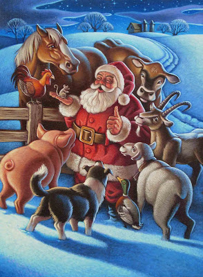
Unused cover illustration for "The Barnyard Night Before Christmas
Have you ever had an illustration project scratched before launch? Worse yet, scratched after launch? After you painted it? It has happened to me a few times in the last 17 plus years. The first time it happened, I was really bummed, even angry, as if because someone thought my art was less than usable, this somehow made me a bad artist. A couple more times and I figured out that it's not always the artist's fault. Most of my rejected pieces have been perfectly good and publishable projects, but for whatever reason (client preference, miscommunication of intention, intuitive feel, etc.) someone in power kills the project. Fortunately, I have never failed to be paid for one of these aborted flights. Sometimes I can see and even agree with the Art Director's rationale as was the case for the cover of my book
The Barnyard Night Before Christmas. I was furiously painting along, needing the cover to be finished so that it could go out to marketing and have the promo cover made. I finished and shipped it off to the publisher. Then word came that the focus group made up of the editor, Art Director, designers and whomever else sits in on those things had determined that the image I painted wasn't the right one for the cover.
After some discussion, it was decided that, indeed it might not be and another image was selected. The new image did not quite fit the shape for the cover while allowing for the type, so I had to extend the edges and paint another strip of sky that was inserted using Photoshop for the final crop.
I am actually very happy that we went with the other cover. It has more mystery to it and invites the reader to open up the book and see what the inside holds.
Barnyard Night Before Christmas previously on LNA


10 comments:
This is so beautiful.
What a great menagerie of animals pulling Santas slide.
I would love to know the whole story.
Wonderful cover art!
wow! both of these illos are lovely beyond! the only reason i like the final cover art better is that the balloons in the "rejected" artwork make it look a little less "christmasy" — but, it is very lively and drew me in for quite awhile. you are such a talent!
I can see the reasons behind the change but do love the movement & the top piece
fun images beautifully done.
A really lovely image, but I also agree with the choice of the other one for the cover. Thanks for explaining that these things happen to an illustrator, and that sometimes, the change is for the right reasons.
Thanks for the feedback everyone. I admit to being a little bit miffed when I learned of the cover change, but in the end, the cover was better for it. besides, the cover is maybe the most important picture in a book because it is what draws you in.
What a great story and lesson for us all. It was perfect for this week's IF word. Thank your for sharing that. I like the quiet feeling in the final art. It's very engaging.
I love both images...and I always enjoy your thoughts on the ups and downs of being an illustrator.
Beautiful work!
Post a Comment