Showing posts with label Illustration Friday. Show all posts

Wednesday, August 21, 2013

IF Pick of the Week!

I was wondering why I had a significant uptick in page views for the chicks illustration I posted last week. Well it turns out I was selected as pick of the week on the the Illustration Friday Blog. I have posted my work on their blog on and off for some time, depending on the week's theme. This is the first time my piece has been selected as pick of the week. I know it's randomly selected, but still cool and I appreciate the extra eyeballs. If you have never participated on Illustration Friday, you should check it out. There are usually some pretty cool illustrations posted each week. It will only be there on the front page for a couple more days, so check it out

Friday, July 6, 2012

Suspend Disbelief


Any book or movie that falls into the fantasy genre demands that you suspend disbelief and just sit back and enjoy the story. I think it would also be pretty cool to be able to suspend magical flames in my hand and then send them flying like the character in this book.The painting above is from a series of covers I did for the Chestomanci Series by Diana Wynne Jones.


The book is called The Lives of Christopher Chant and you can still get it, though the series of covers I did has been phased out and the books are now packaged with different covers. It's a bummer that most books that hang around for any length of time get the face lift treatment, but such is life. It was fun to do so many covers for the same author and series though. I think I did seven or eight Wynne Jones covers over a period of a couple of years.

Friday, May 25, 2012

Uncle Sam Van WInkle- Final Sketch


This is the final approved sketch for my project for Liberty magazine. As I mentioned in my thumbnail post earlier, this article is about the faded convictions and slumbering values of Protestant America. I will now be taking this to finish in full color, but I have a few days before it is due, so today I am working on a private oil painting commission.

Thursday, April 26, 2012

Inventing Color from Black and White Reference


I did this as a demo for my Illustration 1 students to explain how I make the jump to a full color palette when working from black and white reference. I think this is a valuable exercise for any artist as it forces you to think outside of the box instead of relying on whatever colors are in your photo reference. This challenge was probably as beneficial for me as it was for the students. First, I found a photo that I had taken  at the Getty Museum of a Roman sculpture.


I liked the way the light played across the various planes of the head and the structure of his head was appealing. I knew that working from black and white would force me to think about the basics of color so I set a couple of parameters for myself. One was that I would consciously create a temperature shift from light to shadow and that regardless of the colors I chose, meaning that if the light source I defined was cool, I would paint the shadows warm and vice versa.  I would also maintain a strong value pattern from light to dark. Given these guidelines, I also wanted consciously chose colors that I do not normally work with, forcing myself to invent palettes out of my comfort zone.


The results were delightful and surprising. I found myself fully enjoying the experimentation and being excited by the way certain colors looked against others. Although in some respects the color palettes are not natural, I think they are all believable for the reasons I set as parameters from the beginning: the value patterns were maintained and the color temperature shifts from light to shadow. Each of these versions also has its own unique mood as well. This is an oversimplification of the concept of temperature shifts and they can often times be more subtle than what I did here. Creating color studies like these can be valuable in defining what you want to achieve in a particular piece. These head studies are 4" x 5.5" and I took about an hour and a half to paint each one.

Friday, March 23, 2012

Swamp Sunset

Swamp Sunset by Greg Newbold- 8" x 16" acrylic

I just got an email today from a mother telling me how much her children loved Spring Song, the book that includes this image. It's really nice to hear from readers and parents of readers since, for me at least, I don't often get that kind of feedback. In part it read:
My children and I enjoyed Spring Song today and I wanted you to know how much we enjoyed your illustrations.  I've seen your work before and should have recognized it...Thank you for sharing such lovely work.
This reaction is one of the main reasons why I enjoy making a book so much. In recent weeks, I have pulled out and revised some manuscripts that I have written and am gearing up to get another book in the pipeline. Finding a publisher is the hard part, so wish me luck.

Moonlight Serenade- 8" x 16" , acrylic

Here's the companion piece to this one. I think I may have posted it before, but couldn't find the link.

Friday, February 17, 2012

Window Cleaning


I started this picture yesterday and finished it this morning- including the drawing as well as the wait for client approval. I can't believe the difference in speed working digitally has made. Granted this is a rather simple illustration, but working traditionally, this painting would have taken at least two days, maybe three. Everyone told me that eventually digital would become much faster than paint, but I didn't understand how fast it would become until the last few projects. I still miss having a physical object as an artifact of the process, but I cannot dispute the dramatic increase in speed.

This magazine illustration revolves around a young boy who goes to help give service one Saturday which included cleaning windows, so my picture depicts the moment when he wipes the window cleaning fluid off the glass. you can see him through the clean section. The magazine title and text will go on the left side and continue under the figure over his shirt.

Friday, February 3, 2012

Suspense


The Illustration Friday theme for the week is "suspense". I did this piece for a magazine article a couple of months ago. In the article, the father feels prompted to check on his young sons sleeping in the back of the camper truck while traveling on an early morning camping excursion. He finds them passed out from carbon monoxide poisoning, but they are revived because he listened to the prompting. The moment I chose to depict is that moment of suspense when the father doesn't quite know what is going on as he looks in the back of the truck. The light from the flashlight served to illuminate the bottom of this full page article. I cropped off the fade to white.
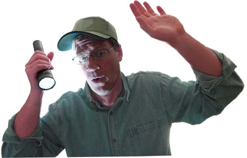

Once again, it's nice to have a willing model in a pinch as I used myself for this project. My indulgent wife shot the photos which I pieced together to get my photo comp from which to draw. This piece was painted entirely in Photoshop after I scannned in my drawing.

Monday, December 26, 2011

The Messenger

The Messenger- acrylic 5.5" x 8"

I found this while rummaging around the studio and it fits this week's Illustration Friday theme perfectly. It was for a story about a man who received a message from an angel while sleeping. Sometimes, I think we can all use a little inspiration from above.

Friday, December 2, 2011

Burn Your Bad Work? No, Just Repaint


Yellowstone (after cropping and repainting) 6.75" x 12" - acrylic.

Ever wonder what to do with all those old illustrations laying around your studio? you know the ones that were so specific and had so many dead areas left for type that they are practically useless? I have burned a few bad ones over the years, but rather than torching them all and having the fire brigade on my doorstep, I have started cropping and repainting them. I have a collector friend that has been buying a piece from me every Christmas for the last few years. Last year I pulled out a few candidates for him to choose from and he found one he liked. Well sort of liked. He wanted me to paint out the figure of the hiker. I happily complied and was pleased with the results which I posted earlier here. This got me thinking of how many useless pieces I have laying around. Those paintings that have good elements, but that are not really suitable to hang on your wall, nor are they attractive enough to put in your portfolio or resell.

Here is the painting after I cut it down

I figured I could crop, repaint or collage elements from one of these otherwise bonfire worthy pieces and turn it into something good. There are thousands of hours of work collected in my flat file and it seems dumb to waste these paintings, so I think I'll be doing more of this in the future. This time, I found one that needed some serious cropping and repainting to make it wall worthy.

Tape lines indicate where I wanted to crop


Here is how it looked before I started reworking it and re assembled with it's original parts after. At least half of the picture area was blank because of type restrictions the publisher placed on me. In this new version, the moose got exiled from his habitat since he didn't fit the new vision. Also, the sky got completely revised as did many of the trees and the thermal pool on the left. In the end, a piece that was practically worthless before now will have an honored place on my collector's home office wall.

Friday, November 25, 2011

Feeling Round?


One of my favorite things about the day after Thanksgiving is... not shopping. Actually I like to eat a nice turkey sandwich while catching some football on TV. Not that I need anything to make me feel round after the delicious feast yesterday, but who can resist all those tasty leftovers? The Illustration Friday theme for today is "round". That combined with the football game on TV reminded me of an illustration I did right out of college for a local magazine. It was about the gourmet nature of certain tailgate parties. Given how long this took to paint, I am pretty sure I got paid about $8 an hour for this thing. But I was glad to get anything printed way back then. This was done in 1992, about a year and a half before I dove headfirst into a full time freelance career. At the time, I was looking for a way out of my desk job illustrating educational software on a computer that resembled something out of the Flintstones. 

Thursday, November 10, 2011

Shane Jackman CD Cover Art


Cover for Shane Jackman's new album "Peace"

I have always loved the peaceful silent nature of new fallen snow. My musician friend Shane Jackman and I have wanted to collaborate on a project for some time. I finally got the chance to do a piece of cover art for one of his albums, so here is a sneak peek. After concept discussions for the cover of this album, we settled on the idea of a peace sign pressed into a snowy hillside at evening. Shane is crafting this recording to appeal to all denominations as more of a holiday album but it will have songs that are obviously Christmas themed. The bright star in the sky stands as a little reminder of that. Shane is an incredibly gifted singer and songwriter and I am excited to be a part of this package. The album will be simply titled "Peace" and will have a mix of original Christmas and holiday themed tunes as well as a few traditional carols Shane has arranged.

Check out Shane's website here

Friday, October 28, 2011

Have a Scary Halloween!

Clown-Fish; 5" x 5" acrylic on paper, by Greg Newbold

Here's another one of my goofy fish that I finished just yesterday. It seemed appropriate for Halloween. This one is a little creepier than usual, but still pretty funny. It's getting shipped off to a fundraiser for the Westmont Museum of Fine Art in Santa Barbara, California. Everyone was given a 5" x 5" piece of BFK paper to do anything they wanted on. My friend Scott Anderson teaches art there and when I saw his contribution, I was a little embarrassed by my previous effort. It was a fun drawing, but not typical of my painted work. I asked for another shot and this is what came out of it. I did it as a demo for my Illustration 1 class at BYU. I have seen a few on the pieces for this show posted online and I think a few people are going to end up getting some little gems. I'm tempted to bid myself.

Friday, October 21, 2011

Fueling the Fire

Fueling the Fire- 11.5" x 12" acrylic/mixed media by Greg Newbold

Sometimes the only way to keep the wolves at bay is to fuel the fire. Make sure your creative fire is always stoked with new and interesting projects. I have found over the years that I have to take time to do work that is just for myself or just for fun. The breakthroughs and discoveries I make during these explorations are what keeps me excited to do those inevitable jobs that are less than thrilling, but that pay. By injecting aspects of my explorations into my paying work, I have been able to keep my creative fires burning. If you don't have anything exciting going on in your paying work, come up with a personal project that excites you and get to work. The benefits are enormous and far reaching.

Sunday, October 16, 2011

Crowbar's Farewell

Crowbar's Farewell- Acrylic/mixed media; 12" x 18"- Greg Newbold

I did a series of paintings for a story written by Jean Craighead George called When Crowbar Came. Based on a true story of a crow who was befriended by the authors' family and the shenanigans that this very smart crow perpetrated during his time with them.  I painted seven scenes for an educational reading anthology series and this piece was the finale. In the end, the crow decided he belonged with those of his kind. When all the crows scattered like leaves in the wind one fall, Crowbar went with them.

Friday, August 26, 2011

Jekyll Or Hyde?

Jekyll and Hyde- 11" x 14", mixed media by Greg Newbold

I did a series of theater posters a while back for Pioneer Theater Company and one of the shows was a production of Dr. Jekyll and Mr. Hyde. I wanted to give a sense of mystery without resorting to the tired "half in half" sort of depiction of this character. I decided that instead of having Jekyll in his "Hyde" disguise, or vice versa, I would simply add a sort of  mad glow to his right eye. I got a lot of mileage out of this one including getting it accepted into the Society of Illustrators Annual.

Also see Cyrano De Bergerac from this same series here
Check out my new painting video here

Friday, August 19, 2011

Influenced by the Best

"Thunderbird" -Sunset magazine "cover"
Oil on canvas, 18" x 24" by Greg Newbold

Whether we want to admit it or not. All artists are influenced by what they see. Whether it's our surroundings, the things we like, photography or the work of other artists, we seek out and internalize the visual material that resonates emotionally within us. During my MFA journey at the University of Hartford, we were given the assignment to create a magazine cover in the style of a Golden Age Illustrator. I of course immediately wanted to pay tribute to one of my favorites, N.C. Wyeth.

The 1914 Dixon cover that inspired me

While researching possible magazines in which to insert my painting, I thought o the several magazine covers created by another of my favorite painters, Maynard Dixon. I figured why not pay homage to both artists at once. I found a grainy photo of Maynard Dixon that gave me enough information to start from and with the addition of a palette and brush, I created a heroic view of Dixon painting in a landscape much like the ones he loved to paint.

Giant in the Clouds- by N.C. Wyeth

I tried to create the scene with the design, color and brushwork  sensibilities of Wyeth, especially the clouds and the way that the figure drops off into mostly shadow. In the end, I think it also shows  quite a bit of the influence both artists have had on my own work.

Friday, July 29, 2011

Angel-Fish

Angel-Fish, 9" x 9" Acrylic and metal foil.

Anyone following this blog has probably noticed a bit of an obsession with fish. It started out innocently enough with a small demo painting of a fat fish for a class I was teaching and has since morphed into a series of progressively goofier fish since then. To date I have painted over a half dozen of these critters and I am sure there are more to come. Click the links below to see some of the others in this crazy fish family.

Cat-Fish
Dog-Fish
Angler Fish
Devil-Fish

Monday, July 25, 2011

Pioneer Art Fest Paint Out

Old Moline - 12" x 12", Oil

I had a great time painting at the Pioneer Art Festival held at Wheeler Farm this past Saturday. I did both the Early Bird Paint Out and the regular Paint Out and I had a great time. The Early Bird  from 6:00 to 8:00 a.m.was more of a warm up, but I like how it turned out. I'll post that tomorrow. For the main paint out, I scouted a motif earlier in the week and estimated the light for the hours I would be painting. I picked an antique Minneapolis Moline tractor as my subject. As the perennial piece of machinery on any farm, I thought a tractor would be fun to paint. I got set up and my painting was underway by 8:15. It was funny seeing other artists get a little upset that I had a prime spot, but there was no lack of subject matter on the farm. I got a good block in going by about 10:00 a.m. After that I was humming along getting to the good details and thick paint.

About halfway through the painting- 2 hours in

At 12" square, it was the largest painting I have attempted outdoors, but I enjoyed it and gained confidence as I went along. One lady ducked under my view as she walked in front of me and I had to laugh. I was painting pretty fast (for me) but not quite fast enough to paint in a spectator. I got great comments from other artists about how this painting turned out and was feeling pretty good about my chances at a prize. Alas, the cash prize eluded me, but I got a great swirly purple art glass paperweight as an honorable mention prize. My boys promptly dubbed it "Koraeghoth, Maelstrom of Destiny" (whatever that means). I thought it was pretty funny and they were excited that I won a prize even if no money was involved. Considering the competition, I got over my disappointment. There were a lot of artists who have been at this outdoor painting thing a lot longer than I have been. 

Friday, July 8, 2011

Stay (Grateful)

Gratitude- 10" x 13" Acrylic

In today's world we are subjected to a constant barrage of negative messages from the media. They will tell you that you can never be rich, cool, pretty or fit enough. That unless you have this new thing or that, you are a loser. That money is easy if you have credit or at least something that you can double up a loan on. Couple that with the "if it bleeds it leads" mentality on all the newscasts and it's easy to lose sight of what's good in life. Today, thank someone for something nice they did for you. Do something nice for someone else. This afternoon,  someone held the bank door open for me after I arrived one minute past closing. The bank folks probably didn't appreciate the fact that I then held the door open for a lady who arrived two minutes after I did. Oh well. It felt good and I took it one step further by buying two twenty-five cent cups of lemonade from some kids on the side of the road. Go ahead and try it. I promise you will feel better and tomorrow will be happier and more productive.  I did this painting for a magazine article extolling the virtues of being grateful.

Friday, July 1, 2011

Remedy

Advertisement for data recovery company, circa 1999

If you have ever had a hard drive crash or accidentally deleted something, you know what a pain it is to try to remedy the situation. I did this piece a while back for Power Quest, a software company that specialized in recovery of lost data. They no longer exist since being absorbed by Symantec.The concept was a frantic PC owner watching as his hard drive gets operated on. The technology probably looks a little dated now, but the concept was fun to paint. It ran in a bunch of computer magazines back in the day.
